#
op-art
#
minimalism
#
circle
#
op art
#
pop art
#
colour-field-painting
#
word art
#
geometric
#
abstraction
#
line
#
hard-edge-painting
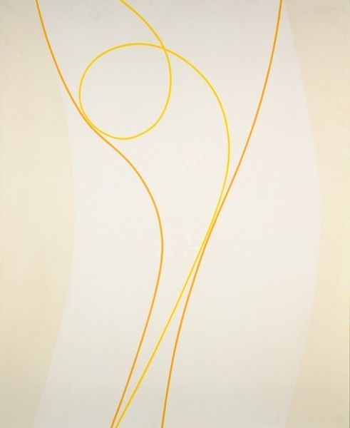
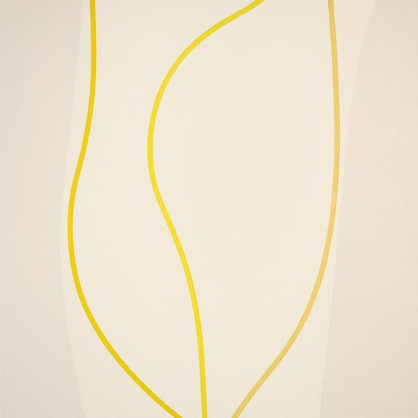
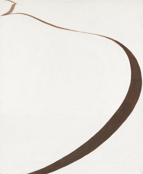
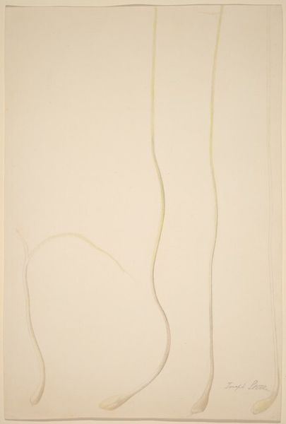
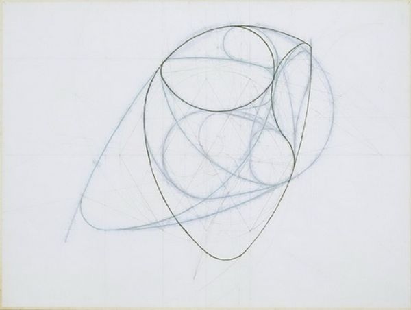
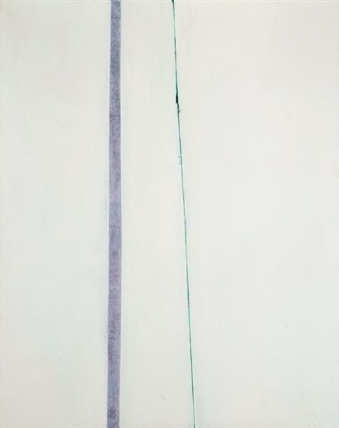
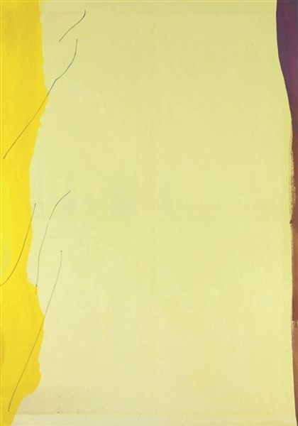
Copyright: Lorser Feitelson,Fair Use
Editor: This is Lorser Feitelson's "Untitled (February)," created in 1970. It features this elegant golden line curving across a pale, cool background. There's something incredibly clean and serene about it, almost like a calligraphic gesture. How do you interpret this work? Curator: The hard-edge style of "Untitled (February)" places it firmly within a fascinating period of art history. Feitelson's minimalist composition embodies the cultural shifts of the late 60s and early 70s. Consider the socio-political landscape; there's a desire to break from the complexity and perceived chaos, reflected here in the almost meditative simplicity. What role do you think institutional settings, like galleries and museums, played in elevating this type of abstraction? Editor: That's a great point. Were institutions looking for something neutral, something that wouldn’t stir up more controversy? It feels quite removed from, say, the social commentary we saw in some Pop Art. Curator: Exactly. There's an intentionality here that diverges from earlier, more expressive modes. The starkness could also be read as a commentary on the increasing commercialization of art; a clean slate in reaction to Pop Art's embrace of consumer culture. The placement within a gallery space lends it a kind of authority, almost demanding contemplation. Do you see this reflected in contemporary responses to minimalist art today? Editor: I do, actually! I think that galleries give minimalist work this sense of significance even if the average viewer might be initially underwhelmed. It's fascinating to think about the cultural forces at play. Curator: Absolutely, understanding these social contexts gives these artworks far more profound meaning than simply what we see on the surface.
Comments
No comments
Be the first to comment and join the conversation on the ultimate creative platform.
More like this