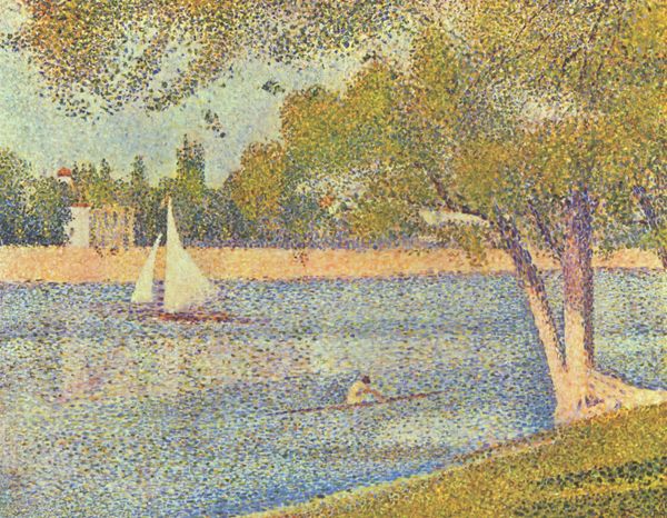
About this artwork
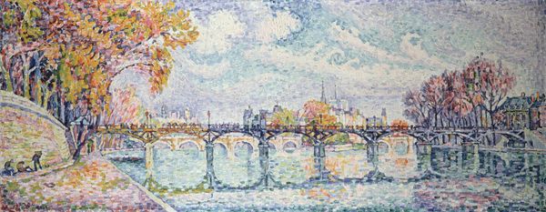
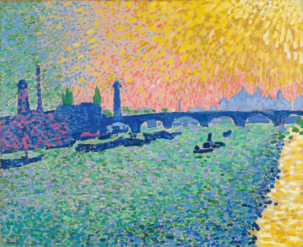
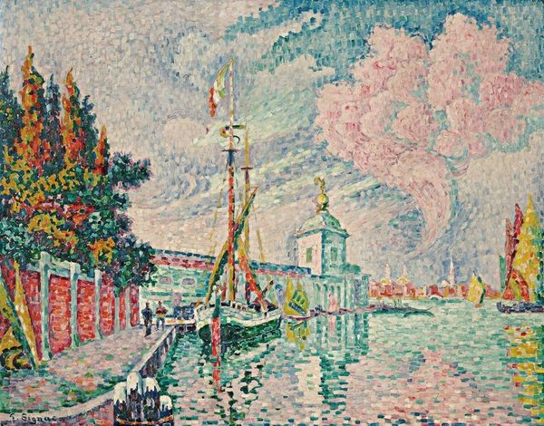
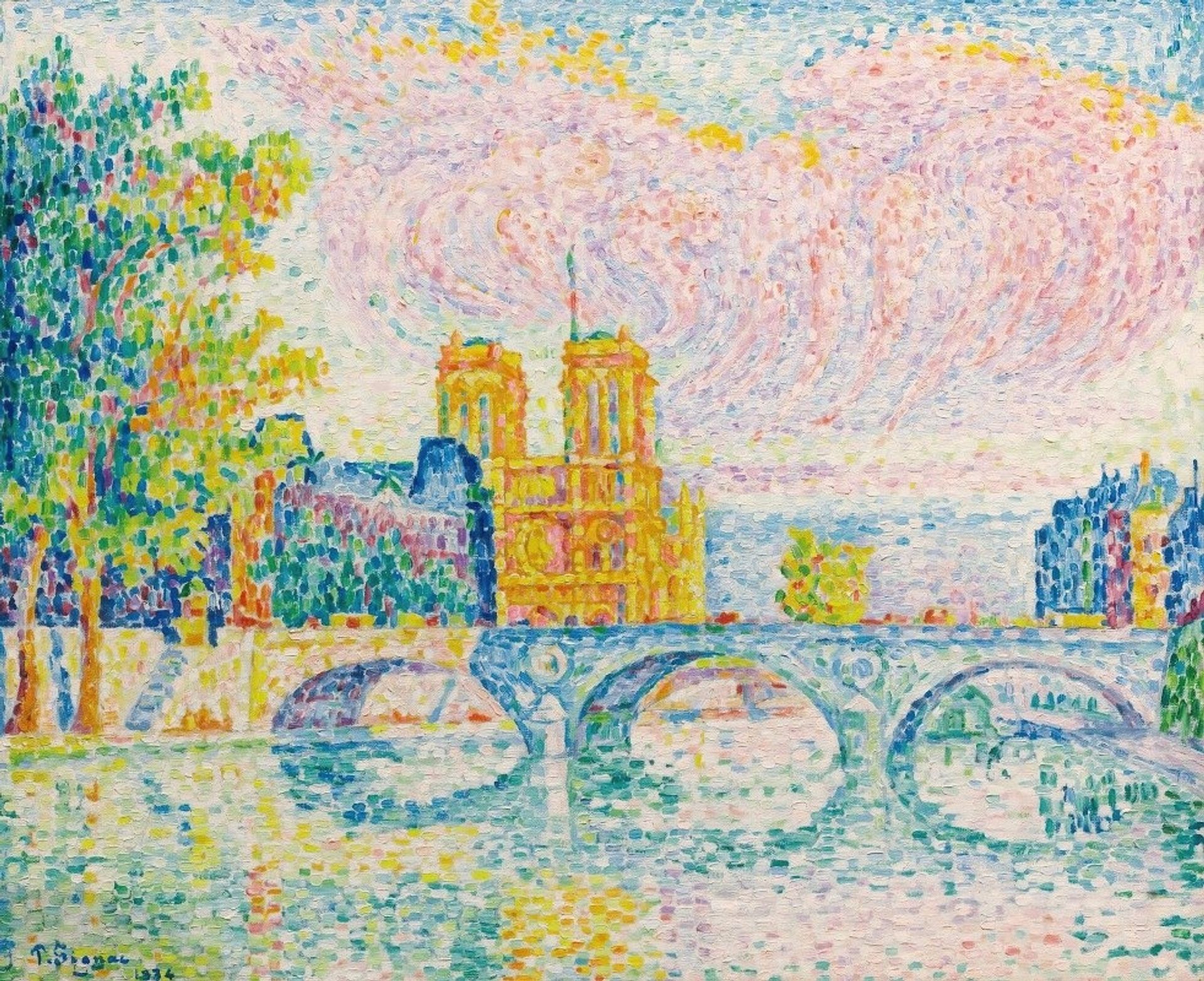
Editor: So, this is "La Cité, Paris," painted by Paul Signac in 1934, using oil paints. The first thing I notice is the incredibly vibrant use of color – it almost vibrates on the canvas! What are your thoughts on Signac's compositional choices here? Curator: Well, focusing purely on form, observe how Signac employs pointillism not just as a technique but as a structural element. The composition isn’t simply a representation of Paris; instead, the application of discrete dots of color creates a tapestry-like surface, denying any illusion of depth in favor of a flattened picture plane. Editor: I see what you mean. It's less about creating a realistic depiction and more about... color as structure? Curator: Precisely. Consider the distribution of these dots – note how analogous color schemes cluster in certain areas, with yellows dominating Notre Dame to contrasting hues of blues and greens across the river’s surface. It almost evokes a kind of ordered chaos, don’t you think? What feeling do you derive from such ordering? Editor: That’s really interesting. I hadn’t thought about how the choice of color also affects its structure. It almost makes the light itself a tangible thing. How does that influence the viewer? Curator: Think about how this systematic approach to color affects your reading of the image as a whole. Does this deconstruction of light influence our perception of the city of Paris, removing the narrative to highlight an emphasis on artifice and design? Editor: It definitely gives a new perspective. I am seeing things in a totally different way now. Thanks! Curator: My pleasure. Observing Signac’s deliberate emphasis on surface transforms the artwork into something more meaningful than an impressionistic landscape.
Artwork details
- Copyright
- Public Domain: Artvee
Comments
No comments
About this artwork
Editor: So, this is "La Cité, Paris," painted by Paul Signac in 1934, using oil paints. The first thing I notice is the incredibly vibrant use of color – it almost vibrates on the canvas! What are your thoughts on Signac's compositional choices here? Curator: Well, focusing purely on form, observe how Signac employs pointillism not just as a technique but as a structural element. The composition isn’t simply a representation of Paris; instead, the application of discrete dots of color creates a tapestry-like surface, denying any illusion of depth in favor of a flattened picture plane. Editor: I see what you mean. It's less about creating a realistic depiction and more about... color as structure? Curator: Precisely. Consider the distribution of these dots – note how analogous color schemes cluster in certain areas, with yellows dominating Notre Dame to contrasting hues of blues and greens across the river’s surface. It almost evokes a kind of ordered chaos, don’t you think? What feeling do you derive from such ordering? Editor: That’s really interesting. I hadn’t thought about how the choice of color also affects its structure. It almost makes the light itself a tangible thing. How does that influence the viewer? Curator: Think about how this systematic approach to color affects your reading of the image as a whole. Does this deconstruction of light influence our perception of the city of Paris, removing the narrative to highlight an emphasis on artifice and design? Editor: It definitely gives a new perspective. I am seeing things in a totally different way now. Thanks! Curator: My pleasure. Observing Signac’s deliberate emphasis on surface transforms the artwork into something more meaningful than an impressionistic landscape.
Comments
No comments