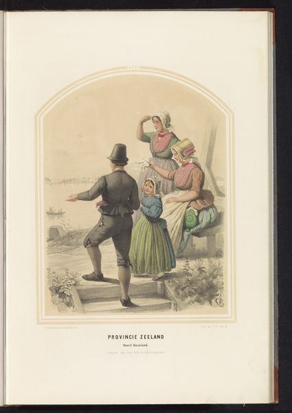
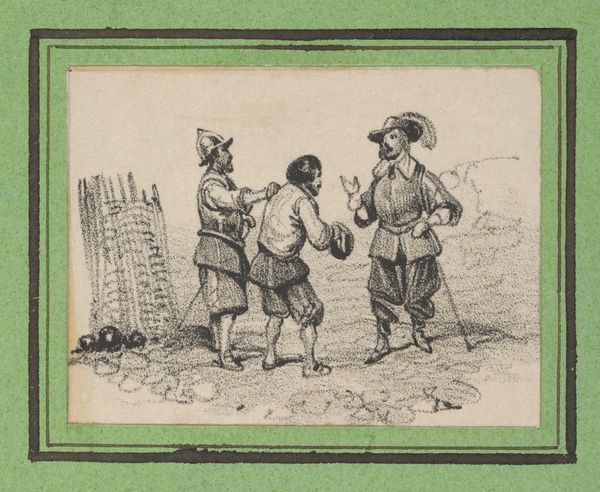
print, watercolor, engraving
# print
#
watercolor
#
watercolour illustration
#
genre-painting
#
engraving
Dimensions: height 367 mm, width 266 mm
Copyright: Rijks Museum: Open Domain
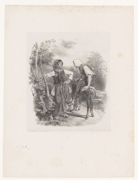
Curator: Here we have Albert Quantin’s "De twee hanen," or "The Two Roosters," created sometime between 1876 and 1890. It’s a print enhanced with watercolor and engraving. It’s… well, it’s quite striking. Editor: It does have an arresting quality. My immediate response is one of discomfort, actually. The figures, particularly the one in the foreground, exude a sense of theatrical artifice that I find a bit unsettling. Is that the intent? Curator: The intent, from a formalist perspective, seems rooted in presenting a clear, balanced composition. Observe the use of color—subtle washes that create depth and texture, while also focusing attention to certain areas, specifically that figure in the foreground, whose stance is quite studied and pronounced, almost confrontational, don't you agree? It's meticulously rendered, designed for a distinct semiotic reading, in other words. Editor: But it’s that studied-ness that makes me wonder about power dynamics. He stands separate, his garb sets him apart—a jester perhaps— while a family or community, perhaps, huddles to the right with eggs, likely on their way to the market. He’s got the best clothes, why, and where did he get them from? Where do *his* eggs come from? Who's benefiting from what? The composition guides our eyes, yes, but it does so by placing these possible social inequities in sharp relief. This may represent class distinctions and perhaps Quantin's social critique. Curator: An interesting interpretation! However, the visual elements also tell another story: his positioning creates balance with the family grouping. Note his pointed shoes draw attention upward. He is as much a binding agent here. This allows the composition to feel balanced; it unifies and stabilizes everything as a holistic system. The colour tonality adds to this, especially with those carefully observed areas. Editor: Maybe it is meant to critique those aesthetic unifications. Are there parallels in its relationship to French society, and specifically the Third Republic's self-image, with an emerging and conflicting urban and rural divide, for example? The contrast of wealth to the apparent rustic simplicity and vulnerability? Even in those simple shoes--sabots, no doubt, worn by agricultural workers! So much semiotic weight there. It would need additional contextual examination. Curator: Your approach reveals valid points, but mine considers that this perspective shifts depending on a number of interpretations when thinking about this work structurally. There isn't just one view. Editor: Exactly. Thank you for that structural clarity. It underscores how potent artwork such as Quantin's work is as a catalyst. It enables dialogue around art *and* life!
Comments
No comments
Be the first to comment and join the conversation on the ultimate creative platform.
More like this