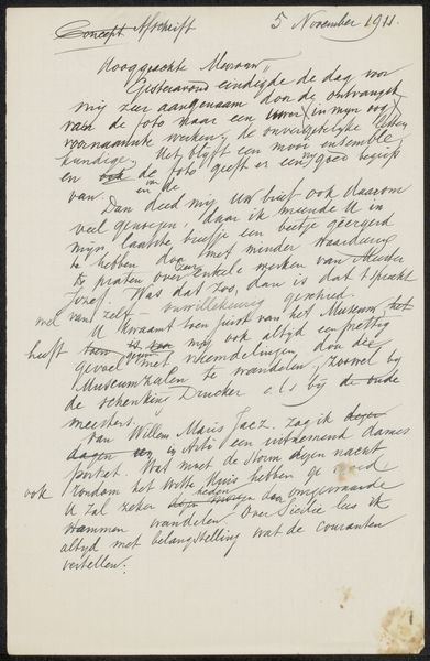
drawing, mixed-media, paper, ink
#
drawing
#
mixed-media
#
hand-lettering
#
hand lettering
#
paper
#
ink
#
geometric
#
modernism
#
calligraphy
Copyright: Rijks Museum: Open Domain
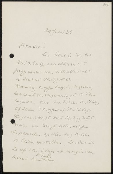
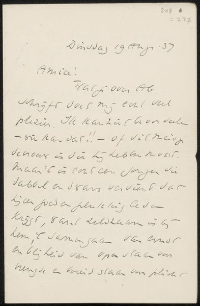
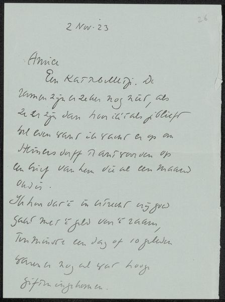
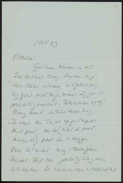
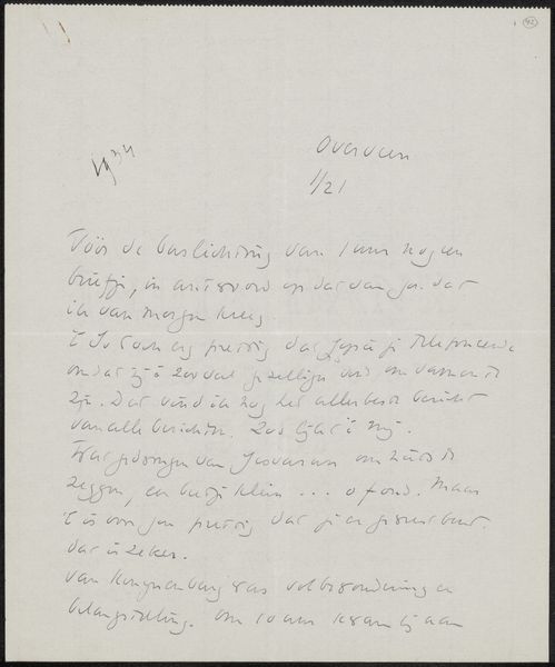
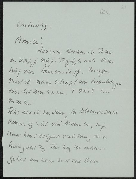
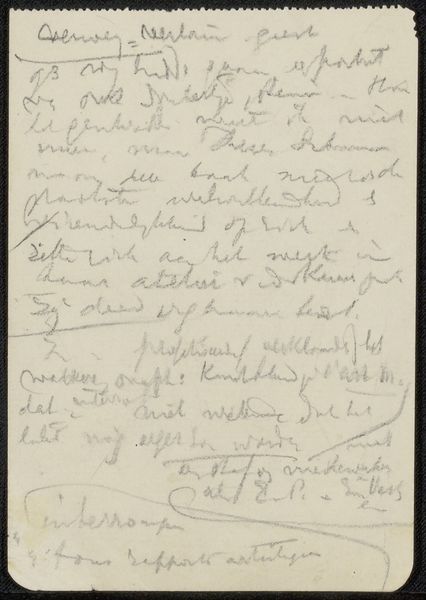
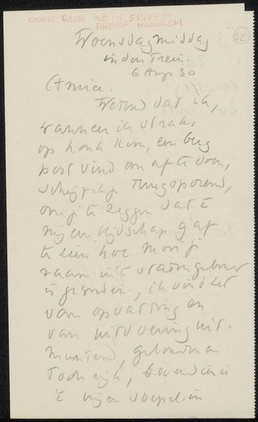
Editor: So, this is "Brief aan Willem Bogtman" by Richard Nicolaüs Roland Holst, created around 1922. It’s a mixed-media piece, ink on paper I think, held at the Rijksmuseum. At first glance, it looks like a simple handwritten letter, almost like a casual note, but the calligraphy has a distinct modernist flair. What strikes you about it? Curator: You know, it whispers to me of intimacy. A personal moment frozen in ink. It feels like eavesdropping, doesn't it? I see the familiar curve of the handwriting, the quirks of expression caught in each letter...Do you read it as merely informational, or does the rhythm and character of the script itself convey something more? Editor: I think it does, it almost feels like it’s meant to be more than just read. It’s decorative, in a way? The hand lettering looks considered. Almost geometric. Curator: Precisely! Roland Holst wasn't simply writing a letter; he was crafting a visual experience. The letter becomes an artwork in its own right. There is rhythm. Line weights contrast the empty space. Modernism toyed with blurring those lines, challenging how we experience art and life, even mundane tasks like letter-writing. Editor: I hadn’t considered how intentional the writing itself could be. I was so focused on the message, but it's clearly the medium too. Curator: Think of calligraphy not just as beautiful writing, but as a dance, a visual music, composed of line and form. It’s a lovely reminder that beauty exists in the most unassuming places. Editor: Absolutely, I’ll definitely be looking at handwriting differently from now on. It is much more intimate, I see that!
Comments
No comments
Be the first to comment and join the conversation on the ultimate creative platform.
More like this