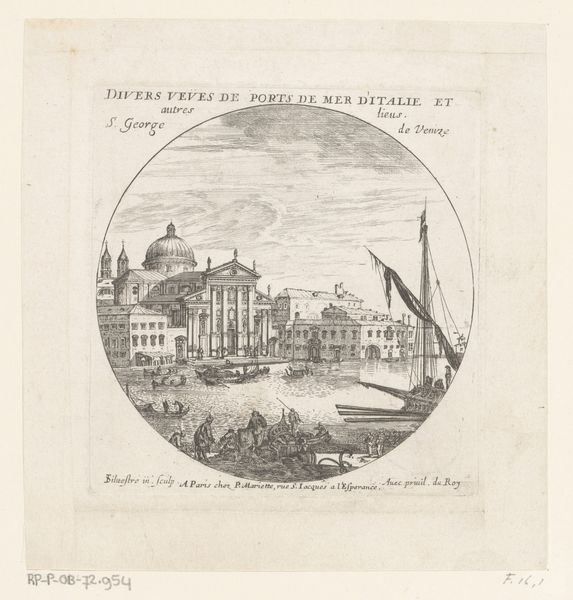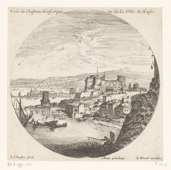
Titelprent met de Chiesa di San Giorgio Maggiore te Venetië Possibly 1631 - 1717
0:00
0:00
israelsilvestre
Rijksmuseum
painting, print, watercolor
#
venetian-painting
#
water colours
#
baroque
#
painting
# print
#
landscape
#
watercolor
#
cityscape
#
watercolor
Dimensions: height 121 mm, width 115 mm
Copyright: Rijks Museum: Open Domain
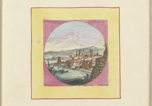
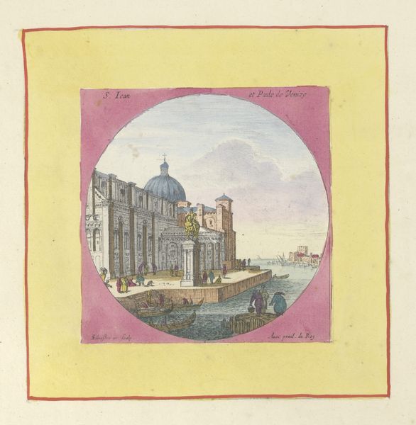
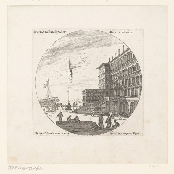
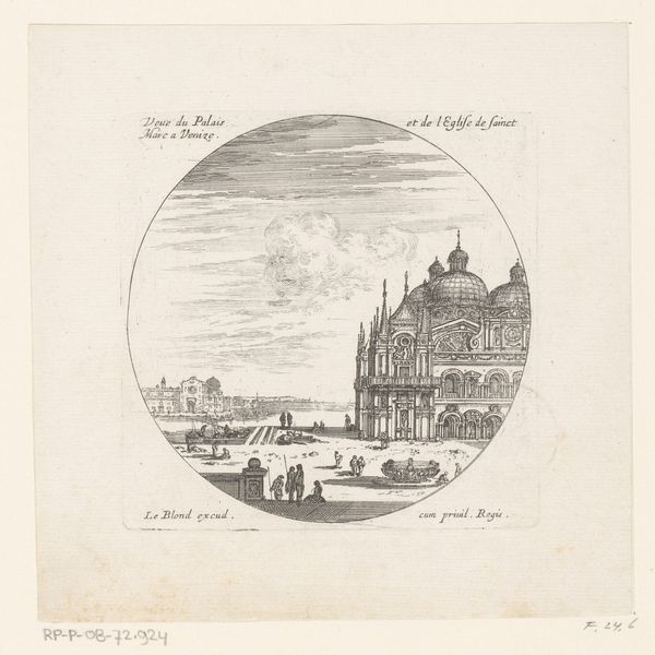
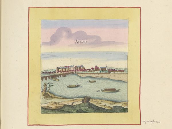
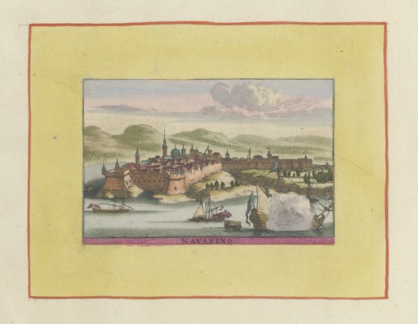
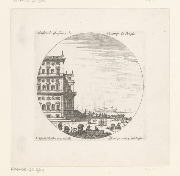
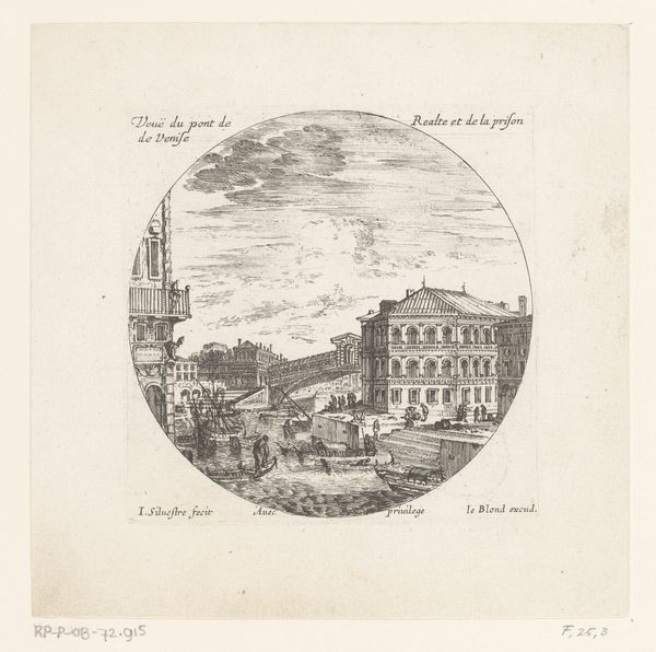
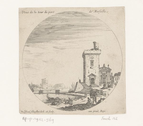
Curator: Here we have “Titelprent met de Chiesa di San Giorgio Maggiore te Venetië,” or title page with the Church of San Giorgio Maggiore in Venice, attributed to Israel Silvestre and dating, perhaps, from sometime between 1631 and 1717. It’s held here at the Rijksmuseum. Editor: It's…charming! In that polite, slightly faded, slightly-too-sweet kind of way. Like a biscuit left too long in the tea. Curator: You're reacting, I suspect, to the colours – the almost lurid pink encircling the scene and the pale yellow border – very characteristic of the Baroque style. These palettes, however, speak volumes, creating emotional tension or enhancing symbolism. Editor: Symbolism of…over-sugared biscuits? I kid. But what symbols exactly? Curator: Well, consider San Giorgio Maggiore itself. Churches often symbolized spiritual and temporal power. Then think about Venice. To Europeans, Venice represented trade, exoticism, a gateway to the East... All wrapped into one neat package. Editor: So it’s less about religious piety and more about…capitalism with a heavenly glaze? Curator: Not exclusively, no. Silvestre uses watercolour and printmaking. The printmaking would've enabled widespread distribution of these cityscapes, reinforcing Venice’s image. Watercolor adds a certain… lightness. The printing process facilitates distribution, ensuring these visions become part of a larger cultural memory. Editor: A controlled brand, you could say. But it also, in its way, looks quite fragile. Those watercolour washes—they could disappear in an instant. It does give me pause, making me think about impermanence amid Venice’s showy grandness. Curator: An interesting perspective. The fragility also makes me consider the nature of cultural memory—easily erased, subject to interpretation. And also suggests the inevitable transformation cities go through over long periods. Editor: Perhaps that's why I’m drawn to it—this odd tension between marketing a city as a stable icon and its own material vulnerability. Thanks, biscuit picture, you got me thinking! Curator: Indeed. Art always offers layers for consideration, even in the smallest of images. Thank you.
Comments
No comments
Be the first to comment and join the conversation on the ultimate creative platform.
