Dimensions: height mm, width mm, thickness mm
Copyright: Rijks Museum: Open Domain
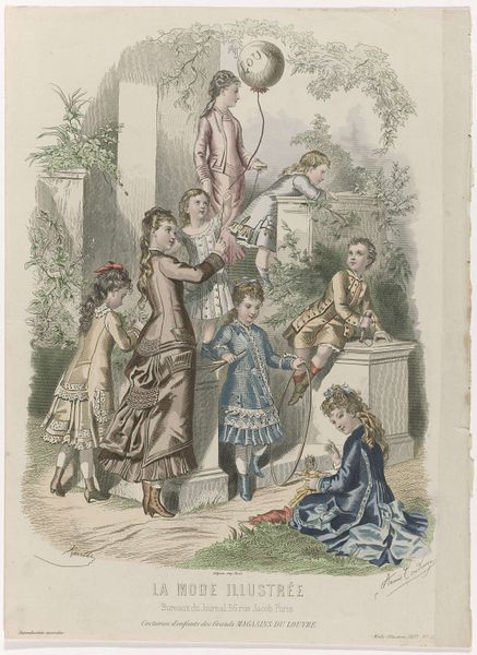
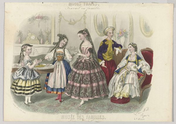
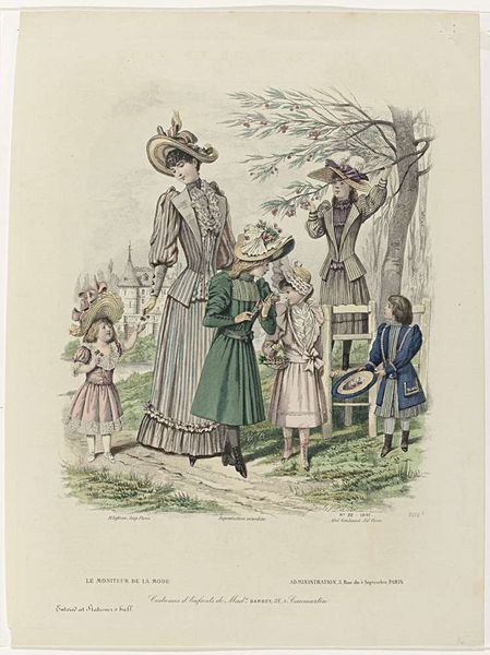
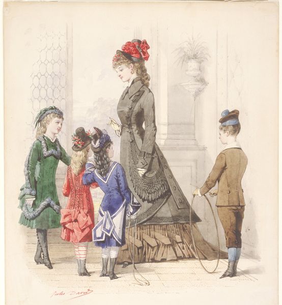
Editor: So, this is "La Mode Illustrée, Journal de la Famille, 1882", created by Firmin-Didot & Cie. It looks like it's made with watercolor and colored pencil. I'm immediately drawn to how the clothing details suggest wealth, but what else stands out to you, from a purely visual perspective? Curator: What I observe is the structured arrangement of the figures. Note the balanced distribution across the picture plane. Consider how the artist uses the varied heights of the children to create a rhythmic effect. How do you interpret the contrast between the intricate wallpaper and the relatively plain clothing of some figures? Editor: It seems like some of the children are being highlighted more through their richer colors. Like the girl in the blue coat and the one in the plaid dress by the table? Is that part of the formal structure, too? Curator: Precisely! Observe the artist's careful attention to the folds and drapes of the fabrics, which add depth and texture. The artist uses color strategically, guiding the viewer's eye, do you agree? The eye travels through their configuration. Notice how the patterns and textures play against the figures, creating a tension between surface and depth. What compositional tools can you identify? Editor: I think the varying tones really enhance the surface qualities and draw you to specific figures within the setting, creating a visual hierarchy in the composition. Curator: And doesn’t that bring forth the visual push and pull which keeps our eyes engaged. Thank you! Editor: That's a different way to look at it, by breaking down all its visual elements. I think I’m starting to get a sense of how analyzing just the art itself helps. Curator: Indeed. The beauty lies in its construction!
Comments
No comments
Be the first to comment and join the conversation on the ultimate creative platform.
More like this