painting, oil-paint
#
sky
#
painting
#
impressionism
#
oil-paint
#
landscape
#
house
#
impressionist landscape
#
oil painting
#
ocean
#
water
#
cityscape
#
modernism
#
sea
#
building
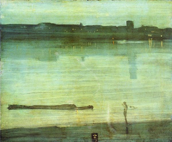
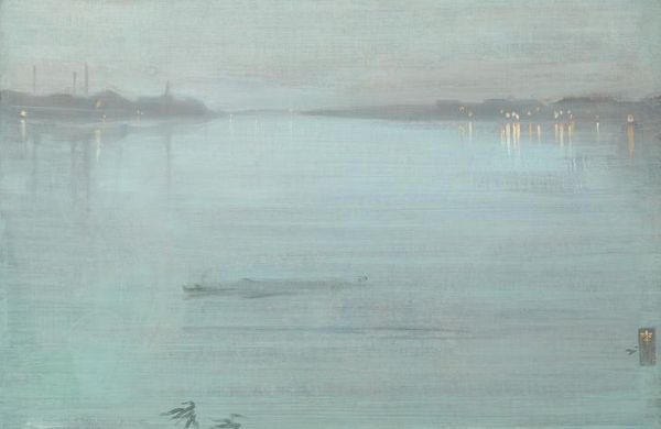
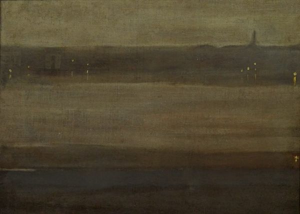
Dimensions: 60.64 x 50.17 cm
Copyright: Public domain
Editor: Here we have Whistler’s “Nocturne, Blue and Silver: Chelsea” from 1871, made with oil paint. There’s something so serene about the hazy blues and the suggestion of city lights reflecting on the water. What do you see in this piece? Curator: It's a fantastic example of Whistler challenging the established art world. Consider the period – Victorian England. The Royal Academy prized detail, narrative, and moral lessons in painting. Whistler, influenced by Aestheticism, rebelled. He prioritized capturing an atmospheric mood, a sensory experience over precise representation. This focus shifts the public role of art from didactic storytelling to evoking subjective emotions. Editor: So, it was more about feeling than seeing? Curator: Precisely. Look at the titles. Instead of calling it “Chelsea at Night,” he uses "Nocturne," a term from music, suggesting harmony and tone are paramount. Also note how the near monochromatic palette serves this mood, sidelining the subject as merely atmospheric. Don't you think that he seems to want to distance himself from the social commentary, aiming for art for art's sake? Editor: I guess I hadn't thought about how much the title directs our understanding. It is like he is pushing against the art establishment. So, are those indistinct shapes just a reflection of the rising power of industrialists at that time? Curator: One could say this hazy dreamscape hints at social and environmental costs of the rapid urbanization in the latter half of the 19th century. Instead of depicting modern marvels and its glorious accomplishments, he focuses on the aesthetic dimension of the subject and its social implications, like in this case. Editor: That really gives me a new appreciation for how rebellious and forward-thinking Whistler was being. I never considered the title, color and near abstraction as active, social elements challenging the status quo. Curator: Exactly. It reminds us that art's meaning is constructed, and Whistler strategically positioned his work to disrupt expectations.
Comments
No comments
Be the first to comment and join the conversation on the ultimate creative platform.
More like this