metal, photography
#
portrait
#
metal
#
photography
#
ancient-mediterranean
#
ceramic
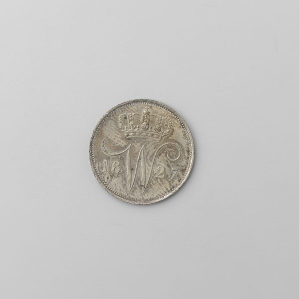
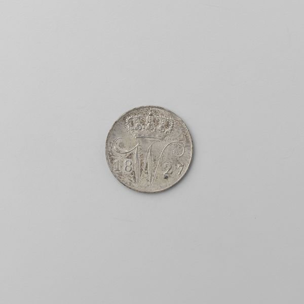
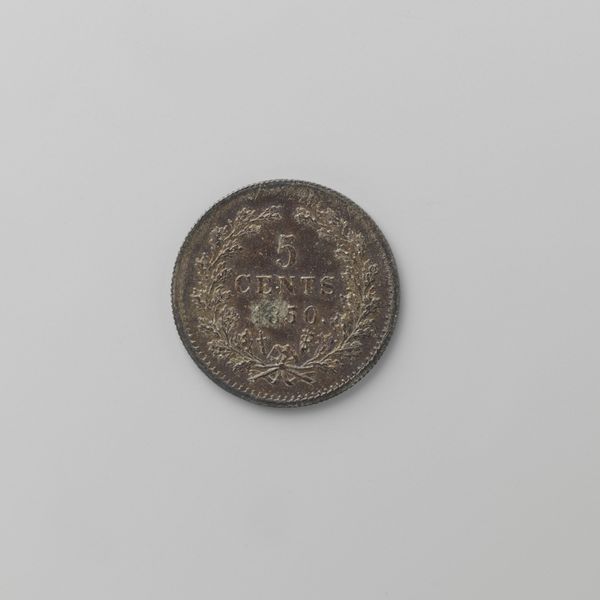
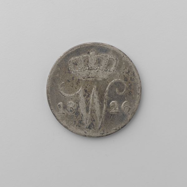
Dimensions: diameter 2.1 cm, weight 4.21 gr
Copyright: Rijks Museum: Open Domain
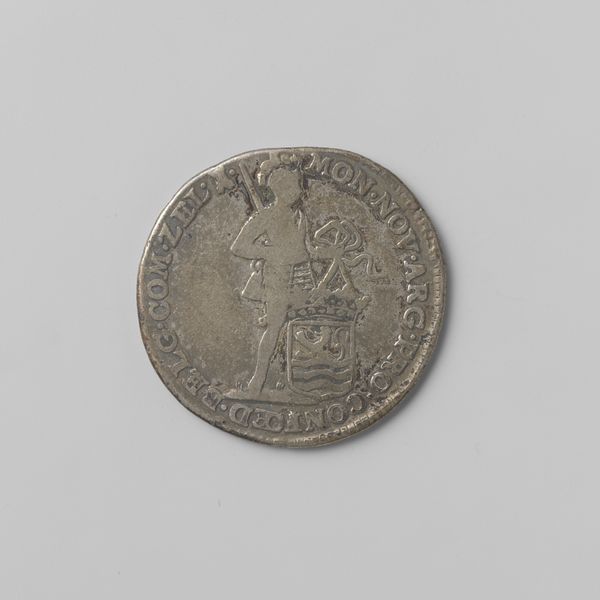
Editor: Here we have a Dutch 25 cent coin from 1830, currently residing at the Rijksmuseum. I find the worn texture quite evocative. What can you tell me about it from a formalist perspective? Curator: Certainly. Consider the carefully balanced composition: the crown surmounting the monogram, neatly bisecting the coin's field. Observe the relationship between the relief and the flat ground. Do you perceive how the interplay creates depth? Editor: I do, the crown definitely pops! It almost feels sculptural. So, the incised lettering '1830' on the coin flanks what looks like a ‘W,’ drawing your eye around the coin. Curator: Precisely! Notice how the crisp, precise lettering and ornamentation contrast with the coin's distressed surface. Does this suggest a tension between idealized representation and material reality? How does this visual tension change your understanding? Editor: Yes, it is so apparent and adds complexity. The pristine design versus its present aged state tells a story, not only of the ruler but of the currency’s journey over time. But could we explore the significance of that monogram design element a bit more? Curator: Of course, examine the placement and execution of that dominant ‘W’. Its central location, emphasized by the crown, establishes a clear visual hierarchy. A symbol, no less, of power! Editor: Thank you. I see how looking at these design choices helps decipher its intended meaning. Curator: It is through this attention to detail, Editor, that we come to more deeply appreciate art.
Comments
No comments
Be the first to comment and join the conversation on the ultimate creative platform.
More like this