oil-paint
#
portrait
#
cubism
#
abstract painting
#
oil-paint
#
oil painting
#
geometric-abstraction
#
abstraction
#
modernism
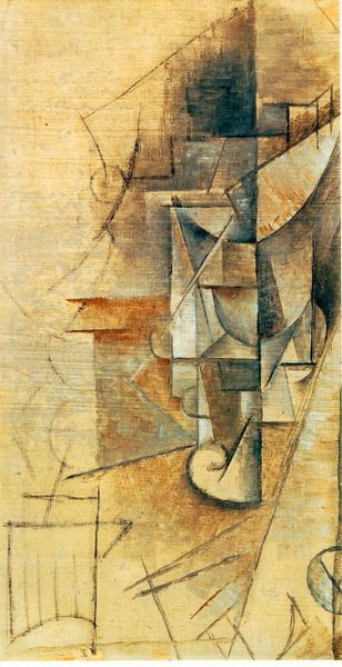
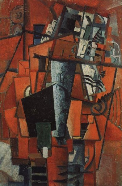
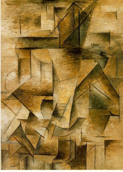
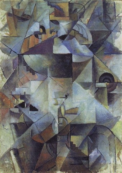
Dimensions: 79.5 x 63.5 cm
Copyright: Public domain
Editor: Right, so this is Piet Mondrian’s *Composition in Grey-Blue*, painted in 1913 using oil paint. Looking at it, I’m struck by how muted the colours are, almost like a faded memory, but also how the fractured shapes seem to want to break free from the canvas. It's definitely cubist, but where does one even begin to understand what's going on here? What do you see when you look at this work? Curator: I see Mondrian wrestling with representation, trying to capture not just *what* he sees but *how* he sees. Look at how he's deconstructing the forms, fragmenting them into these geometric planes. It's like he's x-raying reality, stripping away the surface to reveal some underlying structure. What feelings rise up when looking at this, what stories does the composition spark? Editor: I can definitely see that dismantling, that yearning for something beyond the surface. It does feel very...intellectual. It makes me wonder what he was looking at when painting it! Curator: Perhaps. Or perhaps it was more about looking within. What do the colors evoke for you? That grey-blue...is it somber? Serene? Or something else entirely? You are correct, the colours also hold significance; do you feel as though any could symbolize something specific or create particular contrast between sections of the composition? Editor: Mmm, definitely a kind of serenity, perhaps tinged with melancholy. And the limited colour palette makes those occasional warmer tones—the oranges and beiges—really pop, providing balance between colour contrast. I wonder if Mondrian ever doubted whether anyone would “get” what he was doing? Curator: Doubt, perhaps. But I imagine that within the silence, and geometry he crafted, that the doubts would be embraced as another hue. A hue just as important in the expression as any on the palette, in creating balance, nuance, or dissonance in his geometric world. He may have felt deeply the potential within art! Editor: I love that perspective, it has really helped me appreciate that while some might think art like this is simplistic, it is a journey of immense self-awareness.
Comments
No comments
Be the first to comment and join the conversation on the ultimate creative platform.
More like this