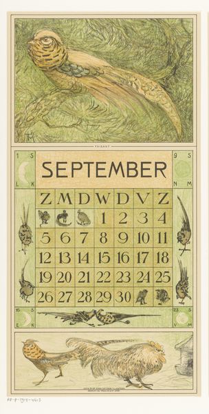
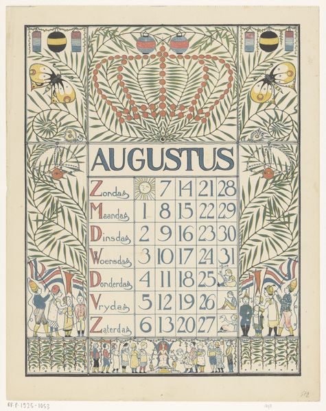
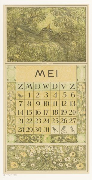
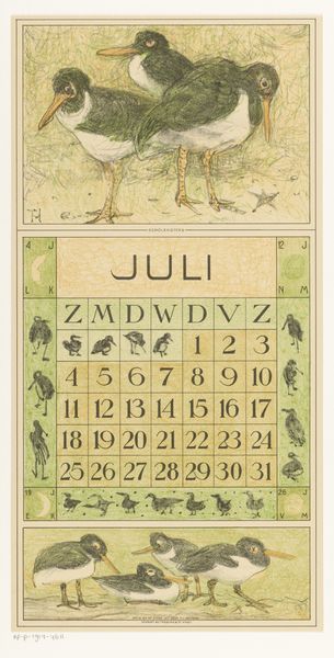
graphic-art, print, poster
#
graphic-art
#
art-nouveau
# print
#
old engraving style
#
landscape
#
19th century
#
poster
#
historical font
Dimensions: height 420 mm, width 210 mm
Copyright: Rijks Museum: Open Domain
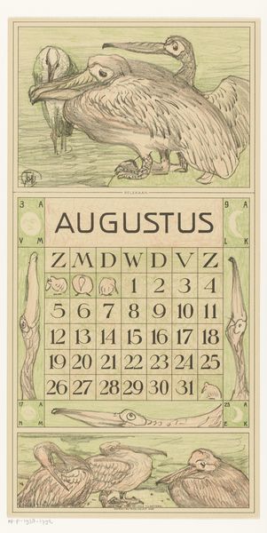
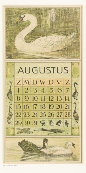
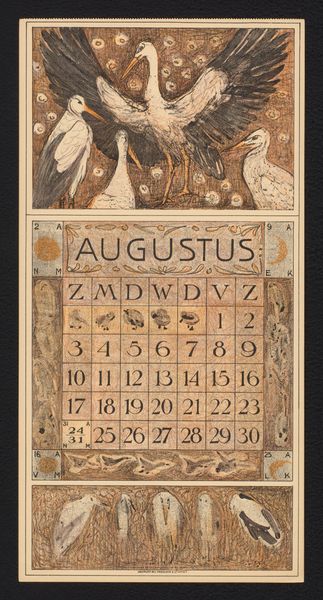
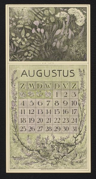
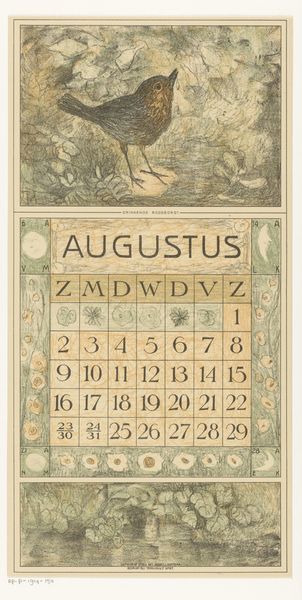
Editor: Here we have Theo van Hoytema's "Kalenderblad augustus met witte duif," created in 1915. It's a lovely Art Nouveau poster. The subdued greens and browns give it such a tranquil, pastoral feel. I'm especially drawn to the contrast between the white dove at the top and the darker birds at the bottom. What do you make of it? Curator: It’s interesting you point out that contrast. Think about the symbolism embedded within this imagery, particularly in 1915. World War I was raging. The white dove is a well-known symbol of peace, while the dark birds might represent foreboding or the darkness of the conflict. The calendar format itself speaks to the passing of time, to waiting. Does that waiting resonate in a period of widespread death, mourning, and global political upheaval? Editor: That’s a powerful point. I hadn’t considered the war's influence so directly. So the calendar becomes almost a countdown, a somber reminder of the relentless march of time during wartime? Curator: Precisely. And beyond the overt symbolism, let's consider the social context. Art Nouveau, despite its aesthetic beauty, was largely a style for the bourgeoisie. So, how does a seemingly apolitical calendar, meant for an affluent audience, subtly acknowledge or perhaps even critique the ongoing global tragedy? Editor: So you're saying the artist might be using familiar, comforting imagery—like the dove and the Art Nouveau style—to offer a subtle commentary on the war to the people? Curator: Possibly. It's a gentle nudge, a visual paradox. The image operates within the established aesthetic conventions while also hinting at the anxieties and disruptions of the time. And it would not provoke any negative backlash from the consumers purchasing his product, as perhaps a stark war scene might. Editor: That makes me appreciate the image so much more, seeing that contrast, this tension, between surface beauty and underlying message. It really makes you consider the artist's place in such an environment. Thank you. Curator: My pleasure. It is through these subtle nuances that we can begin to grasp art's role within wider, often turbulent, socio-historical contexts.
Comments
No comments
Be the first to comment and join the conversation on the ultimate creative platform.
More like this