About this artwork
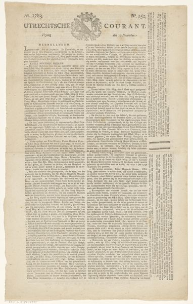
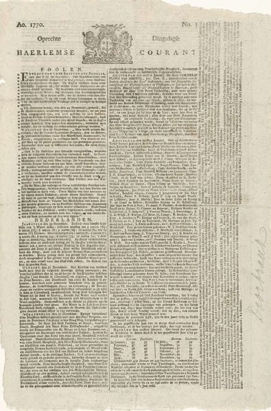
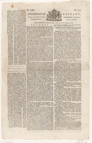
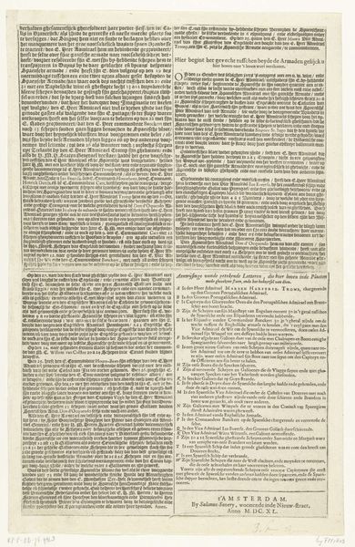
Curator: I find this incredibly absorbing. This piece is entitled "Tabel van de staatkundige geschiedenis van Nederland, 1805", created in 1805, as the title suggests, and made using typography and printmaking techniques. It is essentially a broadside. Editor: Wow, that’s…dense. My immediate impression is just layers and layers of text, like a visual representation of the weight of history bearing down on you. There's almost no visual respite. Curator: Precisely. It is designed as a table – or chart – laying out the political history of the Netherlands. We must understand its purpose as a historical document rendered through symbols of text and typography, a very different symbolism from traditional figurative depictions. Editor: Right, this isn't about aesthetics; it's a direct communication of information. But the visual design also communicates something: authority, perhaps? All those tightly packed columns, neat and orderly. The typography alone almost convinces you it’s important, and undeniably so. Curator: Yes, in iconographic terms, we might see the text itself as an almost sacred space. Consider the elaborate detail in medieval illuminated manuscripts where scripture was adorned with intricate flourishes, lending the words additional authority and layers of interpretation. Here, the density serves a similar purpose, emphasizing the complex and intricate nature of history. Editor: It really makes you think about how much weight we give to the written word, doesn't it? Seeing it presented so starkly, devoid of any distracting visuals, really highlights the power we attribute to language, even to the arrangement of words on a page. Do you think people trusted sources more because they were difficult to create at the time? Curator: Undoubtedly, the laborious printing processes lent authenticity. Each character carefully placed, and therefore the whole composition carefully constructed. Also consider that literacy was far less widespread. What then are the political implications of presenting information this way, making it accessible, potentially, to the broader population? Editor: Food for thought indeed! It really is amazing how something so seemingly straightforward can spark so many questions. Thanks for unraveling it a bit, literally and figuratively. Curator: The pleasure was mine. To consider the historical and cultural values placed onto the text… an endless journey for thought.
Artwork details
- Medium
- graphic-art, print, typography
- Dimensions
- height 1045 mm, width 668 mm
- Copyright
- Rijks Museum: Open Domain
Tags
Comments
Share your thoughts
About this artwork
Curator: I find this incredibly absorbing. This piece is entitled "Tabel van de staatkundige geschiedenis van Nederland, 1805", created in 1805, as the title suggests, and made using typography and printmaking techniques. It is essentially a broadside. Editor: Wow, that’s…dense. My immediate impression is just layers and layers of text, like a visual representation of the weight of history bearing down on you. There's almost no visual respite. Curator: Precisely. It is designed as a table – or chart – laying out the political history of the Netherlands. We must understand its purpose as a historical document rendered through symbols of text and typography, a very different symbolism from traditional figurative depictions. Editor: Right, this isn't about aesthetics; it's a direct communication of information. But the visual design also communicates something: authority, perhaps? All those tightly packed columns, neat and orderly. The typography alone almost convinces you it’s important, and undeniably so. Curator: Yes, in iconographic terms, we might see the text itself as an almost sacred space. Consider the elaborate detail in medieval illuminated manuscripts where scripture was adorned with intricate flourishes, lending the words additional authority and layers of interpretation. Here, the density serves a similar purpose, emphasizing the complex and intricate nature of history. Editor: It really makes you think about how much weight we give to the written word, doesn't it? Seeing it presented so starkly, devoid of any distracting visuals, really highlights the power we attribute to language, even to the arrangement of words on a page. Do you think people trusted sources more because they were difficult to create at the time? Curator: Undoubtedly, the laborious printing processes lent authenticity. Each character carefully placed, and therefore the whole composition carefully constructed. Also consider that literacy was far less widespread. What then are the political implications of presenting information this way, making it accessible, potentially, to the broader population? Editor: Food for thought indeed! It really is amazing how something so seemingly straightforward can spark so many questions. Thanks for unraveling it a bit, literally and figuratively. Curator: The pleasure was mine. To consider the historical and cultural values placed onto the text… an endless journey for thought.
Comments
Share your thoughts