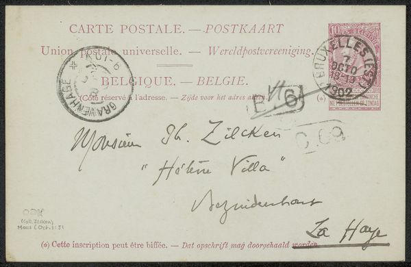
drawing, ink, pen
drawing
pen sketch
ink
pen
calligraphy
Copyright: Rijks Museum: Open Domain
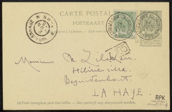
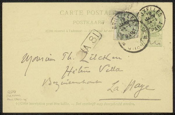
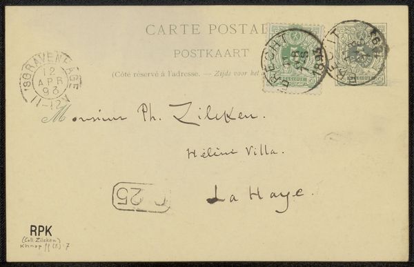
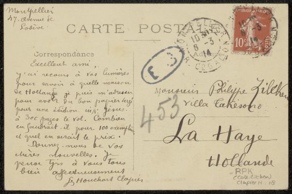
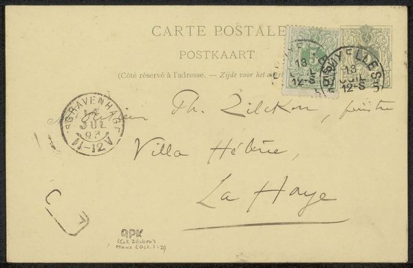
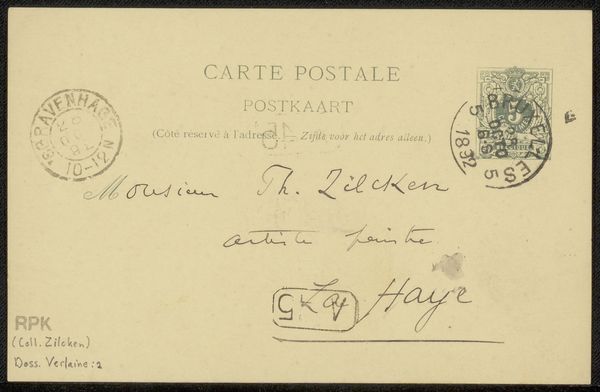
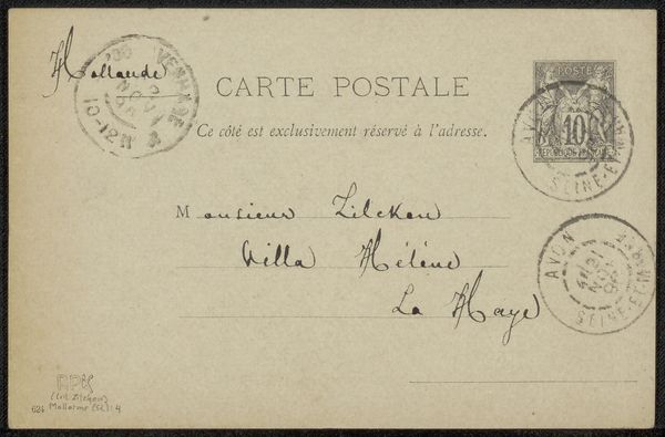
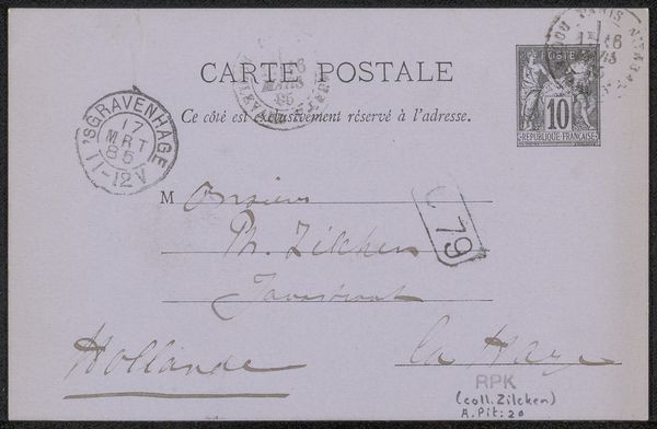
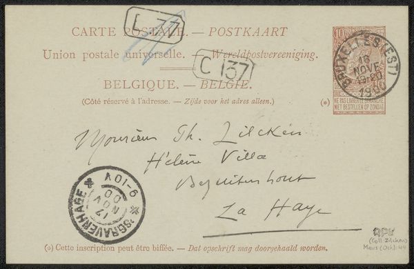
Editor: So this is "Briefkaart aan Philip Zilcken" a postcard to Philip Zilcken, created by Fernand Khnopff sometime before 1893. It looks like it's ink on paper, a simple pen drawing, essentially. There's something immediate about seeing someone’s actual handwriting; it feels so personal. What stands out to you when you look at this? Curator: The most striking element is the inherent intimacy communicated through handwriting. In this context, consider how written correspondence functioned as a primary mode of communication and cultural exchange. The stamps are signifiers of place, both of origin and intended destination, with their own rich visual language, reflecting sociopolitical affiliations and perhaps even personal histories through cancellation marks. Look at how the script itself takes on iconic properties; the flourish and form contribute as much meaning as the textual content. Editor: That's a great point. It’s almost like the writing becomes another layer of visual information, just as important as what the words are saying. How does the address itself—"Helene Villa, Bezuidenhout, La Haye"—influence our understanding? Curator: Addresses often evoke ideas about a specific culture, class and context. The simple act of placing marks to specify ‘place’ conjures associations of wealth, location and community that ripple outwards and colour how the work will be read. How do these visual, social, historical symbols shape or warp your perception? Editor: It really makes you think about the personal life of the artist. Thanks, this was really insightful. Curator: Indeed. And considering Khnopff's use of symbolism in his paintings, it’s fascinating to see these symbolic layers, perhaps unintentional, even in something as utilitarian as a postcard.
Comments
No comments
Be the first to comment and join the conversation on the ultimate creative platform.