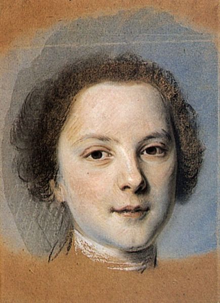
drawing, pencil
#
drawing
#
baroque
#
pencil
#
northern-renaissance
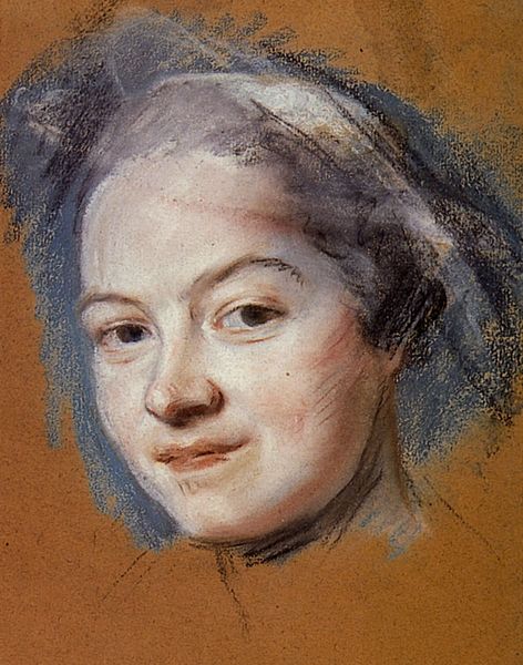
Dimensions: 34 x 25 cm
Copyright: Public domain
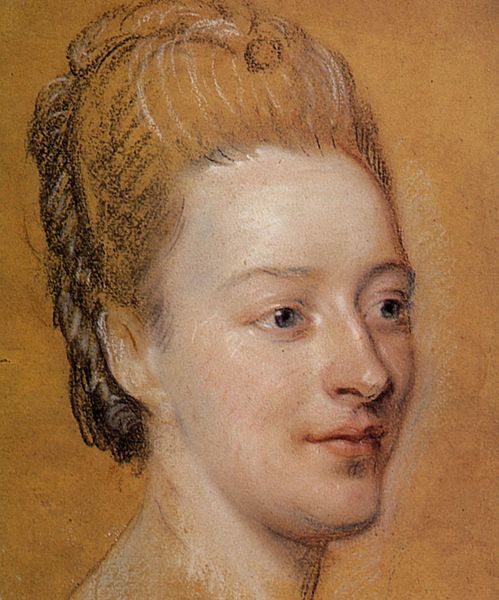
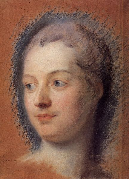
Editor: We’re looking at "Susanna Fourment," a drawing by Peter Paul Rubens from around 1620. It's made with pencil. I’m struck by the subject’s direct gaze; her eyes are so compelling. How do you interpret this work, focusing on its form? Curator: Well, focusing on its formal elements, we see a skillful manipulation of line and tone. The use of line, particularly around the face and collar, creates depth and volume. Notice how Rubens uses hatching and cross-hatching to suggest form and shadow, thereby enlivening her skin’s tone. The red chalk adds warmth, contrasting with the cool gray pencil, enhancing the portrait’s dimensionality. Editor: So, the contrast between the red chalk and the gray pencil isn't just about color; it’s about structure? Curator: Precisely. It’s about how these materials work together to define form and texture. Consider also the composition – the subject's head is slightly off-center, which prevents the portrait from feeling static. This asymmetry, along with her candid expression, contributes to its lifelike quality. Do you agree? Editor: I see that now. It is interesting how her asymmetry makes it dynamic. So much intention went into a quick sketch! Curator: Yes. A pure formalism decodes how carefully constructed "Susanna Fourment" is despite its spontaneity. Ultimately, the beauty of the drawing arises from the harmonious interaction of line, tone, color and composition. It prompts me to question how Baroque aesthetics valued dynamic symmetry. Editor: I appreciate understanding that through those elements you mentioned. It shifted my view! Thanks!
Comments
No comments
Be the first to comment and join the conversation on the ultimate creative platform.
More like this