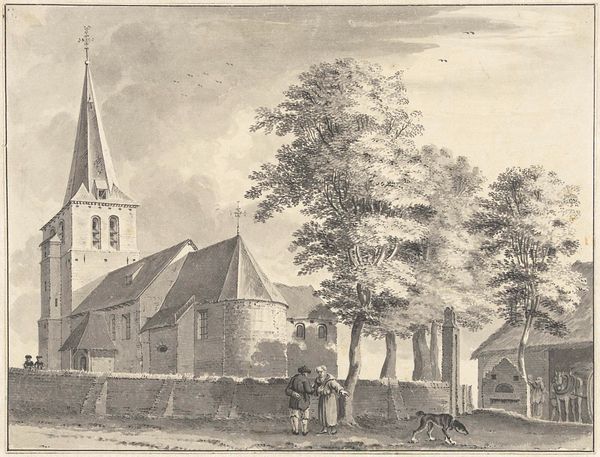
print, etching, engraving
#
neoclacissism
# print
#
etching
#
old engraving style
#
landscape
#
19th century
#
cityscape
#
engraving
Dimensions: height 168 mm, width 198 mm
Copyright: Rijks Museum: Open Domain
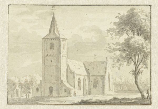
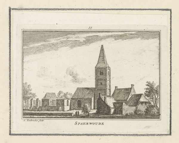
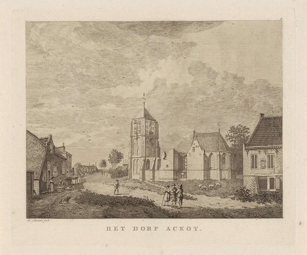
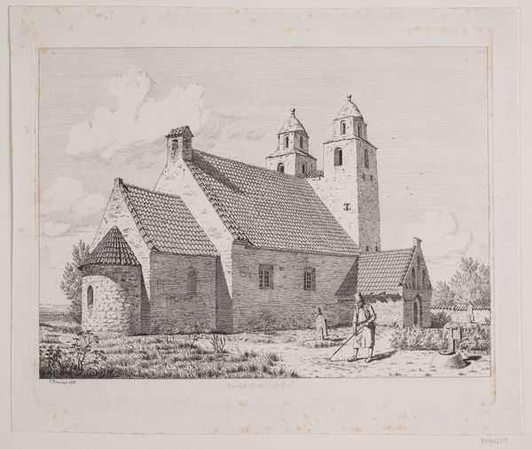
Editor: So, we're looking at "De kerk te Ommeren," an etching and engraving by Hermanus Petrus Schouten, created sometime between 1762 and 1822. It has a lovely, serene feeling, like stepping back in time. What captures your attention most about this particular cityscape? Curator: Well, first off, time *is* a slippery thing with this one, isn't it? Almost like Schouten snagged a feeling, a memory of Ommeren more than just *the* Ommeren, if you catch my drift. For me, it’s that fascinating dance between precision – the architectural detail, meticulously rendered – and a kind of dreamlike atmosphere. Notice how the figures almost seem to float within the scene. Are they really *there* or just conjured into existence as a form of remembering? I mean look at the animals, could they almost be apparitions? Does that resonate with you at all? Editor: It does. There’s a stillness about it. But if he was trying to capture the true appearance, why not paint it with full colors, for example? Curator: Ah, but see, the monochrome is part of the magic! It simplifies, focuses. By stripping away the vibrancy, the color, we’re left with the bones of the place, its form and shape. The greyscale forces us to think of the place in a more "historicized" way. Editor: That makes sense. It highlights the age and endurance. Curator: Exactly. Think of sepia-toned photographs from the same era…It evokes history and the timeless nature of faith in general. And besides, isn't it wonderful how simple lines create texture and space! Did you notice that clever use of hatching to make the cloudy sky or weathered stones? It looks more true to life than if they'd filled it in solidly with just blacks and greys! The lack of solidity reinforces the dreamlike quality, eh? So much of the feeling derives from the style and its simplicity. Editor: Definitely. The simplicity does bring the feeling out. Thank you. I really learned a lot. Curator: My pleasure. It’s lovely to ponder over memories... and isn't art just a container for those?
Comments
No comments
Be the first to comment and join the conversation on the ultimate creative platform.
More like this