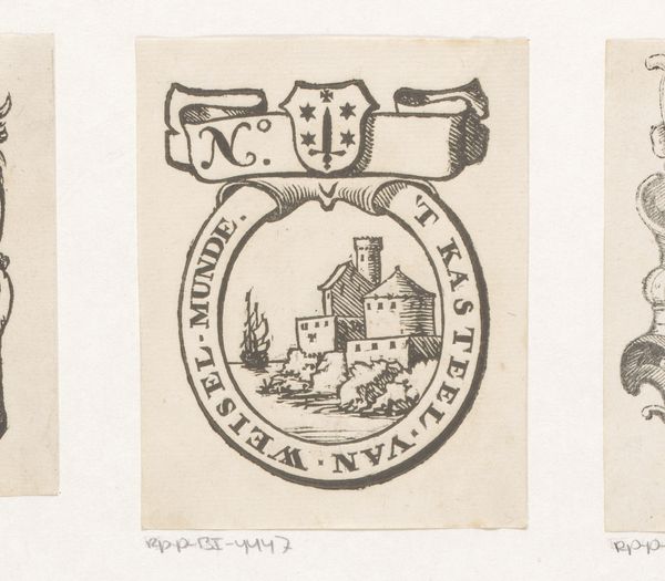
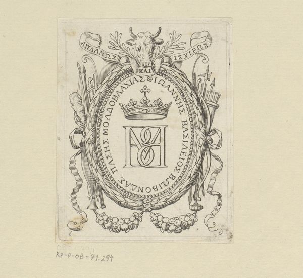
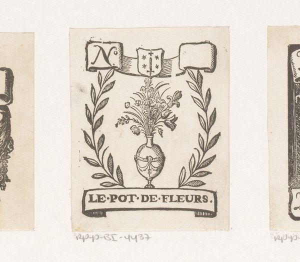
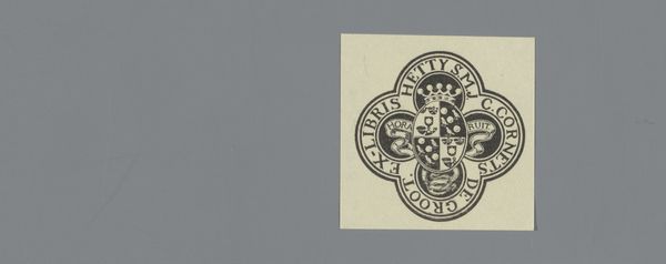
graphic-art, print, engraving
#
graphic-art
#
baroque
# print
#
line
#
engraving
Dimensions: height 81 mm, width 65 mm
Copyright: Rijks Museum: Open Domain
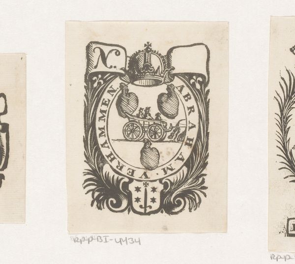
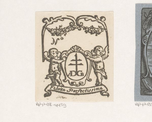
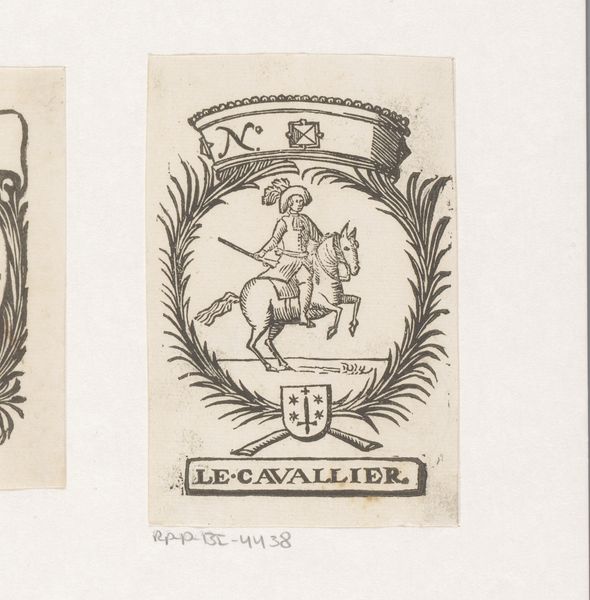
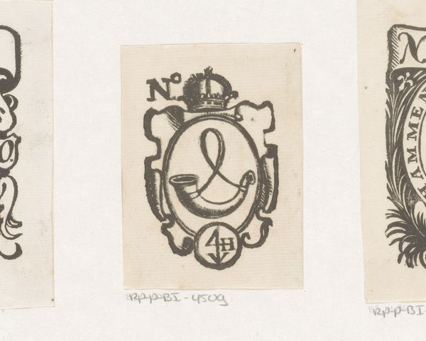
Editor: This is a 17th-century print titled "Vignet van David en Barent Vrients". It seems to be an engraving, a graphic work. The composition has such intricate detail; it's all lines and shapes working together. What catches your eye when you look at this piece? Curator: The density of the linework is certainly striking. Consider the deployment of line as the primary structuring device. Note how varying its thickness and proximity produces the tonal modulations that give the forms their perceived depth. The baroque style is quite evident, wouldn't you say, with its flair for dynamism and ornamentation? The lines form an oval cartouche around a central image. Editor: I see that, but what’s the meaning? It feels more like a logo today. Is it like a family crest? Curator: We might consider it a precursor, perhaps. Focus less on assigning a definitive meaning and more on analyzing how its constituent elements interact visually. Note the juxtaposition of the organic—the tulip, the foliage—with the geometric regularity of the surrounding inscription. How does that tension play out? Editor: I think I understand a little better now. It is not so much about the symbolism as it is about the relationship between lines and the forms. Curator: Precisely. Now, what about the textural effects? Editor: Oh, I see! I think by understanding those interactions of the various materials and their effects that’s the intended value of the image itself, to the engraver. Curator: Exactly! The formalist exercise is always so revealing, wouldn't you agree?
Comments
No comments
Be the first to comment and join the conversation on the ultimate creative platform.
More like this