plein-air, watercolor
impressionism
impressionist painting style
plein-air
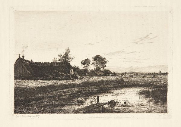
landscape
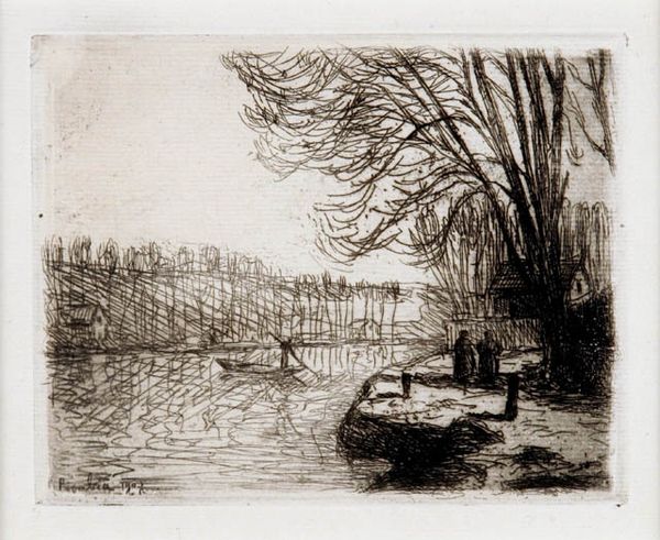
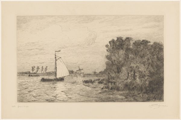
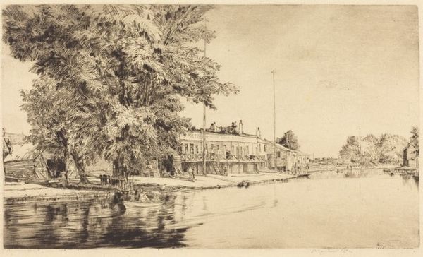
impressionist landscape
nature
watercolor
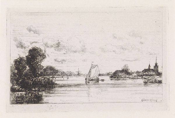
cityscape
watercolour illustration
watercolor
Copyright: Public domain
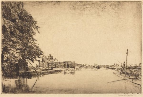
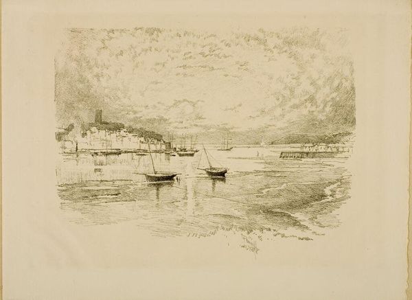
Editor: This is Anders Zorn's watercolor "Stockholm" from 1881. The hazy atmosphere gives it a really dreamlike quality. I’m curious, what do you see when you look at it? Curator: I see Zorn engaging with the industrialized landscape through a traditionally “feminine” medium – watercolor. It begs the question, doesn’t it? Why watercolor for a cityscape brimming with maritime trade? Consider the physical demands of *plein air* painting in 1881 – transporting materials, battling the elements. This wasn't some idle pastime; it was labor. Editor: So, you’re saying his choice of watercolor reflects something deeper? Curator: Precisely! Think about the availability and cost of pigments at the time, too. The earth tones, the limited palette, they speak to a specific materiality and perhaps a critique of lavish artistic production. How might this reflect the social realities of Stockholm's working class? Editor: I hadn't considered the social commentary aspect of it. It feels so serene, I sort of missed that layer. Curator: Indeed. Also consider, watercolor at this scale was associated with leisure or travel – think amateur sketchbooks. Zorn elevates it, but he also brings the viewer into the conditions and economy of that moment. What if those ships sailing into the harbor represent not prosperity, but colonial exploitation? The muted colors take on a different tone. Editor: Wow, that’s…dark. Curator: It is a reminder that every brushstroke has embedded labor and value – it’s about what gets seen and, more crucially, what is deliberately obscured in the making. Thanks for helping me notice details I hadn't fully appreciated. Editor: I agree! Thinking about the social implications of materials really changed how I see it.
Comments
No comments
Be the first to comment and join the conversation on the ultimate creative platform.