drawing, paper, ink, pen
#
drawing
#
ink paper printed
#
hand drawn type
#
paper
#
personal sketchbook
#
ink
#
pen work
#
pen
#
calligraphy
Copyright: Rijks Museum: Open Domain
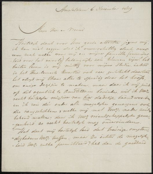
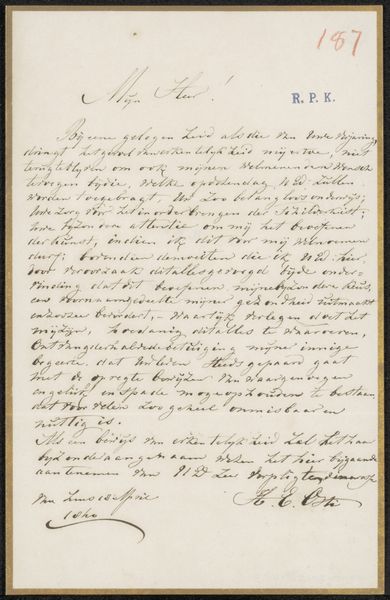
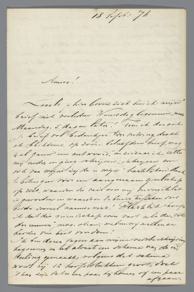
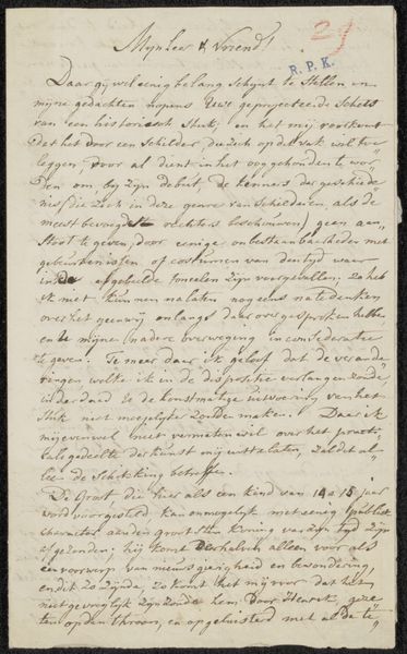
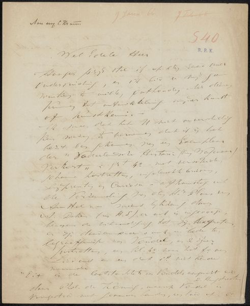
Curator: Welcome. We're looking at "Brief aan Philip Zilcken" or "Letter to Philip Zilcken," believed to have been created in 1915 by Albert Verwey. It's an ink drawing, seemingly penned directly onto paper. What's your first reaction? Editor: Intimate. I’m immediately struck by how personal this feels—it is clearly handwritten with cursive script. The overall effect is something quite precious despite its utilitarian nature. Curator: Absolutely. As a drawing, it’s compelling in its arrangement, how Verwey uses the ink to craft a carefully spaced composition with text filling the sheet while preserving a structural frame of blank space around the borders. The formal construction complements its implicit function as a letter. Editor: Indeed. And considering the period, it cannot be divorced from the historical and societal turmoil. This was written during World War I. Letters would’ve been vital lifelines. Can we delve into the implications? It perhaps offered some manner of comfort and connection when geographic, sociopolitical, and emotional space threatened to fracture interpersonal bonds. Curator: I concur that the material circumstances provide insight. I’m especially captivated by the line work. It’s quite controlled, evidencing the skilled calligraphic hand. The loops, swirls, and elegant serifs denote not merely prose, but also a dedication to beauty and style despite its more common usage. Editor: Let’s consider Verwey and Zilcken, however. Theirs was a friendship cultivated in intellectual circles. How much did class privilege play in having the opportunity to send written correspondence during a cataclysm that disproportionately affected the working classes? Also, this piece showcases a potential critique on written communication. Curator: It certainly allows various contextual readings of textual representation. And while I respect your perspective regarding that social vantage, let's return to Verwey's artistry. He treats the letterform as texture, arranging blocks of script to create visual rhythm, like a musical score. Editor: That is undeniably important and perhaps intentional, especially since one OCR scan reads the place written is near Noorderzjee. This place may reflect and mirror that intimacy you speak about because the Netherlands remained neutral during WWI. This piece thus speaks to themes of resistance, neutrality, and community. Curator: A point well taken; seeing the context certainly deepens how we appreciate the visual artifact. Editor: And focusing on just the textual construction limits how we can imagine Albert Verwey's and Philip Zilcken’s world.
Comments
No comments
Be the first to comment and join the conversation on the ultimate creative platform.
More like this