lithograph, print
#
imaginative character sketch
#
cartoon like
#
cartoon based
#
lithograph
# print
#
caricature
#
cartoon sketch
#
personal sketchbook
#
symbolism
#
sketchbook drawing
#
genre-painting
#
cartoon style
#
storyboard and sketchbook work
#
cartoon carciture
#
sketchbook art
Dimensions: height 355 mm, width 338 mm
Copyright: Rijks Museum: Open Domain
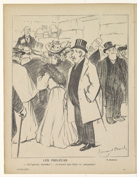
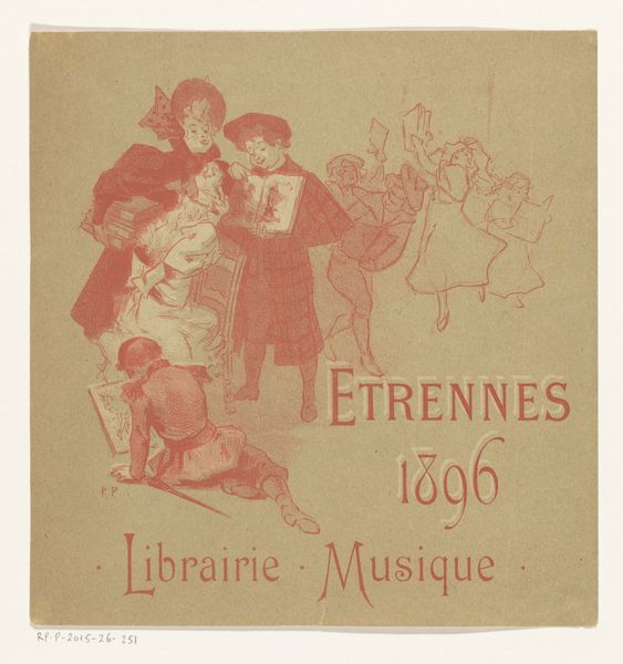
Editor: We’re looking at "Marianne op straat uitgescholden," a lithograph print by Théophile Alexandre Steinlen, created between 1894 and 1896. The scene has an uncomfortable energy. I’m curious how you see its composition influencing that mood. Curator: Indeed, let us begin with the title itself, "Marianne op straat uitgescholden", literally “Marianne insulted in the street”. The lithographic process, allowing for broad tonal ranges, creates a deliberate crudeness. Notice how the figures are tightly packed, nearly violating the picture plane; observe that we can discern the medium through rough edges in all areas. Editor: I see what you mean, it is like there's a confrontation, everything in very close quarters and flattened. The palette too is quite limited, mostly pastels in a somewhat subdued range of colors: dusty rose, muted blue, beige, with minimal modeling or gradients in those hues. Are these aesthetic choices deliberate, or simply the printing technology? Curator: Precisely, notice how even these few colors used are deployed as compositional devices—isolating the group of 4 figures as the main subjects within the lithograph; how would the picture feel if Steinlen printed this scene in shades of black and white? Editor: I think if this print was only in grayscale the emotional affect would be muted -- the subtle shades in the faces or clothes provide some warmth or familiarity amidst an otherwise hostile setting. Curator: Note, too, the absence of a deeply defined background – the indistinct architecture only provides context, with very thin lines giving depth only when juxtaposed with more broad patches elsewhere. Does this reinforce a feeling of alienation, that those involved in the incident are in the same bubble or class together? Editor: Absolutely, I'm getting a sense of both the individuals and the societal critique much more clearly now by considering the forms, lines, colors, and limited space within the picture! Curator: Likewise!
Comments
No comments
Be the first to comment and join the conversation on the ultimate creative platform.
More like this