Copyright: Rijks Museum: Open Domain
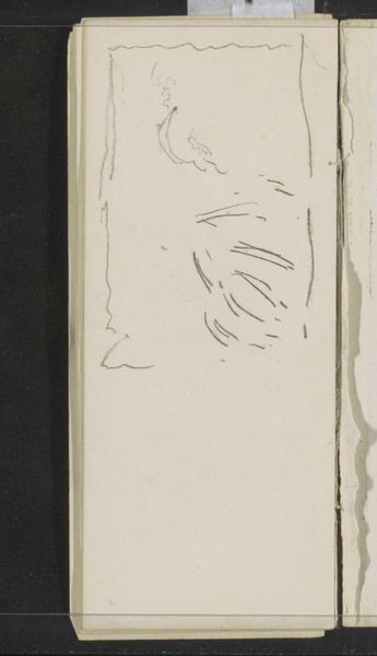
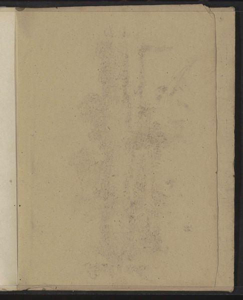
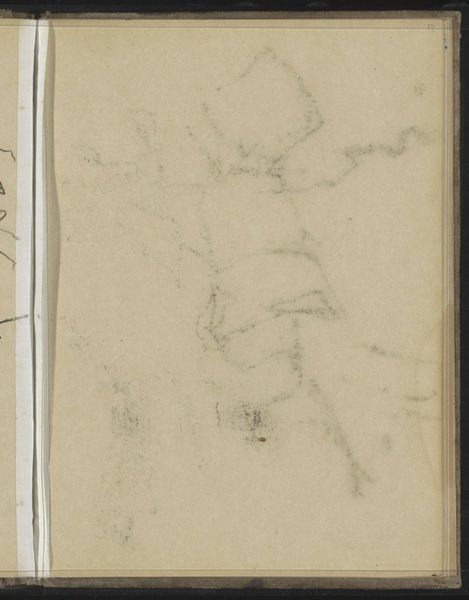
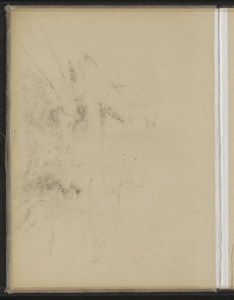
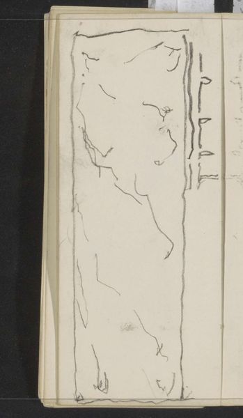
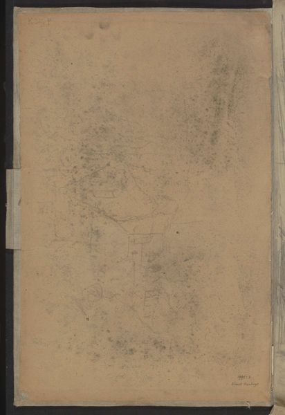
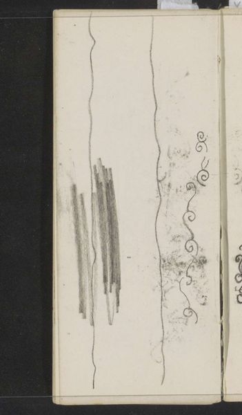
Editor: We're looking at "Studie," a pencil drawing by Gerrit Willem Dijsselhof, circa 1901, currently held at the Rijksmuseum. It strikes me as an ephemeral landscape; the sketchiness gives it a transient quality. What do you make of its composition? Curator: The strength of this work resides in its reduction to fundamental elements. Consider the strategic deployment of line – its varying weight and density that hints at form without fully committing. Notice, for instance, the economy of the marks on the left-hand side, balanced by the denser cluster towards the top right. Editor: So, it's more about the suggestion of the landscape rather than a literal representation? Curator: Precisely. Observe how Dijsselhof uses the barest of lines to convey the essence of form and space. Ask yourself what the impact of the negative space is. Editor: It amplifies the feeling of sparseness and openness, creating a sense of quietness. The materiality also matters, right? The roughness of the paper and the quality of the pencil strokes? Curator: Undeniably. The tooth of the paper interacts with the graphite, creating subtle textural variations. This heightens the drawing's intrinsic qualities, reminding us that the art lies in the act of creation itself. Is it possible to regard the lines that frame the notebook as essential to the work? Editor: That's a great question! I hadn’t thought of the format itself as part of the artwork, but now I see how it emphasizes the piece's incompleteness and intimacy. Curator: I agree; hopefully this detailed look at Dijsselhof's sketch has revealed the richness within what appears to be simplicity. Editor: Definitely. Focusing on the formal elements really opened up a new way of appreciating this piece.
Comments
No comments
Be the first to comment and join the conversation on the ultimate creative platform.
More like this