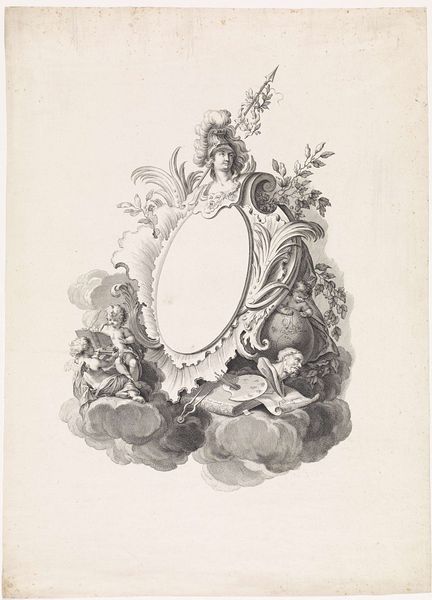
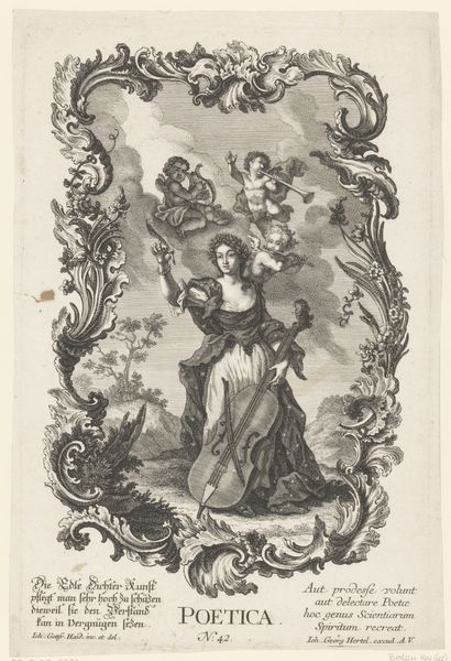
drawing, ink
#
drawing
#
allegory
#
baroque
#
pen sketch
#
figuration
#
ink
#
line
Dimensions: height 181 mm, width 141 mm
Copyright: Rijks Museum: Open Domain
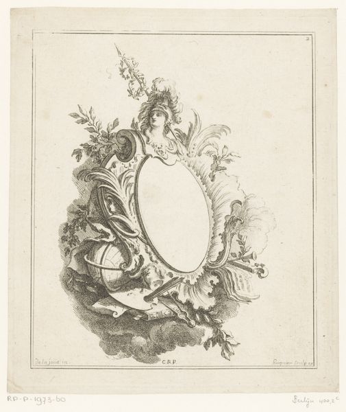
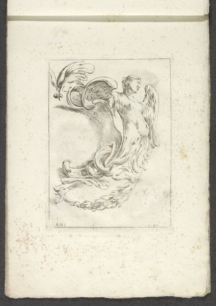
Editor: Here we have "Ceres," an ink drawing created sometime between 1731 and 1775 by an anonymous artist, now held at the Rijksmuseum. It has such delicate lines and a classical feel, like something from a fairytale. I'm intrigued by the framing elements. What strikes you most about its formal composition? Curator: The emphasis on line is immediately apparent. Observe how the artist has used its modulation to create areas of light and shadow, volume and void. Note too the rhythmic play between the curvilinear forms of the ornamental frame, the figure of Ceres, and the meticulously rendered foliage. It all contributes to a balanced, albeit asymmetrical, composition. How do you interpret the interplay of these forms? Editor: I see a contrast between the rigid frame and the flowing details within it, making it seem very dynamic despite being static. Does the medium--ink on paper--influence your perception? Curator: Indeed. The choice of ink, allowing for precise lines, dictates a focus on contour and form. The absence of colour encourages us to engage with the relationships between positive and negative space. Do you think the artist prioritized form over narrative? Editor: It seems so. I initially saw the allegory, but I appreciate now how the composition itself communicates so much. I had assumed the allegorical content was more important than line, form and structure, but I was wrong. Curator: Precisely. By analysing the formal elements, we access a deeper understanding of the artist's intention and the inherent visual language of the work itself.
Comments
No comments
Be the first to comment and join the conversation on the ultimate creative platform.
More like this