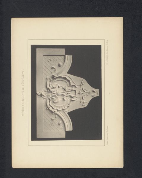
print, engraving, architecture
#
baroque
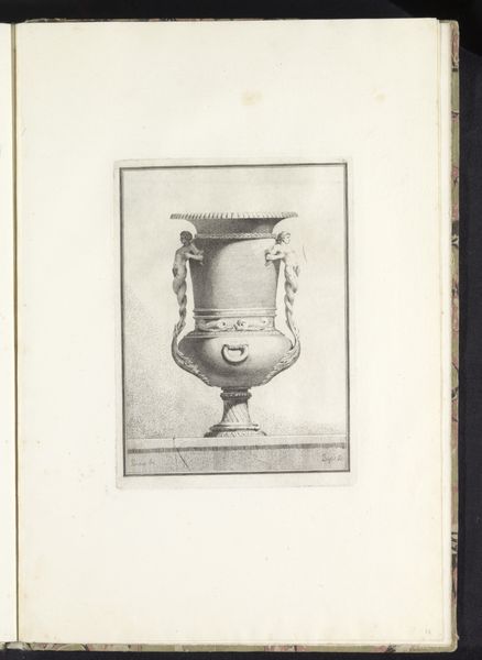
# print
#
old engraving style
#
geometric
#
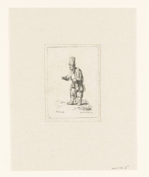
pen-ink sketch
#
engraving
#
architecture
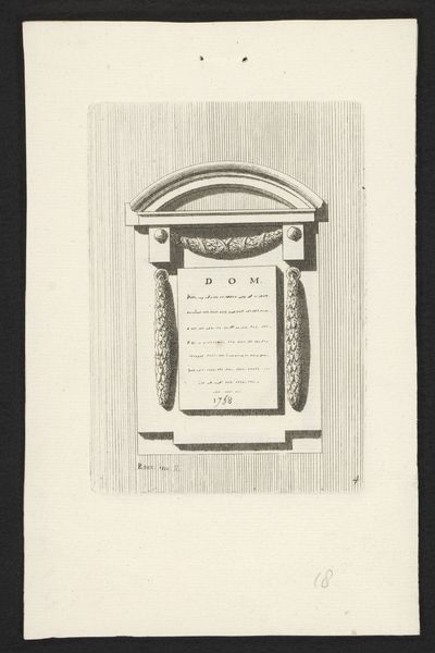
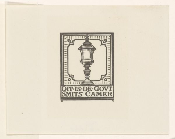
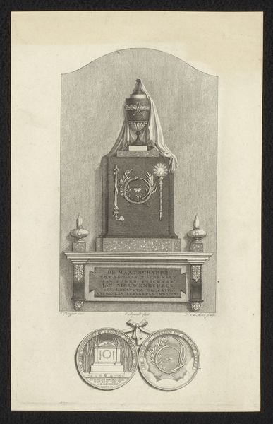
Dimensions: height 139 mm, width 97 mm
Copyright: Rijks Museum: Open Domain
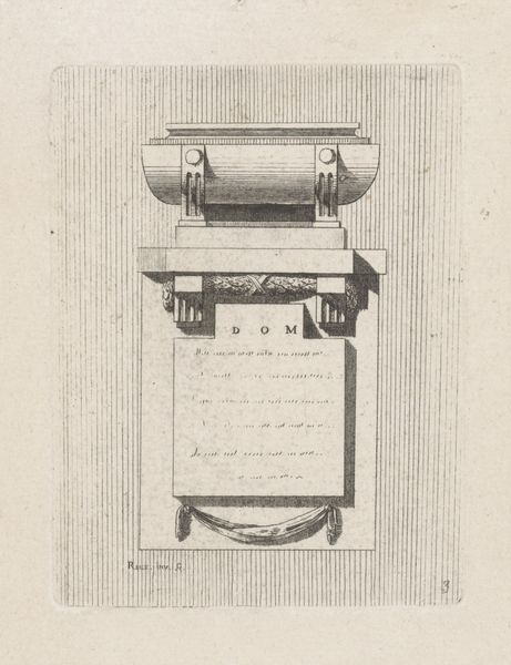
Curator: The texture almost feels etched onto the paper itself, doesn’t it? So austere and formal. Editor: Indeed. Here we have "Epitaaf met vaas," an engraving created in 1758 by Raux. Notice how the artist rendered what seems to be a grave marker. Curator: Yes, and the deliberate choice of engraving as the medium. Think about the labor involved, the precision required to transfer this design onto a metal plate, and then the mechanics of producing the print. It elevates this piece beyond a mere sketch, placing it firmly within a tradition of artisanal craftsmanship. Editor: It speaks to the visual language of memorialization in the 18th century. The neoclassical influence is palpable in the symmetrical arrangement of the plaque. How these shapes serve a symbolic purpose. And note the presence of text contained in the frame of the central cartouche. Curator: Absolutely. Considering that this is a print, designed for reproduction, how does this democratize grief or remembrance? Is it for widespread commemoration or a bespoke artwork printed as a unique commission? Editor: Perhaps both? Prints could circulate more widely, making memorial imagery accessible. At the same time, the dedication could personalize what otherwise is a template, an artistic structure intended for collective participation, while preserving social status, family history and local or national events. Curator: I also appreciate how the print is activating its own value. Consider the consumption of this commemorative print. Editor: A perfect way to approach and conceptualize it. It makes one consider our social obligations to celebrate and grieve. Curator: Indeed. The material process gives so much meaning. Editor: And the imagery so perfectly encapsulates its time.
Comments
No comments
Be the first to comment and join the conversation on the ultimate creative platform.
More like this