Curatorial notes
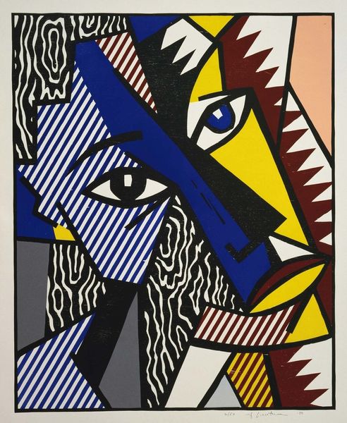
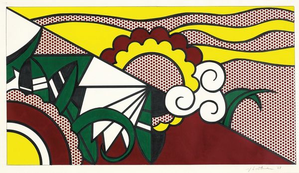
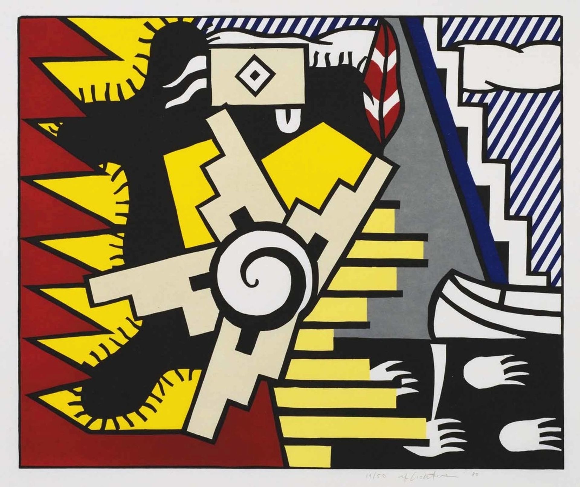
Roy Lichtenstein created "American Indian Theme II" using screen printing, characterized by flat planes of color and sharp, graphic definition. The immediate experience is one of bold contrasts: black against red, yellow against blue, setting a dynamic, almost jarring, visual rhythm. Lichtenstein, rooted in Pop Art, draws on commercial printing techniques, like the iconic Benday dots, to flatten and stylize his subjects. In this piece, he applies this to indigenious themes, reducing cultural signifiers into geometric forms. The composition is structured around interlocking shapes, disrupting any sense of naturalism. The spiral and the zigzag, for example, become motifs abstracted from their original context. This approach to form and sign prompts us to consider the artwork’s commentary on cultural representation, challenging fixed meanings. The flattening of imagery forces us to question the surface and structure of the signs themselves. This invites a semiotic reading where traditional symbols are liberated from their original cultural contexts.