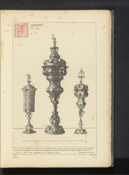
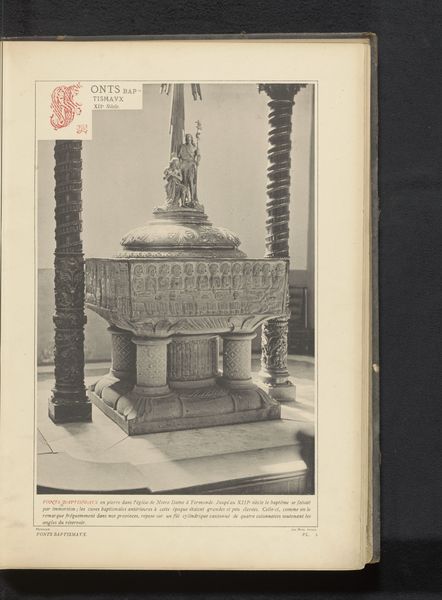
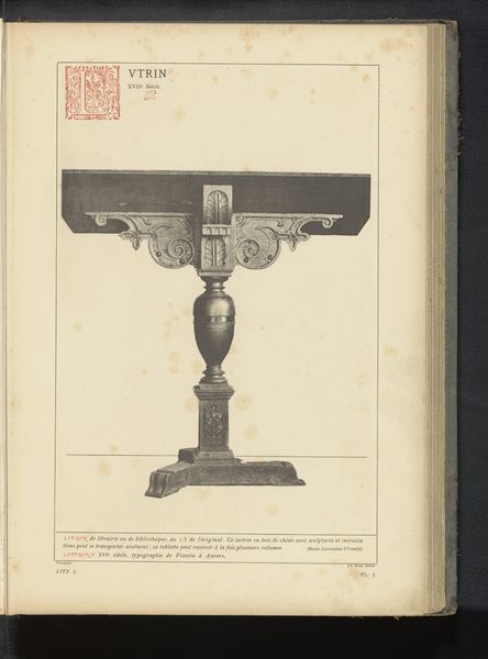
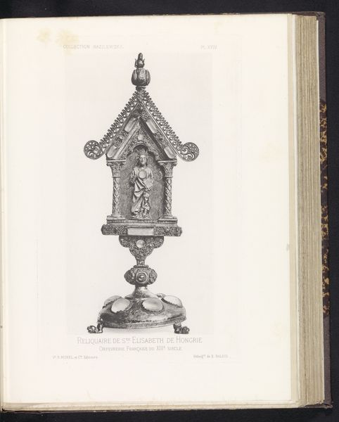
drawing, print, engraving, architecture
#
drawing
#
medieval
# print
#
line
#
engraving
#
architecture
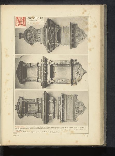
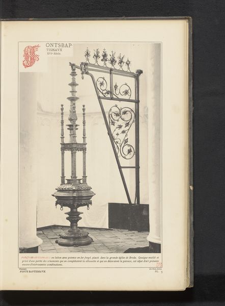
Dimensions: height 289 mm, width 159 mm
Copyright: Rijks Museum: Open Domain
Editor: We’re looking at an engraving of a copper baptismal font, dating back to before 1887. The drawing depicts a font at the Onze-Lieve-Vrouwekerk in Diest, Belgium. The composition looks very detailed. How do you interpret this work? Curator: What strikes me is the insistent verticality. Note how the artist directs the eye upward through the careful arrangement of distinct registers. Each section—base, stem, bowl—exhibits variations in texture and ornamentation. How do these contribute to the overall structure? Editor: It's like each tier builds upon the previous one, doesn't it? The base is solid and rectangular, the stem is ornate, and the bowl looks so elaborate. Curator: Precisely. Observe the use of line; its precision defines the form and renders a sense of three-dimensionality within the two-dimensional plane. The play of light and shadow, achieved through intricate hatching and cross-hatching, creates depth and volume. Do you notice the strategic placement of decorative elements? Editor: Yes, the lion heads around the bowl and the floral patterns lower down the stem... they punctuate the form and draw your eye around. It’s almost mathematical in its precision. Curator: It suggests the artist wasn't just recording an object but was actively constructing a visual experience. It prompts questions about how engravings transmit a haptic experience from a copper artefact. Editor: I’ve certainly noticed details I might have missed if I just glanced at it quickly. I understand better the connection between form and technique here. Curator: Indeed, a keen awareness of these elements enhances our comprehension. The analysis of such forms transcends mere representation. It engages with the language of visuality itself.
Comments
No comments
Be the first to comment and join the conversation on the ultimate creative platform.
More like this