Copyright: CC0 1.0
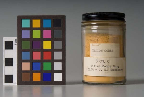
Editor: This is "Yellow Ochre" by Winsor & Newton. It seems simple, but the color is so rich. What do you see in this piece? Curator: The visual weight is distributed asymmetrically, a dialogue between the industrial container and the color chart. Note the formal interplay of the jar's cylindrical form against the chart's rigid grid. Does this juxtaposition suggest anything to you? Editor: Maybe a contrast between manufactured and natural elements? Curator: Precisely. The ochre's pigment, presumably earth-derived, is contained and codified, its chromatic potential simultaneously unleashed and controlled by the grid. I find it a fascinating visual statement. Editor: I never thought of it that way. I'll definitely look at pigments differently now!
Comments
No comments
Be the first to comment and join the conversation on the ultimate creative platform.
More like this