#
abstract expressionism
#
abstract painting
#
rough brush stroke
#
possibly oil pastel
#
oil painting
#
fluid art
#
acrylic on canvas
#
paint stroke
#
painting painterly
#
watercolor
Copyright: Public domain
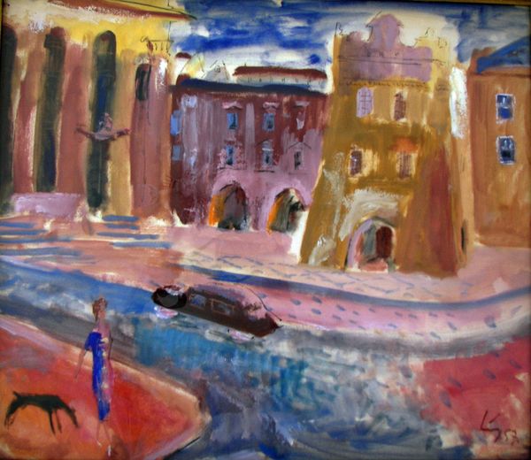
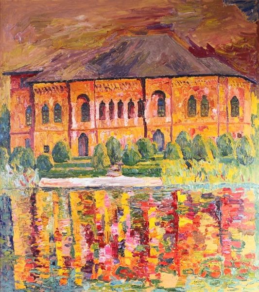
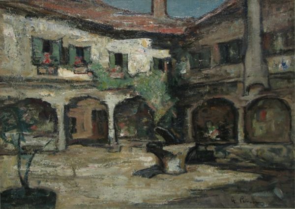
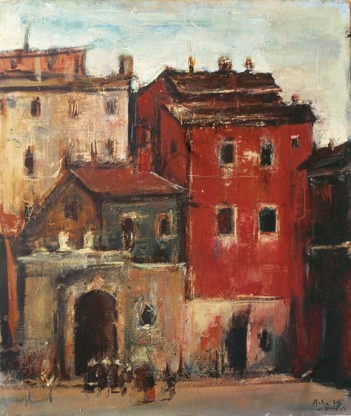
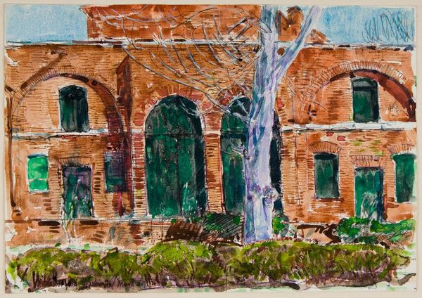
Gheorghe Petrascu made this painting of Venice with oil on, presumably, canvas. I get the sense that the process was really important to Petrascu, judging by the texture and the way the colors are laid down. You can see the physicality of the medium so clearly. The paint is laid on thickly, almost like frosting, and you can practically feel the weight of it. There’s a real immediacy here, and the colors are mixed right on the surface, creating a kind of raw, unfiltered view. Look at the way the light hits that ochre building. See how the brushstrokes are almost choppy, building up this dense, tactile surface? It reminds me of Courbet. There's something similar in the use of impasto to capture the effects of light and shadow. Like Courbet, Petrascu seems less concerned with precise representation, and more interested in exploring the material qualities of paint itself. It’s all about the paint, which is really all art is about, right?
Comments
No comments
Be the first to comment and join the conversation on the ultimate creative platform.
More like this