Dimensions: 200 mm (height) x 155 mm (width) (plademaal)
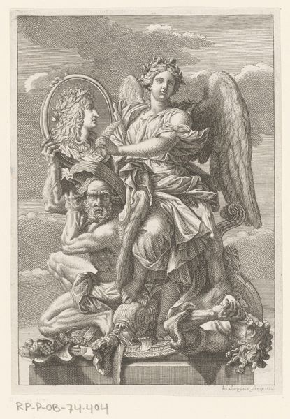
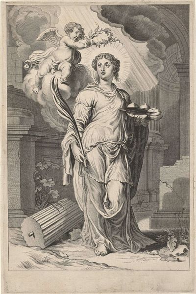
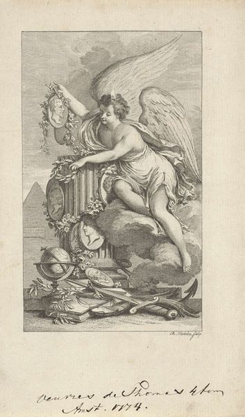
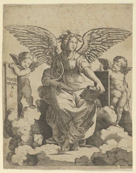
Editor: Here we have "Berømmelsens genius" by J.F. Clemens, made in 1769. It's an engraving, and I'm struck by the linear quality – so many fine lines create such depth. It feels almost academic in its precision. What do you see in this piece from a formalist perspective? Curator: Primarily, I'm drawn to the interplay between line and form. Note the use of line weight; how it varies to create a sense of volume and shadow. Consider the composition: the figures are arranged in a pyramidal structure, a classical device for creating stability and hierarchy. How does this compositional choice affect your reading of the artwork's meaning? Editor: It definitely lends a sense of importance, almost like a divine scene, the way the figures are staged and elevated, it’s hard not to see the weight of tradition here. I also find myself looking at the cloud, it reminds me that it is not just in the subject of this artwork where we find line at play, but also the background. How intentional do you think the line is? Curator: The lines that define the contours of the clouds work as their own form of semiosis – notice the way they're built up through short, repetitive strokes to simulate texture and depth; the overall tonal quality, while monochrome, gives an atmospheric effect to what is meant to be a weightless subject. Do you perceive a tension between the rigidity of the lines and the softness of the forms they depict? Editor: That tension is certainly there. The sharp lines contrast with the soft clouds and the cherubic figure. This exercise reminds me that formal analysis isn’t about listing techniques, it’s about interpreting how they work together to construct meaning. Curator: Precisely. The visual language constitutes the very essence of the artwork, it communicates with and affects us and reflects upon us the intentions of the artist and time of the piece.
Comments
No comments
Be the first to comment and join the conversation on the ultimate creative platform.
More like this