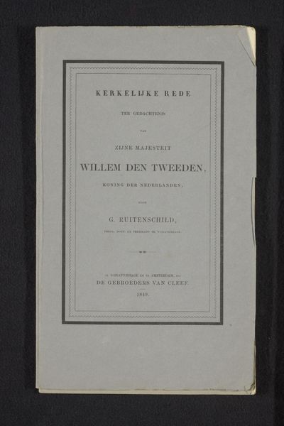
Mathematische und naturwissenschaftliche Mittheilungen aus den Sitzungsberichten der Königlich Preussischen Akademie der Wissenschaften zu Berlin 1884
0:00
0:00
print, typography
# print
#
typography
#
modernism
Dimensions: height 267 mm, width 190 mm, thickness 3 mm
Copyright: Rijks Museum: Open Domain
Curator: At first glance, this looks like a fairly straightforward document—but the muted green and carefully arranged typography give it an unexpected elegance. Editor: Indeed. What we have here is the cover for "Mathematische und naturwissenschaftliche Mittheilungen aus den Sitzungsberichten der Königlich Preussischen Akademie der Wissenschaften zu Berlin," or, roughly translated, "Mathematical and Scientific Reports from the Proceedings of the Royal Prussian Academy of Sciences in Berlin." This is Heft IV from April 1884. Curator: So, it’s essentially a collection of scientific papers presented to the Prussian Academy of Sciences? The typographic layout feels very much in line with the period, with that almost gothic feel despite being distinctly modernist. There’s a stark order to it, wouldn’t you say? Editor: Absolutely. This was a period when printed material carried tremendous authority; that tightly structured text embodies the seriousness and objectivity that scientific discourse aimed for. The borders too evoke a sense of established institutional tradition. Curator: Those small, ornate border details add a touch of understated embellishment that elevates it beyond pure functionality. It is more than just delivering information; it gives the information significance, authority even, through symbolism. It reflects how scientific knowledge was viewed – a key to understanding the universe’s hidden order. Editor: You’re right, these details also served to legitimize and perhaps even to aestheticize scientific knowledge within society. Notice also that the very choice of a sans-serif font aligns it with the emerging aesthetic trends of modernism, pushing for clarity and rationality in design to mirror developments in science itself. It's an intriguing visual manifestation of evolving epistemologies. Curator: Precisely! And that interplay – the modernist simplification combined with subtle ornamental echoes of tradition, gives it a powerful resonance. One feels the weight of both scientific progress and cultural continuity in such a seemingly simple design. Editor: It makes one consider the layers of meaning conveyed in what was likely intended as a purely functional piece of print. Curator: Exactly! What we thought to be functional speaks of cultural identity and evolving notions of truth and knowledge. Editor: An academic volume unexpectedly revealing about the cultural landscape from which it sprang.
Comments
No comments
Be the first to comment and join the conversation on the ultimate creative platform.
More like this