print, photography, pen
# print
#
photography
#
pen
Copyright: Rijks Museum: Open Domain
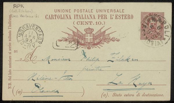
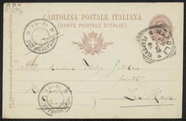
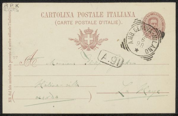
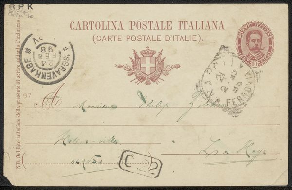
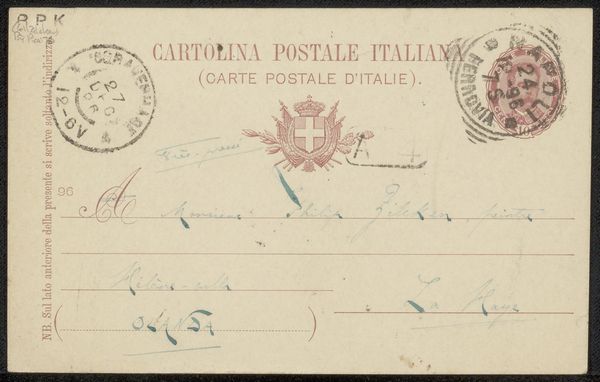
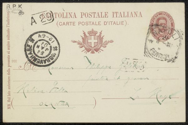
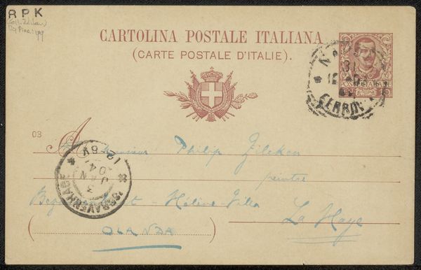
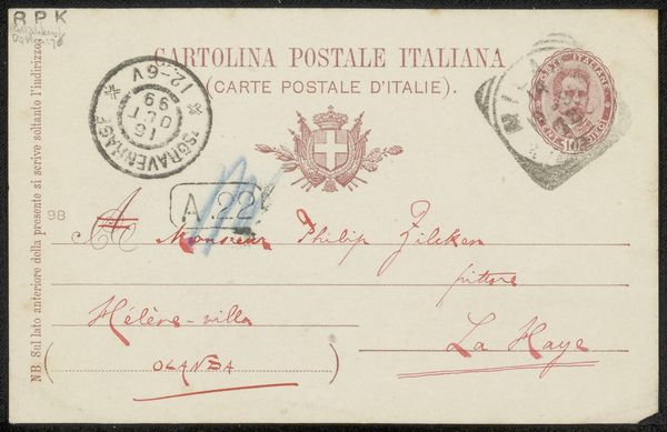
This "Briefkaart aan Philip Zilcken", made by F. Camerom, presents a fascinating study in signs, symbols, and the architecture of communication. At first glance, the eye is drawn to the symmetrical arrangement of national emblems—flags, a crown, and an escutcheon—printed in a muted red, balanced by the cancellation stamp to its right. Below, the handwritten address in elegant cursive adds a personal touch. The rigid lines of the postal form contrast starkly with the organic flow of the handwriting, creating a visual tension. Structurally, the card uses semiotic codes of nationality and formality, typical of postal communication. These printed elements frame and formalize the personal message, while the handwriting injects individuality into the standardized format. The text "Olanda" and "La Haye" are more than place names; they act as signifiers of national identity and geographic location. Ultimately, this card exemplifies how even the most mundane objects can be rich with meaning when viewed through the lens of structural and formal analysis.
Comments
No comments
Be the first to comment and join the conversation on the ultimate creative platform.
More like this