#
imaginative character sketch
#
quirky illustration
#
blue ink drawing
#
quirky sketch
#
personal sketchbook
#
ink drawing experimentation
#
sketchbook drawing
#
watercolour illustration
#
storyboard and sketchbook work
#
sketchbook art
Dimensions: height 195 mm, width 252 mm
Copyright: Rijks Museum: Open Domain
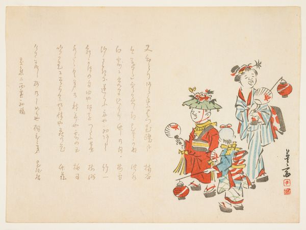
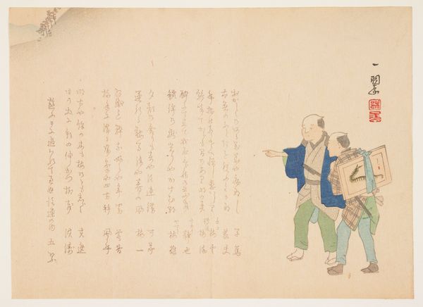
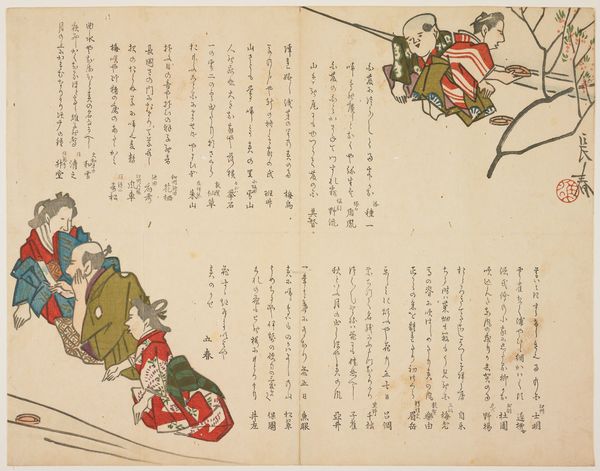
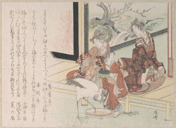
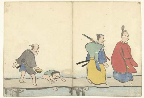
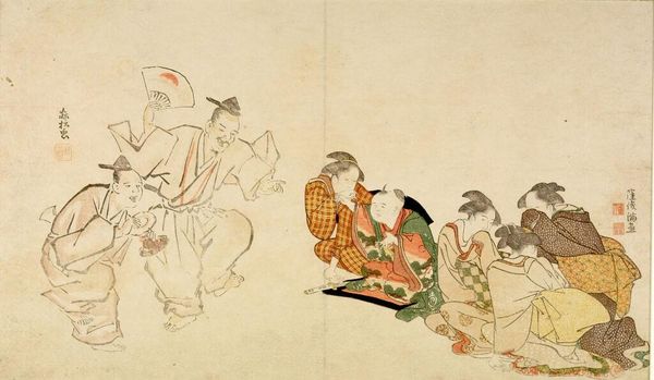
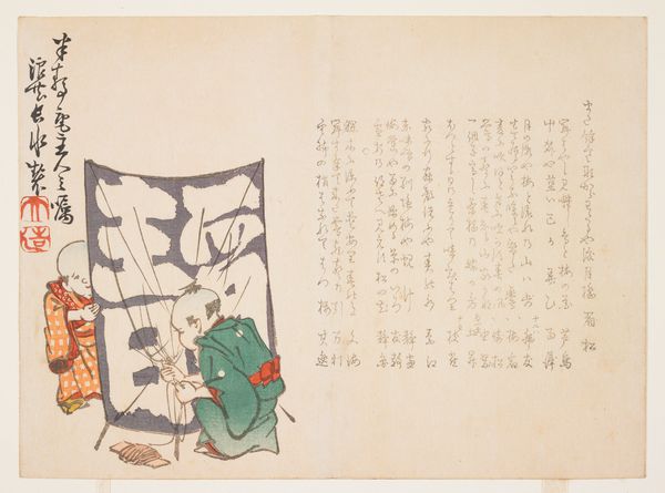
Editor: We're looking at "Optocht van de geluksgoden," or "Parade of the Gods of Fortune," created in 1899 by Chikushin. It's an ink and watercolour illustration that feels lighthearted but also has a chaotic energy due to the arrangement of the figures. What strikes you about its visual composition? Curator: Note the asymmetry. The composition deliberately avoids conventional balance. The gods are not arranged in a straight line but rather seem to tumble across the page. Furthermore, examine how the limited color palette enhances the work. Blue, yellow, and hints of purple delineate form and add depth despite the piece's flatness. What do you observe about the artist's application of line? Editor: I see the lines are very clean and precise, almost like a comic book. I can tell they really paid attention to the individual characteristics. But is the text an intrinsic component, or merely supplementary? Curator: Indeed, it may appear as a simple sketch. Note, however, the sophisticated interplay between line and wash. This combination suggests the artist's experimentation with depth and texture, something to admire. Consider the integration of text. Rather than acting as a mere caption, it's intricately woven into the composition, informing the overall design, the arrangement itself becomes a visual element. What do you think? Editor: Interesting point. I hadn't considered the text that way. It makes the whole piece more cohesive. Curator: Precisely. Through its visual economy and considered arrangement, the work reveals an intrinsic aesthetic value. The absence of superfluous detail invites a closer inspection of the artwork. Editor: I never thought about how much you could analyse the different artistic decisions behind something that appears spontaneous. I definitely see the structure now. Curator: Indeed. A deep dive into such intrinsic elements offers nuanced understandings. This will lead to a comprehensive appreciation.
Comments
No comments
Be the first to comment and join the conversation on the ultimate creative platform.
More like this