ceramic, earthenware
#
art-nouveau
#
ceramic
#
earthenware
#
decorative-art
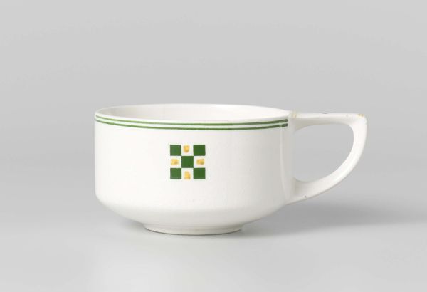
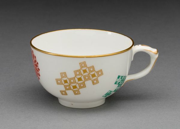
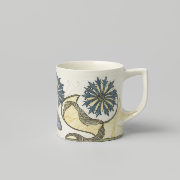
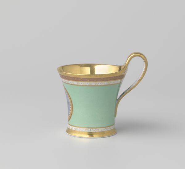
Dimensions: height 6.6 cm, diameter 5.6 cm
Copyright: Rijks Museum: Open Domain
Curator: Good morning. Let's discuss this earthenware coffee cup crafted between 1900 and 1925 by N.V. Plateelbakkerij Zuid-Holland, showcasing a blend of ceramic art with a distinctive block pattern. Editor: Thank you! It's interesting. It looks like a simple, utilitarian object but the carefully rendered block pattern suggests it has more than one purpose. How do you interpret the work from a formalist perspective? Curator: Formally, observe the geometric interplay. The block pattern is rigidly symmetrical, a grid of contrasting ochre and green against the cup’s off-white ground. What compositional relationships do you find most engaging? Editor: The stark contrast definitely stands out, especially since the mug's shape is quite simple and elegant, contrasting the sharp angles with soft curves, almost as if challenging art nouveau ideals? Curator: Indeed. It hints at broader aesthetic debates. The Art Nouveau style, although still apparent, begins to reconcile with more geometric, structured designs. This transition reflects changing socio-cultural values through visual means. Do you perceive any deeper semiotic significance in its restrained ornamentation? Editor: Semiotic significance? Perhaps the simple, almost humble design represents the move towards practicality and accessibility in the early 20th century? Curator: Precisely. Every line, colour choice, and compositional arrangement contributes to its unique visual statement. Editor: Fascinating to see so much meaning held within the design choices of one little coffee cup. I've really learnt how to 'read' its aesthetic. Curator: The interplay between form and function opens avenues to discover cultural values and visual language of a certain time.
Comments
No comments
Be the first to comment and join the conversation on the ultimate creative platform.
More like this