About this artwork
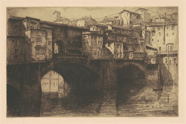
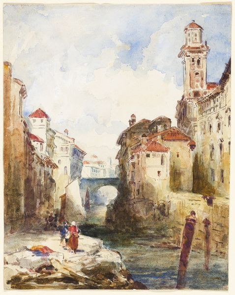
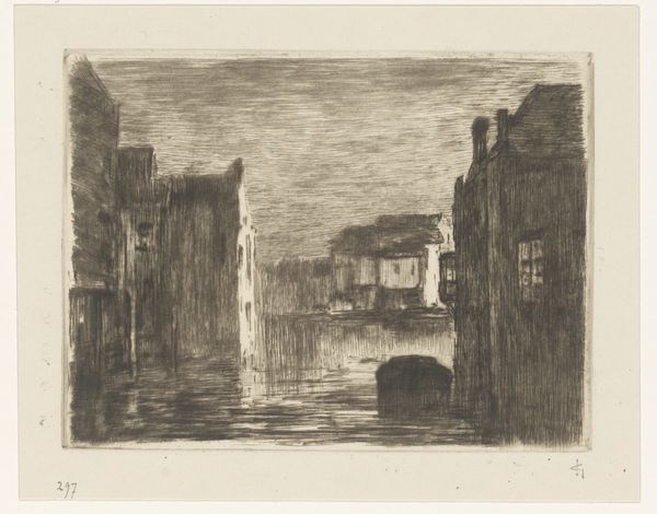
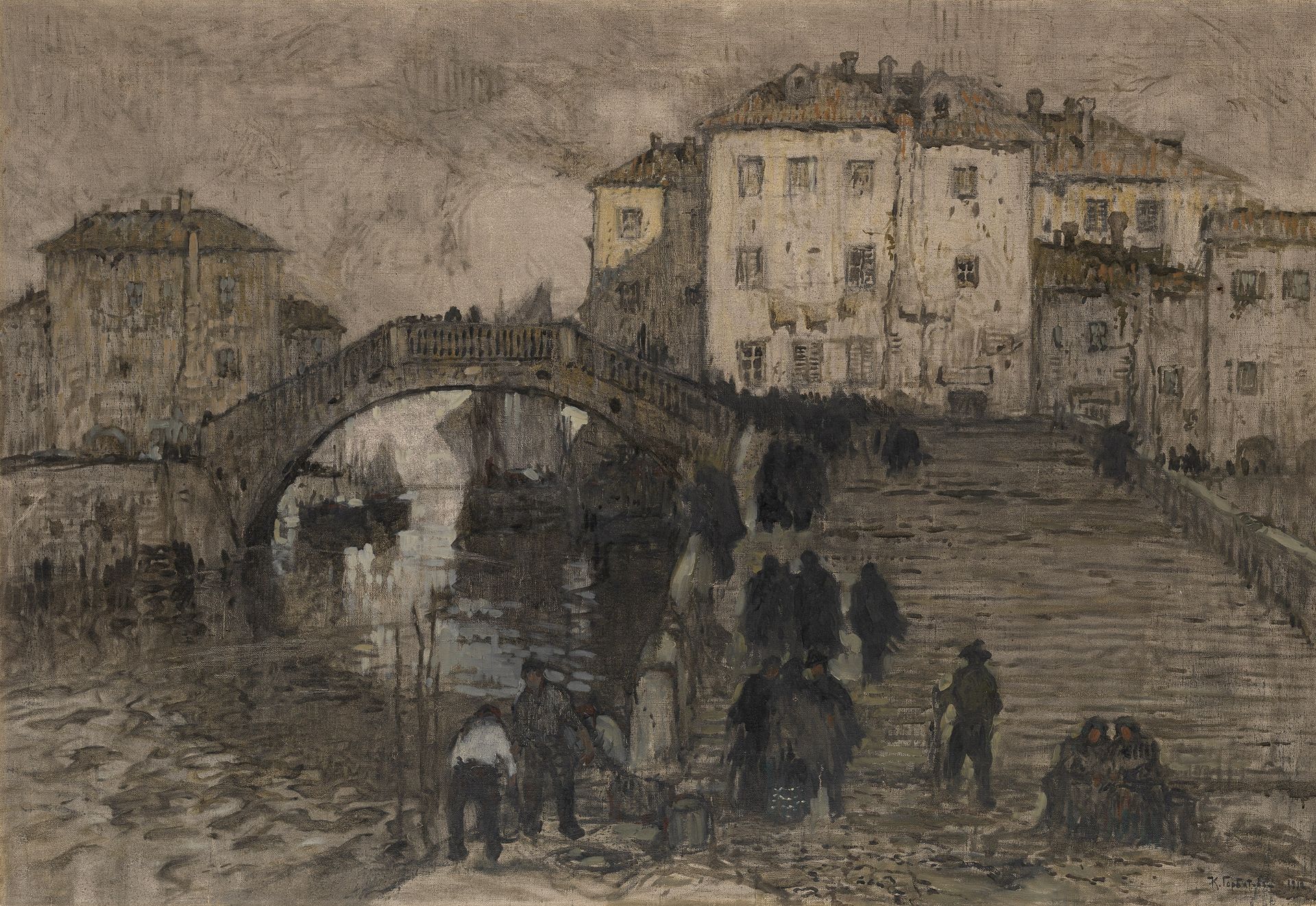
Editor: So, this is Konstantin Gorbatov’s “Venice,” painted in 1912. It’s an oil painting, and it's remarkably… monochromatic. There’s a stillness to it, almost melancholy. All these shadowy figures moving across the bridge make it feel both bustling and lonely at the same time. What's your take? Curator: Oh, I love that you sensed the melancholy right away. It reminds me of those gray Venetian afternoons when the city feels suspended between water and sky. What is the function of art but a mirror to reflect our soul in our experience? Do you get that the painting uses colour subtly to hint at a past world which maybe existed, or may just be imagined by the artist? It’s not *just* realism, is it? Editor: No, you're right. It definitely leans into impressionism… with a dash of something else. It isn't photographic in detail. Why do you think he chose such a muted palette? Was it a stylistic choice, or something more personal, something maybe political? Curator: Could be all of the above! The muted tones draw us into a world steeped in feeling, in the same way one may sink deeper in a book than they do while casually reading the news. When an artist takes something recognisable – Venice! – and bathes it in *atmosphere*, then it ceases to be just a postcard, right? Venice becomes Gorbatov's state of mind. Do you know that Gorbatov would soon have to leave Russia forever? He wasn't just painting a canal. I feel as if he was also, perhaps, painting a farewell. Editor: That makes me see it completely differently. I was focusing on the city, but now it's like the figures are all fleeing *something*. Curator: Exactly. It's a shared human experience. Art transcends pretty pictures. Editor: Definitely given me a lot to ponder. Thanks! Curator: And you me! The world would be pretty beige without such collaborations.
Artwork details
- Copyright
- Public domain
Comments
Share your thoughts
About this artwork
Editor: So, this is Konstantin Gorbatov’s “Venice,” painted in 1912. It’s an oil painting, and it's remarkably… monochromatic. There’s a stillness to it, almost melancholy. All these shadowy figures moving across the bridge make it feel both bustling and lonely at the same time. What's your take? Curator: Oh, I love that you sensed the melancholy right away. It reminds me of those gray Venetian afternoons when the city feels suspended between water and sky. What is the function of art but a mirror to reflect our soul in our experience? Do you get that the painting uses colour subtly to hint at a past world which maybe existed, or may just be imagined by the artist? It’s not *just* realism, is it? Editor: No, you're right. It definitely leans into impressionism… with a dash of something else. It isn't photographic in detail. Why do you think he chose such a muted palette? Was it a stylistic choice, or something more personal, something maybe political? Curator: Could be all of the above! The muted tones draw us into a world steeped in feeling, in the same way one may sink deeper in a book than they do while casually reading the news. When an artist takes something recognisable – Venice! – and bathes it in *atmosphere*, then it ceases to be just a postcard, right? Venice becomes Gorbatov's state of mind. Do you know that Gorbatov would soon have to leave Russia forever? He wasn't just painting a canal. I feel as if he was also, perhaps, painting a farewell. Editor: That makes me see it completely differently. I was focusing on the city, but now it's like the figures are all fleeing *something*. Curator: Exactly. It's a shared human experience. Art transcends pretty pictures. Editor: Definitely given me a lot to ponder. Thanks! Curator: And you me! The world would be pretty beige without such collaborations.
Comments
Share your thoughts