drawing, dry-media, graphite
#
drawing
#
pen sketch
#
dry-media
#
geometric
#
graphite
#
realism
Dimensions: height 104 mm, width 165 mm
Copyright: Rijks Museum: Open Domain
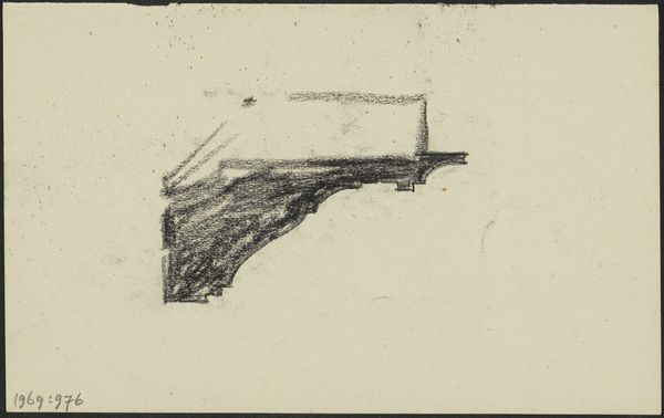
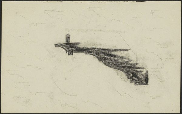
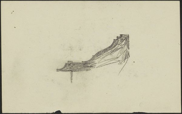
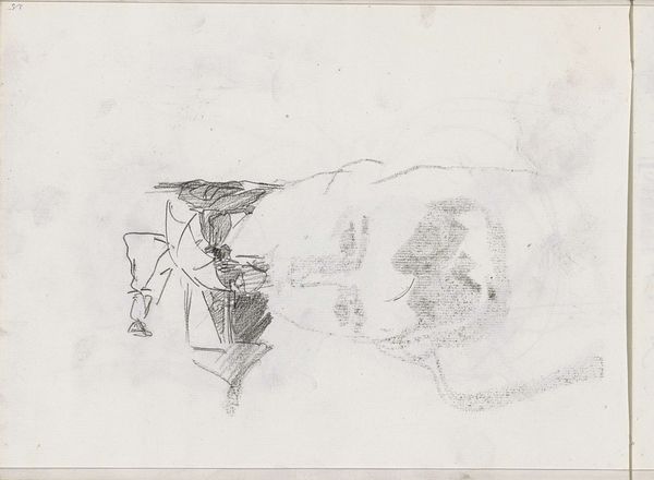
Editor: Here we have Gerrit Willem Dijsselhof's "Console," created sometime between 1876 and 1924. It's a pen and graphite drawing. I'm immediately struck by how solid it looks, even though it's just a sketch. What do you see in this piece? Curator: I see an attempt to capture the weight and support suggested by this architectural detail. Note how Dijsselhof uses hatching to give it depth. Consoles are inherently symbolic, carrying the load of what is above. Editor: You're right, the shading does add to that sense of weight. Is it a particular style? Curator: In the Western tradition, consoles often appear in classical and neoclassical architecture, signifying stability and order, acting almost as visual pillars of strength. However, their meaning might shift based on where they're placed and what they support. Consider, what does it suggest to you? Editor: That's fascinating. It feels a little unfinished, though. I'm drawn to how the artist captured depth with those hatching lines. But it's interesting how the top looks…tentative almost. Curator: Indeed. Does the contrast perhaps suggest something about the changing nature of support structures, maybe even societal ones, as the late 19th and early 20th centuries transitioned? The solidity below anchors the sketch, doesn't it? Editor: That's an interesting perspective! I was mostly thinking about technique, but that historical context adds a whole other layer to it. Curator: Symbols can whisper volumes, don’t you agree? Editor: Absolutely! This really makes me want to look at architectural drawings in a different way now. Thanks for opening my eyes to all those symbolic layers.
Comments
No comments
Be the first to comment and join the conversation on the ultimate creative platform.
More like this