drawing, paper, ink, chalk
#
drawing
#
art-nouveau
#
paper
#
form
#
ink
#
geometric
#
chalk
#
line
#
calligraphy
Copyright: Public Domain
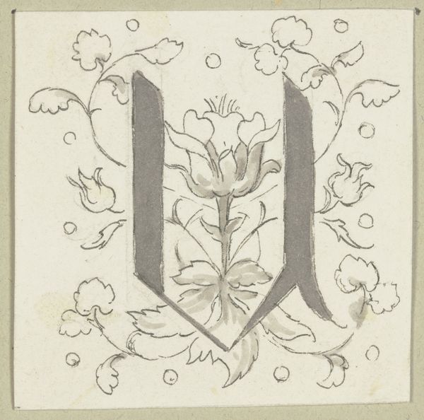
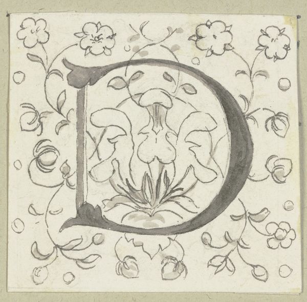
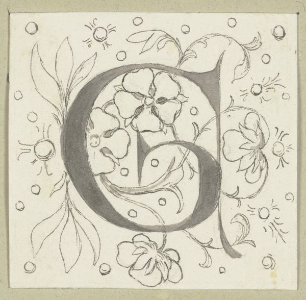
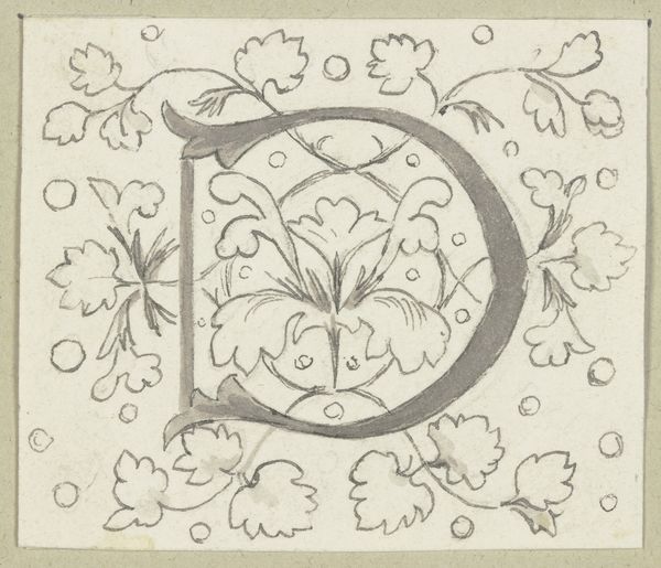
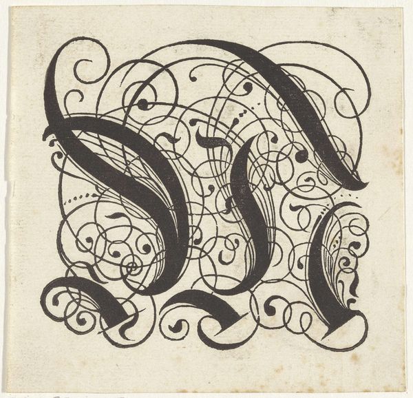
Editor: This is "Initial W" by Wilhelm Steinhausen, around 1884, created using ink, chalk, and paper. I am really drawn to the art nouveau style. The botanical elements are nice, but why a W? Curator: It’s more than just a ‘W.’ Consider the social and political context of late 19th century Germany. Art Nouveau was often co-opted by a rising nationalist sentiment. Who might be commissioning such stylized initials, and for what purpose? Editor: I suppose I hadn't considered that aspect. Is it suggesting the artist had an affiliation with wealthy patrons or a growing nationalistic movement? Curator: Possibly. Aristocrats were eager to rebrand their identity using a more modern aesthetic that gave the *impression* of progress, though upholding the status quo. Do you see how the letter is also almost a crown? Editor: Yes, it's subtly integrated into the design with its upward-pointing elements and ornamental flowers. Almost like hidden messaging within the composition. Curator: Precisely! Steinhausen gives us something celebratory while reminding us of systems of power and identity. Note the line work – sharp yet decorative. What tensions does this evoke for you? Editor: I notice how it almost looks like something natural and delicate. So maybe nature and order coming together under capitalism? That could even be some pretty heavy commentary, and I would've missed that if you hadn't pointed it out! Curator: It certainly invites questions about intention. Bringing together formal analysis and sociohistorical awareness gives us multiple entry points into understanding the work's significance. Editor: Definitely. It's more than a pretty drawing; it's an expression of historical forces. Curator: Right! This lens transforms how we understand and discuss art.
Comments
No comments
Be the first to comment and join the conversation on the ultimate creative platform.
More like this