aged paper
homemade paper
script typography
sketch book
hand drawn type
personal sketchbook
hand-drawn typeface
thick font
sketchbook drawing
sketchbook art
Dimensions: height 183 mm, width 114 mm, thickness 60 mm
Copyright: Rijks Museum: Open Domain
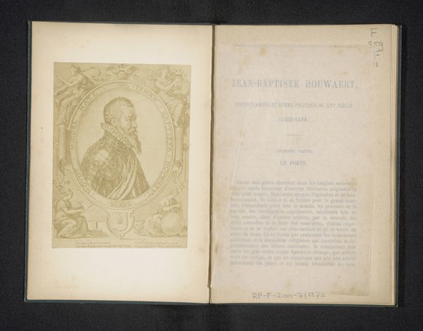
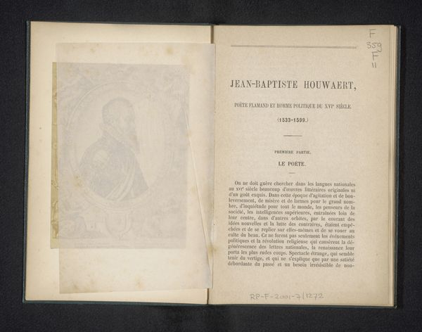
Curator: The object before us is the illustrated title page for Hans Christian Andersen's book, “L'Improvisateur ou la vie en Italie," published in 1860. Editor: It feels intimate. I'm immediately drawn to the stark simplicity and how much that monochrome aesthetic suggests. There is such an apparent quietude, perhaps a yearning in that etched portrait. Curator: Well, the book itself was quite successful and helped build Andersen's reputation. Consider the context—travelogues were exceptionally popular during the 19th century. We were experiencing a sort of democratizing of exploration, even if deeply flawed in its colonial assumptions. Editor: True. I keep returning to the contrast. On the left page, Andersen’s likeness is enclosed in that neat oval, an almost romantic portrayal. Flip the page, and the typography takes over with rigid confidence in this literary product marketed in Paris at that time. I think these details matter because his stories reflect a very precise form of social critique and observation. Curator: The typography certainly speaks to the rise of industrialized printing and distribution networks and of the artist's presence in cultural consciousness across borders. But let’s also recall the political climate of 1860. Europe was teetering on the edge of immense change, a wave of nationalistic movements were transforming societies, the art became entwined within the very real project of consolidating those political powers. How does the frontispiece figure within these currents, do you think? Editor: Perhaps this serene portrait suggests that an author could offer unique insights into an Italian experience removed from all that tension, almost deliberately ignoring that socio-political context? Then we return to what those stories really revealed. So perhaps what the publisher's brand signified here mattered to both promote Andersen’s literary persona *and* sanitize those implicit anxieties from this literary production at a historical moment like this? Curator: A very persuasive thought. Seeing this work anew through your perspective gives me fresh insights into how we frame artistic expression in the context of a shifting world. Editor: And for me, understanding the historical context allows a deeper appreciation of those aesthetic and textual strategies as political acts that shaped how it has been read throughout history.
Comments
No comments
Be the first to comment and join the conversation on the ultimate creative platform.
More like this