#
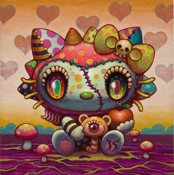
neo-pop
Copyright: Modern Artists: Artvee
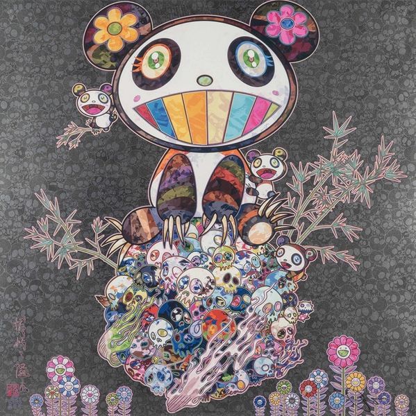
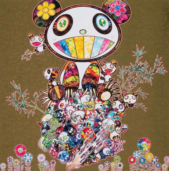
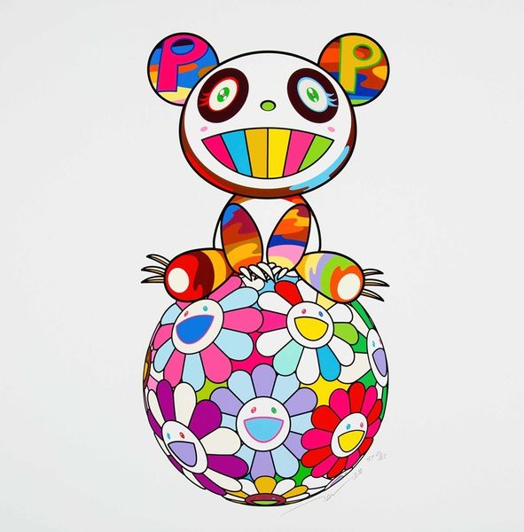
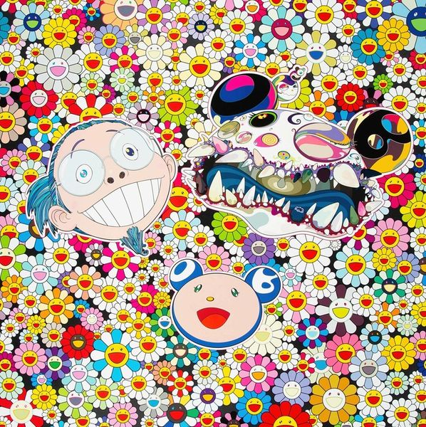
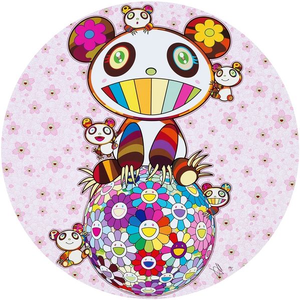
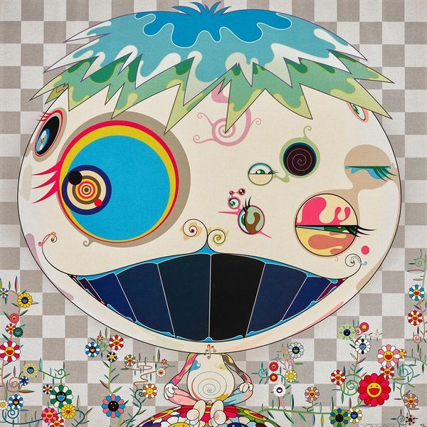
Editor: So, here we have Takashi Murakami’s “A Panda Family Against the Blue Sky,” from 2014. It seems to be a mixed-media piece with a huge, cartoonish panda towering over a mound of colorful skulls. It’s kind of… jarring, with that mix of cute and macabre. What’s your take on this work? Curator: Well, this piece, like much of Murakami’s output, operates in the complex space between pop art, postmodernism, and Japanese tradition. Consider the historical context. Post-war Japan saw a huge influx of American pop culture, particularly through animation and consumer goods. How do you think that shaped Murakami’s generation of artists? Editor: I guess they were absorbing and reacting to these outside influences? Curator: Exactly. And Murakami takes these seemingly simple, “cute” forms – the panda, the smiling flowers – and juxtaposes them with darker imagery, like the skulls. The bright colors and flat, almost digitally-rendered style borrow from pop art aesthetics. But there's also a link to the history of ukiyo-e prints in his embrace of commercial aesthetics and mass production. He challenges the traditional art world and blurs boundaries between high and low culture. Where do you think Murakami sees the public role of art? Editor: Maybe as something more accessible, more engaging with everyday life, instead of being confined to museums? But, also to hint at anxieties beneath the surface? Curator: Precisely. And the panda, a symbol of China, further complicates the image, raising questions about cultural exchange and global anxieties. Notice also how he uses recurring motifs to create a distinct brand identity that can be seen in museum and galleries. What do you make of that? Editor: It's kind of a statement in itself about art in the modern world, right? Curator: It is! Murakami definitely makes you think about how art circulates and what power that holds. I learned something about seeing his works in the current exhibition, so, thank you. Editor: Yeah, thinking about it as a response to cultural shifts makes it way more interesting than just a “cute” picture. I hadn't connected his repetition to a sort of "brand," either!
Comments
No comments
Be the first to comment and join the conversation on the ultimate creative platform.
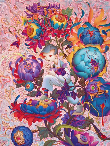
More like this