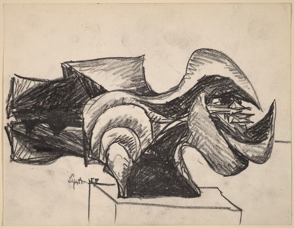
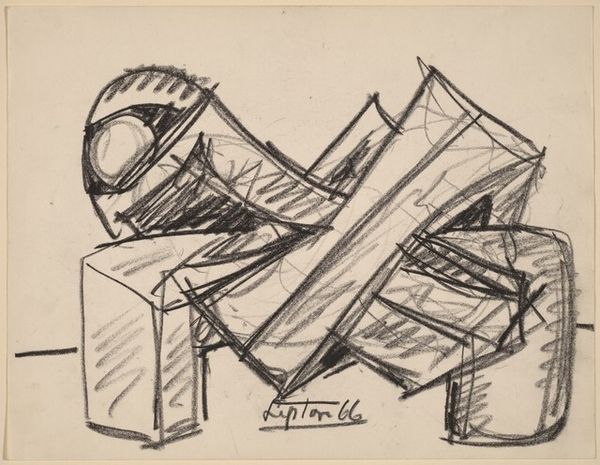
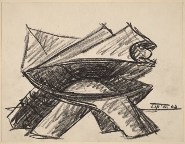
drawing, graphite
#
abstract-expressionism
#
drawing
#
ink drawing
#
form
#
geometric
#
abstraction
#
graphite
Dimensions: sheet: 21.59 × 27.94 cm (8 1/2 × 11 in.)
Copyright: National Gallery of Art: CC0 1.0
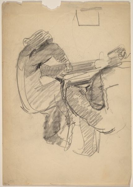
Curator: Welcome. Today we are looking at a study for Winter Solstice by Seymour Lipton, made in 1957. The piece appears to be made with graphite and ink. Editor: It certainly feels grounded, rooted, yet reaching upward simultaneously. I'm drawn to the tension between the defined edges and the shadowy interior. Curator: The geometric form really dominates, doesn’t it? It seems the work grapples with form itself. The heavy shading, the angularity – how do you see it reflecting abstract expressionist ideas about form? Editor: I find the use of shade is a really clever mechanism to almost force the work to appear weighty. This seems less about representing something visible, but is about exploring the hidden dynamics within organic and geometric form – the interplay between growth, decay, darkness, light. It’s interesting that a winter scene would be constructed with so much upwards direction, seemingly opposed to gravity. Curator: Yes, and Lipton was interested in themes of nature and mythology. He’s striving for that primordial feeling that is part of the abstract expressionist impulse. We see Lipton attempting to unearth symbolic, often unknowable significance via non-representative shapes. Editor: Winter Solstice of course has a lot of political weight attached to it, not necessarily that Lipton intended this though, but any artwork created in this era should acknowledge that they existed under the nuclear age, especially ones reflecting winter. The title really is poignant. In pre-Christian European pagan traditions, winter solstice celebrations mark death and rebirth – this piece could reference the socio-political changes being faced by post-war America. Curator: A vital interpretation, especially regarding his broader exploration of form, as we look closer, the piece suggests a dynamic interaction of elements. The way he used materials like ink and graphite in combination, rather than one taking precedent really helps it achieve that look, that's essential to Lipton's art-making. It mirrors society's interaction between organic tradition, and inorganic, atomic industrialisation. Editor: Seeing how Lipton balances the different elements helps understand how he fits into the social contexts of 1950s America. His art does show those transitions we face in everyday life. Curator: Exactly. This piece shows Lipton as a transitional figure, straddling modern anxiety and enduring nature-based archetypes. Editor: I’ll certainly consider it in that context going forward. Thank you for your analysis.
Comments
No comments
Be the first to comment and join the conversation on the ultimate creative platform.
More like this