graphic-art, print, paper, typography, woodcut
graphic-art
art-nouveau
paper
typography
woodcut
Copyright: No Copyright - United States
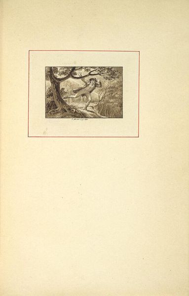
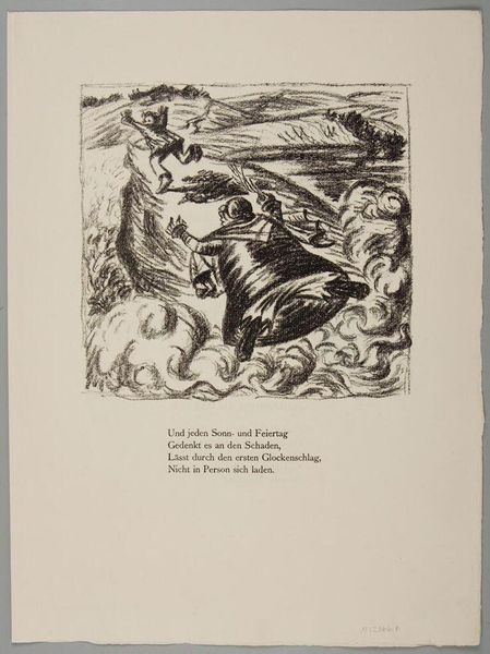
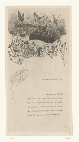
Curator: Georges Auriol, or Jean-Georges Huyot as he was born, created "Preface to L'Estampe originale" in 1893. It’s a woodcut printed on paper, currently held at the Minneapolis Institute of Art. Editor: My immediate impression is a feeling of delicate elegance. The stark black and white contrast and the swirling lines give it an almost musical quality. Curator: Indeed. Auriol was deeply involved in Art Nouveau, and we can certainly observe some characteristics here. The flowing lines, asymmetrical balance, and use of organic motifs are quite obvious. The typography itself functions as an ornamental element. Editor: Those birds, flying toward what I assume is a crescent moon. This image has an almost fairy tale quality. I find it particularly interesting that the typography reinforces that image: it seems as if it is not simply presenting written material. Curator: Certainly. In semiotic terms, we see a clear articulation between the signifier and the signified. The typography reinforces and echoes the visual elements above, becoming part of a unified, self-referential system. The typeface feels organic, echoing natural forms. Editor: The choice of natural imagery — birds, foliage — carries a weight, connecting the preface to larger themes. The image seems hopeful; the birds are heading towards something good, maybe something sublime. The moon certainly resonates with ideas about romanticism. Curator: Interesting; but one could also see the heavy black background and high contrast, almost aggressively, as limiting interpretation of this piece beyond surface impressions of romantic hope. Its stark nature may actually hinder the work’s effectiveness. Editor: Even if one accepts this interpretation, it makes it even more significant; it invites one to interrogate where one draws personal hope and confidence. To look inward at what you can do and contribute and offer it as hope itself. Curator: That perspective adds a nuanced layer. Considering how Auriol balances aesthetic design with the implied narrative and literary function in conjunction with visual symbols allows us a comprehensive reading of "Preface to L'Estampe originale." Editor: Right. Considering the symbolic charge behind something seemingly straightforward brings so many interesting layers to bear.
Comments
No comments
Be the first to comment and join the conversation on the ultimate creative platform.
More like this