drawing, graphic-art, paper, pencil
#
drawing
#
graphic-art
#
art-nouveau
#
script typography
#
hand-lettering
#
hand drawn type
#
hand lettering
#
paper
#
personal sketchbook
#
hand-drawn typeface
#
fading type
#
pencil
#
line
#
sketchbook drawing
#
sketchbook art
#
calligraphy
#
small lettering
Copyright: Rijks Museum: Open Domain
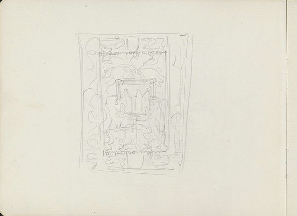
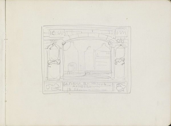
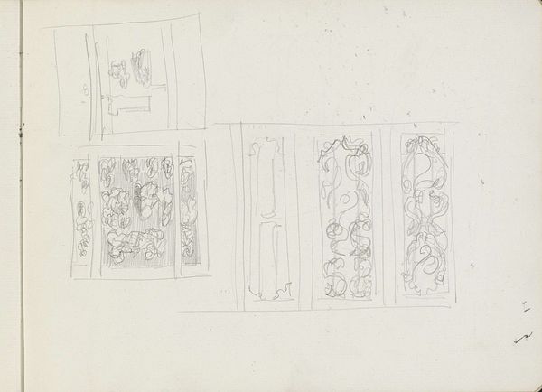
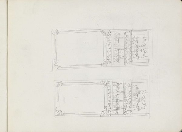
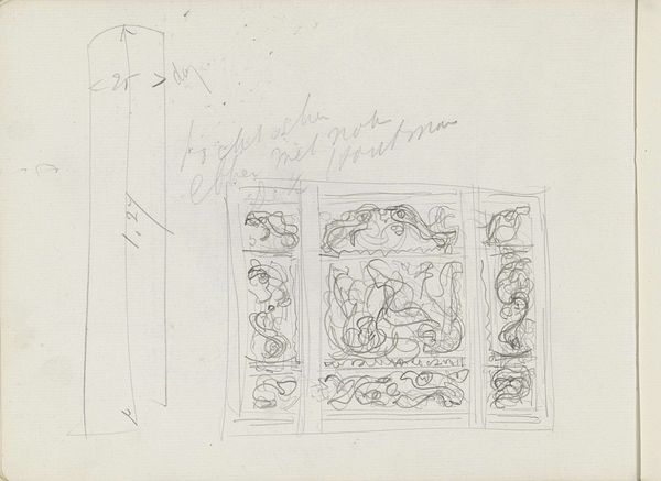
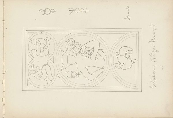
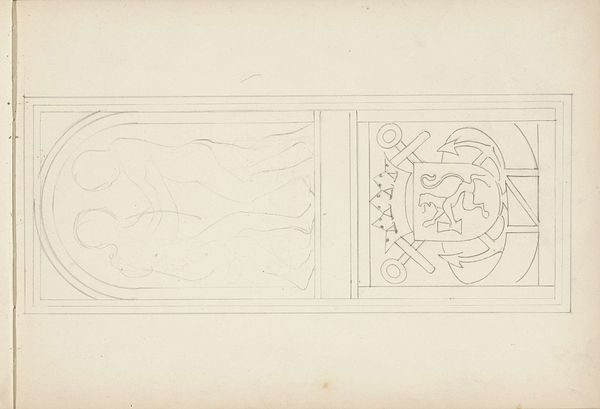
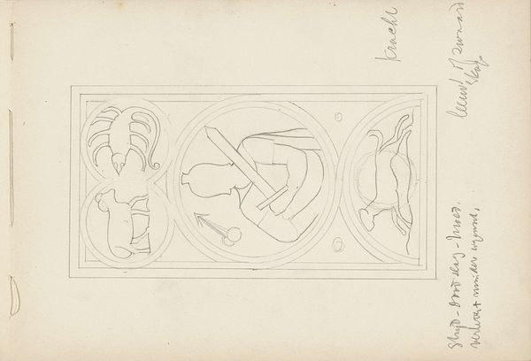
Curator: Looking at this sketch, I find it remarkable how preliminary gestures can evoke such a powerful sense of potential. Editor: I agree; there's an immediate sense of delicate strength in its fragility. It reminds me of early heraldic designs, hinting at nobility. Tell me more. Curator: This is "Ontwerp voor de firma B.H. Manus" - a design proposal for the firm B.H. Manus, dating from around 1905-1910 by Carel Adolph Lion Cachet. It’s currently housed at the Rijksmuseum. Cachet rendered it in pencil on paper, capturing the essence of Art Nouveau. Editor: So, a commercial proposition, visualized in the elegant vocabulary of the era. What symbolic elements stand out to you? Curator: Note the hand-lettering; even in this early stage, it suggests a deliberate association with established traditions. It is an excellent demonstration of period typography. The figures flanking what appears to be a family crest – perhaps they represent stability and support for the Manus company? Editor: Interesting point about tradition. Art Nouveau often aimed to create a new visual language, yet it frequently drew upon historical motifs to legitimize its aesthetic. What kind of power dynamic might be at play between tradition and innovation here, especially when considering its commercial application? Curator: The client would desire imagery to present itself as venerable. Manus benefits from being represented as timeless by associating itself with time-honored motifs of prosperity and nobility. Editor: And the style…that distinct linework feels very self-assured for something labeled a "design." Were commercial designs seen as 'art' during the turn of the century? Curator: I’d argue they were becoming increasingly blurred, due to democratization of cultural power during industrialization. The aim was beauty available for everyone, beyond oil paintings that are the purview of the upper crust. Editor: It is also true that commercial viability served an artist in continuing his practices! On reflection, that intertwining of intent enriches the sketch, hinting at social forces beyond mere commerce. Curator: Exactly! Even preliminary work carries the imprint of its time and, in this case, points to intriguing cultural crosscurrents.
Comments
No comments
Be the first to comment and join the conversation on the ultimate creative platform.
More like this