drawing, paper, ink, engraving
drawing
aged paper
toned paper
allegory
hand-lettering
narrative-art
baroque
old engraving style
hand drawn type
figuration
paper
personal sketchbook
ink
geometric
classicism
ink colored
line
sketchbook drawing
history-painting
golden font
sketchbook art
engraving
Dimensions: height 77 mm, width 75 mm
Copyright: Rijks Museum: Open Domain
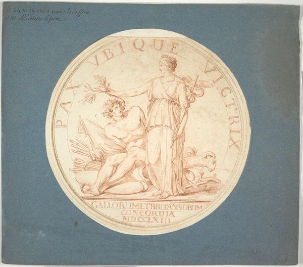
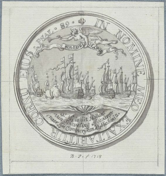
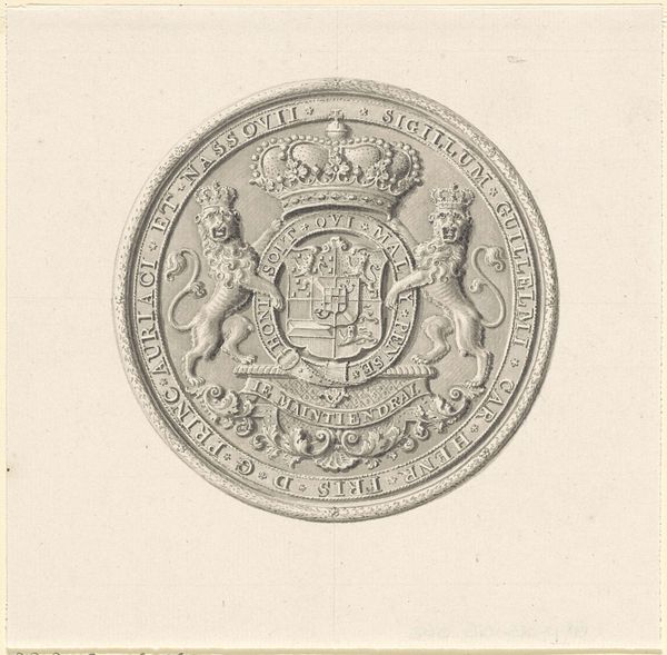
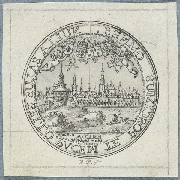
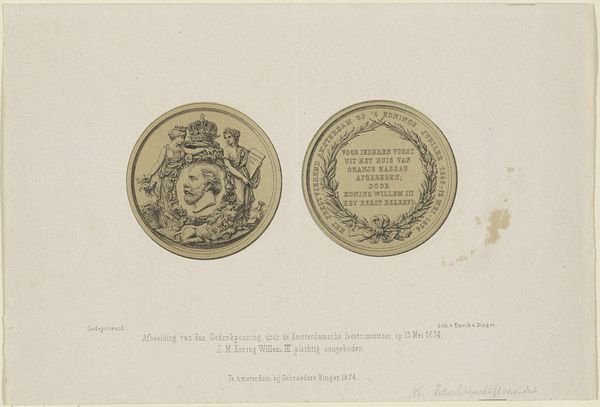
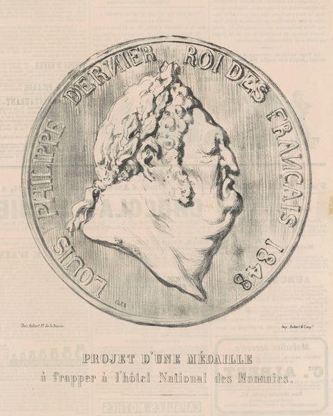
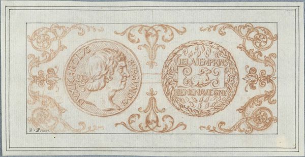
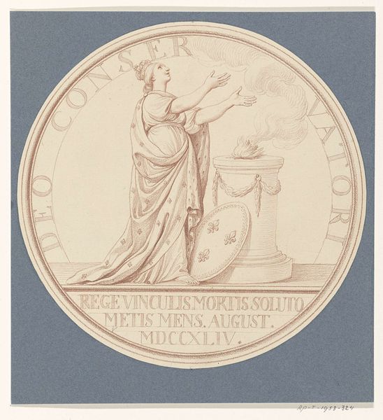
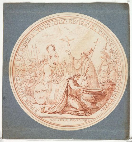
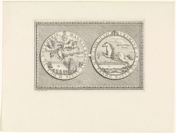
Curator: Look at this intriguing drawing, titled "Penning op de Vrede van Munster," which translates to "Medal on the Peace of Munster." It’s attributed to Bernard Picart and believed to have been made sometime between 1683 and 1733. The piece uses ink on paper, showcasing a meticulous engraving style. It's currently held in the Rijksmuseum collection. Editor: It strikes me immediately as a very hopeful image, but there's also an undeniable sense of... exhaustion about it. The lines are so fine, delicate almost, but you can sense a historical weight to the moment captured here. The aged paper definitely contributes to that feeling. Curator: Absolutely. It’s an allegory rich in symbolism. Notice the figure in the chariot on the left, presumably representing peace or a related virtue. She’s holding an olive branch, a universally understood symbol, but in this case maybe even the olive branch after conflict has transformed society completely. Editor: And the chariot is drawn by lions, no less! That suggests a harnessing of power, perhaps a commentary on taming aggressive forces to achieve this peace. I am interested in what this peace really means – for whom it signifies a new dawn, and for whom it merely repackages existing structures of power and oppression? Who got left out? Who continued to suffer even in this time? Curator: Precisely. The text encircling the image further elucidates the context— it directly mentions the Peace of Munster, a pivotal moment marking the end of the Eighty Years' War between Spain and the Dutch Republic. It has connotations of new markets opening, old hegemonies crumbling, and capital expanding throughout the land. Editor: Given the era, and the fact that is also known as the Peace of Westphalia, I bet those themes resonated across the continent in ways that reshaped cultural memory, the symbolic visual language of the era served as propaganda that aimed to create a shared emotional understanding of complex historical events. What's also striking is the commitment to hand-lettering in the piece itself, with beautiful golden font suggesting not only high status and authority, but also inviting close visual inspection to unlock other hidden cultural and linguistic memories. Curator: It prompts one to really question the narratives surrounding peace. The artist leaves space for dialogue and invites the viewer to think critically about who benefits and at whose expense. I will never look at those powerful symbols like an olive branch, a lion, or font and lettering styles the same. Thank you for offering these crucial thoughts to consider. Editor: Indeed, seeing this as an attempt to define and disseminate a specific interpretation is essential. To me it’s a stark reminder that we need to keep questioning whose peace is truly being celebrated, and to centre the voices often written out of celebratory narratives, so thank you as well.
Comments
No comments
Be the first to comment and join the conversation on the ultimate creative platform.
