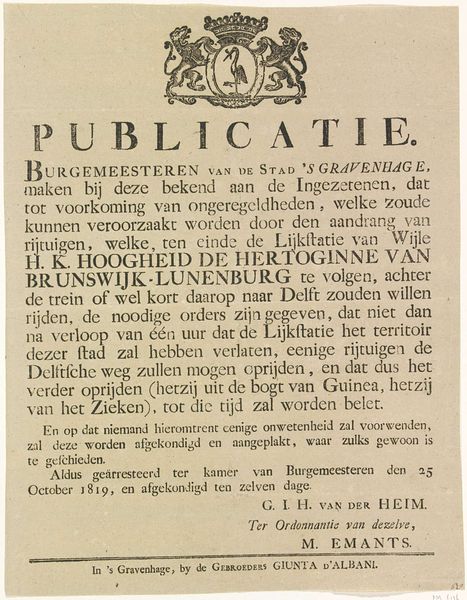
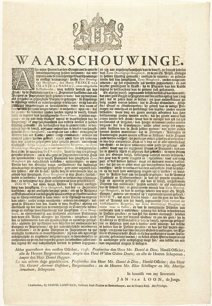
Proclamatie van de stad Den Haag om niet te illumineren bij de verjaardag van de erfprins op 24 augustus 1788 Possibly 1788
0:00
0:00
graphic-art, print, paper, typography, engraving
#
graphic-art
#
neoclacissism
# print
#
old engraving style
#
hand drawn type
#
paper
#
typography
#
pen work
#
history-painting
#
engraving
Dimensions: height 415 mm, width 290 mm
Copyright: Rijks Museum: Open Domain
Curator: This engraving, titled "Proclamation of the City of The Hague Not to Illuminate on the Birthday of the Hereditary Prince on August 24, 1788," is attributed to Isaac Scheltus. Likely created in that same year, it offers a fascinating window into Dutch political sentiments. Editor: My first impression is one of austere formality, a controlled graphic space meticulously organized. The black ink against the aged paper provides a stark contrast, reinforcing the weighty message of the text. Curator: Absolutely. The proclamation itself highlights a refusal to celebrate the Hereditary Prince's birthday. Examining it through a contemporary lens, it raises questions about resistance, public dissent, and the complex relationship between the monarchy and the populace during that era. Who did this benefit? Who was being targeted? Editor: The overall composition, however, strikes me as rather balanced, perhaps deliberately so. Note the heraldic devices at the top—they frame the textual declaration with emblems of authority, almost undermining the subversive sentiment with their classic formalism. Look closely at the typeface too. The choice reflects a society steeped in tradition and yet—a revolution simmers. Curator: Indeed, the typography itself becomes a battleground of meaning. This aesthetic choice speaks volumes about how revolutionary messages were being communicated—not through fiery speeches, but through the very language of power, subverted and re-purposed. Furthermore, it hints at growing dissatisfaction among ordinary citizens. What mechanisms of control were put in place to limit free expression? Editor: The pen work is impeccable. And that ornate initial 'E', flourishing in its design...almost reminiscent of medieval manuscripts, thus providing both legitimacy, but it also subtly betrays how those older, more powerful symbols are deployed in service to new ideas. The craftsmanship and historical references, when interlaced in this fashion, seem to provide an added tension to it. Curator: Analyzing Scheltus's work unveils power dynamics and societal fault lines and enables an investigation of agency and power at play in late 18th-century Netherlands. We're essentially looking at an early form of political activism made enduring through art. Editor: A compelling intersection between formal constraints and underlying unrest. Examining the graphic language, and then delving into the era, offers an unique perspective. Curator: A crucial reminder that art always serves as a profound historical artifact.
Comments
No comments
Be the first to comment and join the conversation on the ultimate creative platform.
More like this