Dimensions: height 336 mm, width 226 mm
Copyright: Rijks Museum: Open Domain
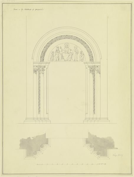
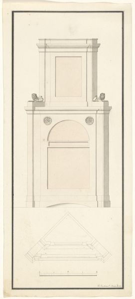
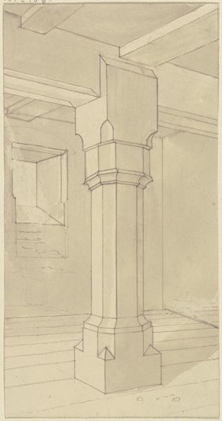
Editor: So, this drawing is called "Ontwerp van de portiek van Singel 548 in Amsterdam," which translates to "Design for the entrance of Singel 548 in Amsterdam." It’s an architectural drawing from 1895, neatly rendered in pen on paper. I am really struck by its symmetrical detail, like looking at some perfectly balanced equation... it gives off almost a chilly vibe. What leaps out at you when you look at it? Curator: You know, “chilly” is an interesting way to put it! It's precise, almost clinical. It takes me to the turn of the century, all industrial progress but with a yearning for a grandiose past. It makes me wonder about the person behind it. Were they a dreamer shackled to precision or a precise soul dreaming of grandeur? See how meticulously those classical motifs are rendered? And it is for an Amsterdam canal house...rather aspirational for the setting. Does that contrast do anything for you? Editor: It definitely does now that you mention it! Amsterdam's more known for its… well, its quaintness, and maybe this is a desire to give the city a neoclassical update, a little bit of Rome by the canals? Curator: Precisely! Think of it: Amsterdam, a city of merchants and canals, suddenly wanting a touch of Roman gravitas. This wasn't just architecture; it was a statement! A quiet declaration of prosperity, a reaching towards perceived higher culture…but do you think the drawing communicates as much without its physical construction? Editor: I am unsure, a drawing invites such consideration but the design must come alive when someone physically interacts with the materials. Thanks, that perspective really opens it up. Curator: It works both ways! Perhaps now, I see its chill not as distance but longing. For history and culture that, at this distance, has had it physical experience removed.
Comments
No comments
Be the first to comment and join the conversation on the ultimate creative platform.
More like this