Copyright: Modern Artists: Artvee
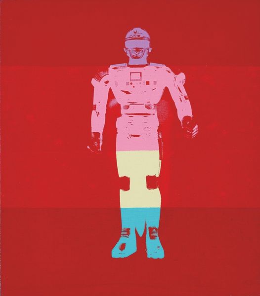
Editor: Here we have Andy Warhol’s "Robot," created around 1983 using acrylic paint as a print. It’s very striking – the stark black background really makes the bold colors pop. What can you tell me about it? Curator: Formally, we see a very graphic, almost stencil-like quality to the execution. Consider the flattening of the subject; Warhol is less interested in depth or realistic representation. Editor: I can definitely see that. There's barely any shading, it is flat. So what’s important, formally speaking? Curator: Observe how the solid blocks of colour - the yellow, green, red and turquoise - interact within the two-dimensional plane. The robot figure is deconstructed into these planes. The negative space surrounding the figure reinforces the artificiality, doesn't it? Editor: It does. The black really emphasizes the flat shapes and colors. So, is the content, the robot itself, secondary to the color? Curator: Precisely. While a robot suggests themes of technology and the future, here those themes seem almost incidental. The essence lies in how Warhol manipulates colour and form to create a visually arresting image. Ask yourself: how does the division of colour relate to semiotic significance and differentiation in consumer imagery? Editor: I guess it really is more about the *how* than the *what*. So it's not about robots, it's about color relationships? Curator: Yes, and the mechanical reproduction made the work possible to begin with. Consider how that plays with our conception of art and mechanical reproduction. Editor: Interesting. I was so focused on it being a robot image! Now I'm looking at those pure shapes. Curator: Exactly. Looking at the construction and deconstruction helps move the dialogue forward and beyond our usual way of interpreting a Pop artwork.
Comments
No comments
Be the first to comment and join the conversation on the ultimate creative platform.
More like this