drawing, paper, ink
#
drawing
#
baroque
#
landscape
#
paper
#
ink
#
cityscape
#
genre-painting
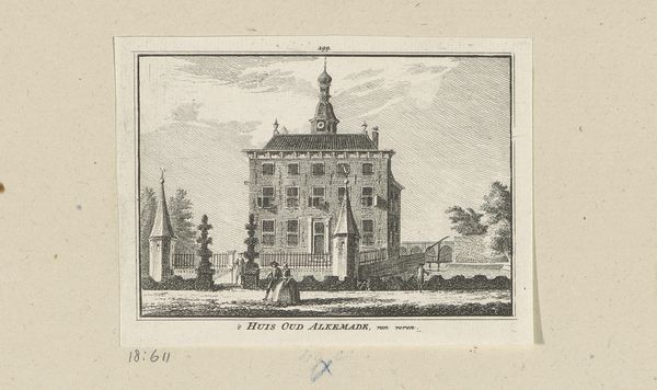
Dimensions: height 135 mm, width 208 mm
Copyright: Rijks Museum: Open Domain
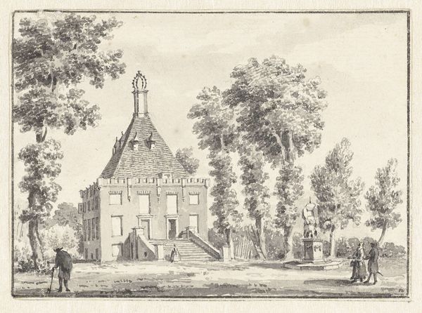
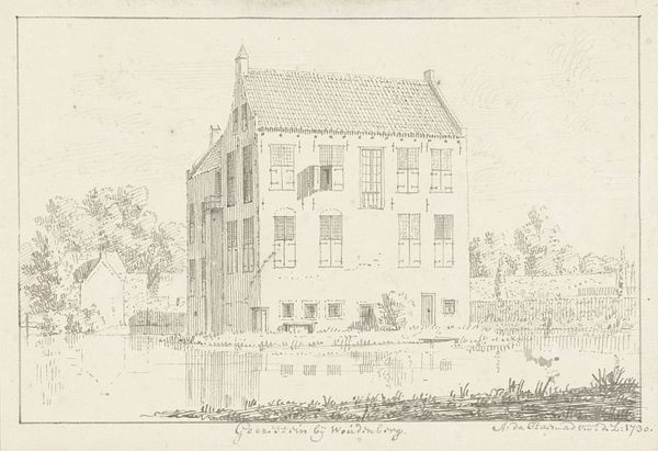
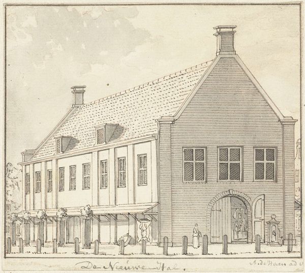
Curator: Here we have Cornelis Pronk's "Het huis Oud Alkemade," a drawing rendered in ink on paper, created around 1730. What strikes you first about this piece? Editor: It’s immediately captivating. The precise linework creates a real sense of order. The pale sepia tones of the ink give it an antique elegance that feels quite serene despite the rather imposing structure depicted. Curator: Indeed. Note the geometric rigor—the rigid symmetry of the building, the calculated repetition of the windows, and the balanced placement of the flanking gatehouses. It’s an exercise in baroque compositional control. Editor: Absolutely. The control speaks to the material circumstances of its creation. It's a drawing, a preparatory medium. But look closely. The evenness of the lines suggests a single craftsman producing a controlled, reproducible image, maybe for an engraving that can be shared widely. The materials – paper and ink – suggest this isn't a unique, one-off piece meant only for an elite patron. Curator: An astute point. However, let’s consider the perspective. It is carefully calibrated to present the house as an emblem of civic pride. The lines converge to create depth while maintaining a flat facade, almost like a stage set, for the ideal of domestic architecture. Editor: And perhaps that’s related to the work that artisans did at the time, preparing pigments and supports that demanded intense physical labor. The very *making* of the inks available shaped this aesthetic of precision and muted color palettes. Think of the apprentice systems…skill developed slowly and passed down through direct practice! Curator: Interesting to consider the work. And yet I am drawn back to the architectural precision: The meticulous detail of the clock tower, each precisely rendered tile of the roof… Pronk’s careful notation elevates the everyday to an ideal form. Editor: The drawing brings us back to our appreciation of humble means. The piece feels less like an idealized portrait and more like documentation reflecting the availability of means during that time and location. Curator: It does offer a unique lens for observation and contemplation of civic and domestic values. Editor: Indeed. And a study in what could be achieved given the tools on hand.
Comments
No comments
Be the first to comment and join the conversation on the ultimate creative platform.
More like this