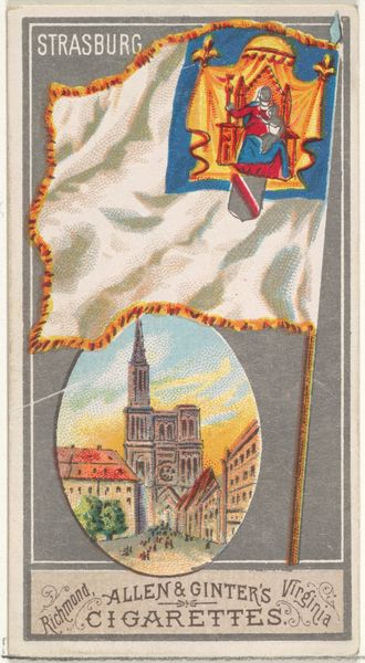
Geneva, from the City Flags series (N6) for Allen & Ginter Cigarettes Brands 1887
0:00
0:00
# print
#
coloured pencil
#
cityscape
Dimensions: Sheet: 2 3/4 x 1 1/2 in. (7 x 3.8 cm)
Copyright: Public Domain
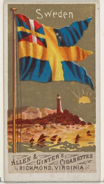
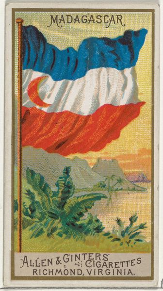
Curator: Right, let’s take a closer look. What immediately strikes me about this image? The chromatic scale of the flag juxtaposed with the circular vignette seems strangely out of balance. Editor: Hmm, I find it utterly charming, almost naive. Like a postcard, but with a touch of…swagger? I feel an almost childlike longing looking at it, I can’t really say why. Maybe it’s that red-and-yellow flag. It looks edible! Curator: Interesting, you see naivete, I see a very deliberate visual strategy. This is "Geneva, from the City Flags series (N6)" created in 1887 by Allen & Ginter, printed using a combination of watercolor, coloured pencil, and possibly even printmaking techniques on paper, the blend of mediums serves a crucial function. Editor: Purposefully childlike? A cultivated nostalgia, perhaps? So what’s going on with that cityscape nestled underneath the flag? Curator: The circular composition depicting Geneva allows the commercial print to function on multiple symbolic levels. We must observe how the geometry informs the reading of space: the red and yellow flag dominates the upper two-thirds, visually overpowering Geneva situated in the lower register of the design. Editor: Ah, I get it. The city becomes… a kind of picturesque footnote to the idea of Geneva? The city’s beauty serves as a branding tactic, almost incidental? Allen & Ginter understood how to create a desire that lingers somewhere between wanting a smoke and fantasizing about distant locales. I appreciate how small and unobtrusive the architectural details in the lower picture really are. This detail only underlines what you called “multiple symbolic levels,” creating almost a dialectical relationship with the consumer of the day. Curator: Precisely. By visually prioritizing the flag, Allen & Ginter elevates the symbolic importance of both geopolitical identification and the firm’s corporate entity. The materiality becomes secondary, replaced with this new commercial function. Editor: Makes you wonder what a "cigarette card" from our era might look like! Less watercolor, more screens, probably. I imagine there's some sadness laced in these consumer fantasies: people wanting connection, a way to belong... It’s so bittersweet and beautiful. Curator: An astute point; one that underlines art's capacity to distill cultural tensions, perhaps.
Comments
No comments
Be the first to comment and join the conversation on the ultimate creative platform.
More like this