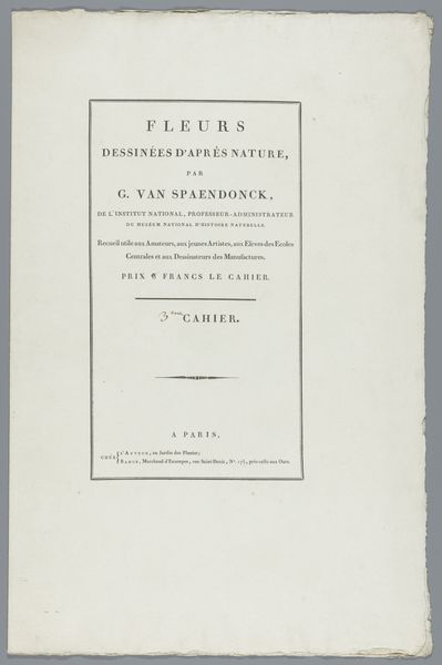
graphic-art, print, typography, poster
#
graphic-art
#
script typography
# print
#
typeface
#
hand drawn type
#
typography
#
typography
#
thick font
#
typography style
#
white font
#
experimental typography
#
classical type
#
poster
#
historical font
Dimensions: height 270 mm, width 190 mm
Copyright: Rijks Museum: Open Domain
Curator: Immediately, I notice how understated it feels. It's like a quiet announcement, a formal declaration made with such simplicity. Editor: The work before us, "Konings-Verjaardag: een lied voor den 19den februarij 1861", is a printed piece from 1861 created by J.H. van Lennep. It seems to be a poster or perhaps a title page. The emphasis on typography is striking, isn't it? Curator: Strikingly restrained, yes. The negative space almost swallows the text. It creates this… solemn reverence, befitting a king's birthday, I suppose, but with a touch of melancholy. Editor: The layout employs varying font sizes and weights to establish a visual hierarchy. Consider the bold san-serif typeface used for "KONINGS-VERJAARDAG", its cap height far exceeding the body text. It certainly catches the eye. Then, the slight embellishment dividing the text block…it’s all so intentional. Curator: Absolutely, every element works to construct meaning. It isn’t just information; it’s a constructed statement. And look, “(Uitgegeven ten bate van de watersnoodlijders)” is included below the author's name— "(Issued for the benefit of flood victims)", in English translation. Editor: Ah, interesting. Proceeds were going to charity! I appreciate knowing that about the artwork’s history because you look at it differently. It adds some much-needed context that explains a lot of that… restrained energy. Curator: Indeed. That sense of solemnity now becomes infused with a deeper purpose. It's no longer just about celebration; it’s about communal responsibility and compassion in the face of disaster. Editor: It's interesting how the artist merged both royal reverence and human tragedy. So perhaps there is less melancholic air about it and a bigger human feel of empathy that translates through time from 1861 into our present. Curator: The longer one looks at it, the more layers one uncovers. Thank you. Editor: Absolutely. It's like uncovering a forgotten melody of our past selves, and for me that’s the magical thing.
Comments
No comments
Be the first to comment and join the conversation on the ultimate creative platform.
More like this