graphic-art, engraving
#
graphic-art
#
allegory
#
baroque
#
pen drawing
#
pen sketch
#
old engraving style
#
line
#
history-painting
#
engraving
Dimensions: height 135 mm, width 116 mm
Copyright: Rijks Museum: Open Domain
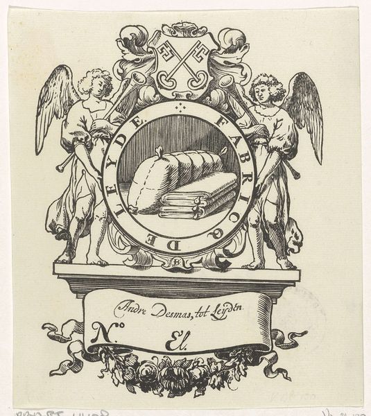
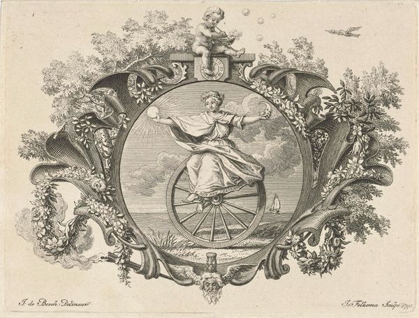
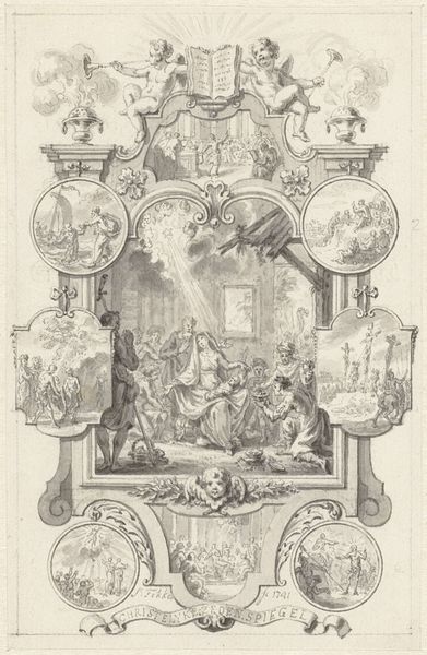
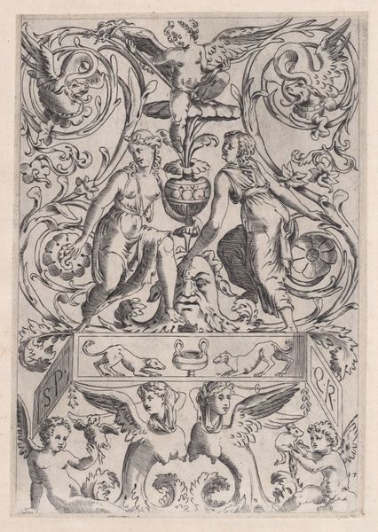
Curator: Ah, yes, this is the "Titelpagina voor klinkdichten", or Title Page for Sonnets, dating sometime between 1706 and 1746. It’s an engraving by François van Bleyswijck, currently residing here at the Rijksmuseum. Editor: My first impression is that it’s wonderfully busy, a real baroque explosion of allegorical figures and musical instruments. The density of detail is remarkable. Curator: Absolutely. Bleyswijck was working within very specific aesthetic and societal constraints, navigating patronage and the expectations around artistic representation in the Dutch Republic. We can examine how class and social hierarchies dictated these visual languages. Editor: True. Look at the craft, the layering of etched lines to achieve tonal variations. The way Bleyswijck handles metal, wood, and fabric— the drum at the base, the strings of the harp— there's such a tactile sense despite being a flat print. I am curious about its functionality as an illustrated page. Was it meant to elevate and market these published poems? Curator: Undoubtedly. The figures, allegories of music and poetry perhaps, suggest an appeal to refinement and cultivated taste, important signifiers of status. And of course, it reflects the baroque obsession with grandeur. I'm particularly interested in how gender roles are coded here, the female figures as muses… Do these images enforce a specific patriarchal narrative surrounding artistic creation? Editor: From a material perspective, what ink was Bleyswijck using? How did the printmaking process democratize the visual, making images available to a wider audience beyond painted works available to a privileged clientele? Curator: Precisely! This leads us to important conversations about accessibility and who controls the means of representation, both then and now. Art exists within a matrix of power. Editor: Right. Thinking about distribution and the socio-economic impact of such images complicates the standard art historical view that separates fine art and prints as different social endeavors. What were the printing press labor practices involved? And to what extent were traditional craft boundaries reinforced or dismantled as printmaking grew as an industry? Curator: The questions you pose really underscore that there is more to examine beyond aesthetics and beauty. Editor: Agreed. Seeing how this image embodies the intersections between the handmade and mechanization underscores the dynamic push and pull between creator and created. Curator: Indeed, a testament to how artworks function within complex social and political realities. Editor: Absolutely, Bleyswijck's piece shows that by looking at material conditions and creative practice, we open doors to exploring both.
Comments
No comments
Be the first to comment and join the conversation on the ultimate creative platform.
More like this