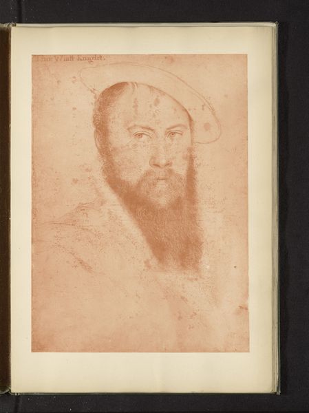
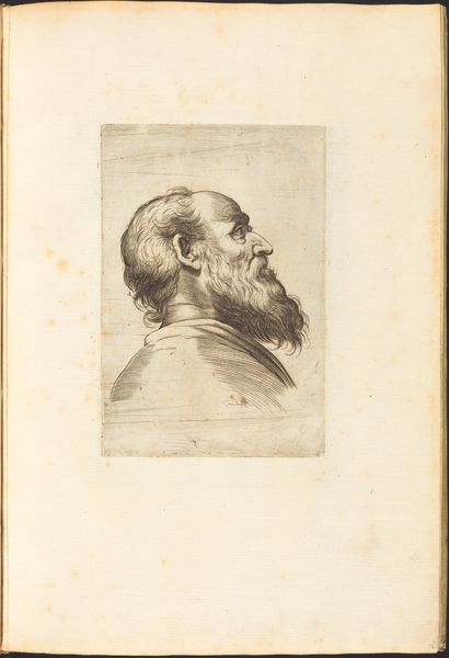
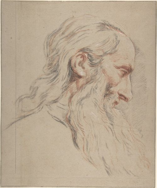
drawing, print, pencil
#
portrait
#
pencil drawn
#
drawing
#
aged paper
#
light pencil work
# print
#
pencil sketch
#
pencil
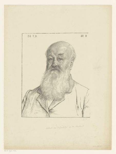
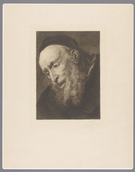
Dimensions: height 60 cm, width 40 cm
Copyright: Rijks Museum: Open Domain
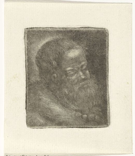
Editor: Here we have Jan Veth’s "Dr. J.E. de Vrij," a pencil drawing from possibly 1896, held at the Rijksmuseum. It's quite striking. The aged paper gives it a sense of history, but I'm really drawn to the contrast between the delicate pencil work and the subject's very strong, almost severe gaze. What stands out to you in terms of composition or form? Curator: The success of this portrait, I think, rests upon the economy of line. Veth has achieved a remarkable likeness with what appears to be a minimal of means. Observe how the subtle gradations of tone, created through hatching and cross-hatching, define the volume of the head and beard. Notice, too, the deliberate placement of the figure within the rectangular frame. Editor: Yes, the frame within the frame emphasizes the subject! It's interesting that you highlight the "economy of line." Does that relate to a specific artistic philosophy or movement? Curator: It speaks to a modernist sensibility, even this early. There's a paring down, a seeking of the essential. Think about how the gaze directs the viewer's focus, too, straight to the sitter's intellect. Where do you think this fits in relation to others from this series? Editor: Knowing this is part of a series "Portretten van de Kroniek X" I’d bet this aesthetic was designed to highlight the intellectual contributions of the figures? Thanks. This Formalist analysis certainly shifts my perception from mere representation to the mechanics of expression. Curator: Indeed. Focusing on how the image functions as an image and what is communicated is key here, without making assumptions outside of the immediate aesthetic encounter. It’s through understanding these building blocks that an image speaks more loudly.
Comments
No comments
Be the first to comment and join the conversation on the ultimate creative platform.
More like this