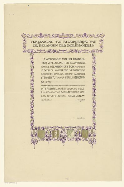
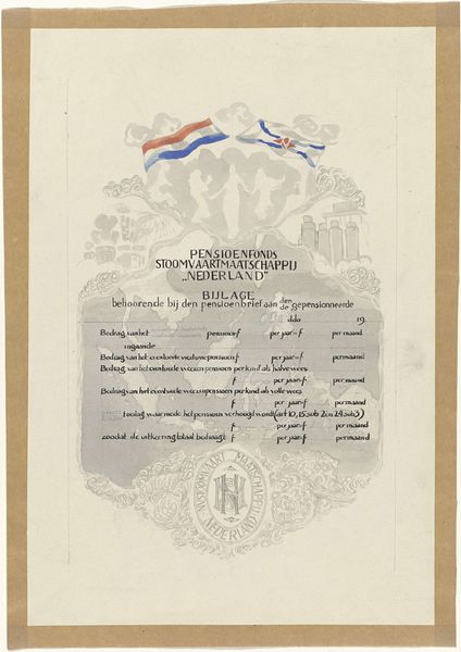
Ontwerp voor een oorkonde van de Vereniging ter Bevordering van de Belangen des Boekhandels 1912
drawing, graphic-art, paper, typography, ink
drawing
graphic-art
dutch-golden-age
parchment
paper
typography
ink
academic-art
calligraphy
Dimensions: height 483 mm, width 317 mm
Copyright: Rijks Museum: Open Domain
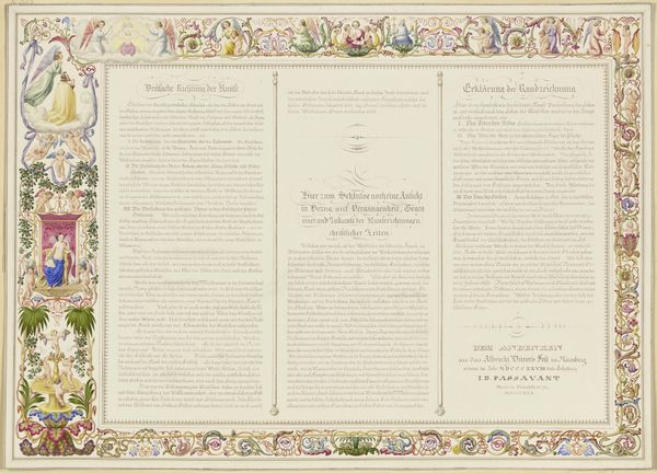
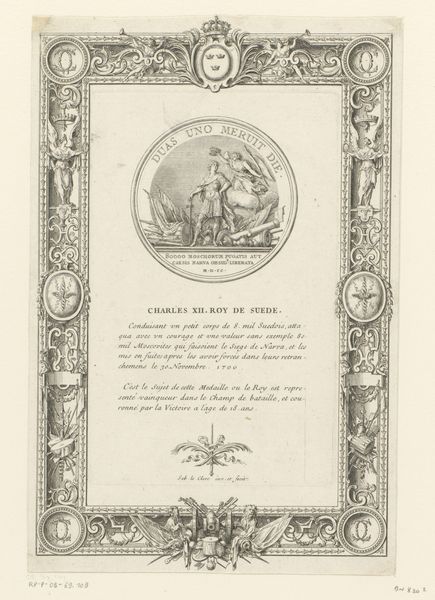
This "Ontwerp voor een oorkonde van de Vereniging ter Bevordering van de Belangen des Boekhandels" was designed by Reinier Willem Petrus de Vries. I imagine him carefully applying watercolor to paper, layering those delicate purples, browns, and blues. It's like a visual poem, right? The artist meticulously combines calligraphy with ornate illustration, framing the official text with decorative motifs. Each carefully drawn flourish feels intentional. I can imagine De Vries thinking about the balance between the formal qualities of the text and the decorative elements. I wonder if De Vries was thinking of illuminated manuscripts when he designed this? The way the text is presented within a decorative border, it reminds me of the craftsmanship and care you see in medieval books. It’s as if he’s connecting this certificate to a longer history of honoring knowledge and artistry. It reminds me that artists are always in conversation with one another, borrowing, remixing, and pushing the boundaries of tradition.
Comments
No comments
Be the first to comment and join the conversation on the ultimate creative platform.
More like this