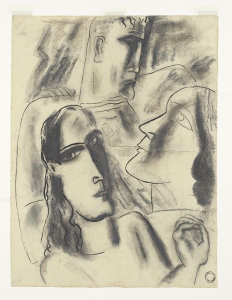
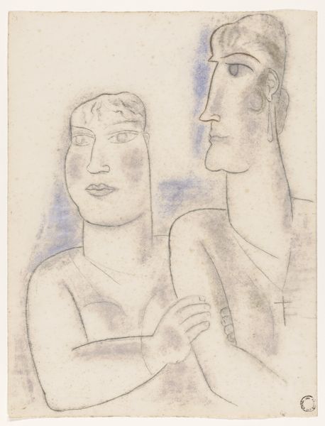
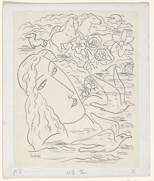
drawing, watercolor
portrait
drawing
landscape
caricature
figuration
watercolor
horse
watercolour illustration
portrait art
Dimensions: height 357 mm, width 441 mm
Copyright: Rijks Museum: Open Domain
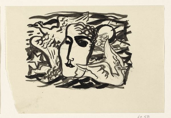
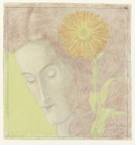
Curator: Before us is Leo Gestel's "Vrouwenhoofd en twee paarden," a work from possibly between 1891 and 1941, held here at the Rijksmuseum. What strikes you initially? Editor: A rather muted palette creates a dreamy, almost surreal quality. The juxtaposition of the woman's head with the horses and geometric flower feels unusual and makes me think of folk art. Curator: Observe how Gestel arranges these elements. The female figure, rendered in soft earth tones, dominates the composition, her gaze directed not outward, but inward toward an almost ethereal floral form held delicately in her hand. Two horses occupy the top left corner of the picture frame, seemingly weightless against the background. The structure itself suggests an exploration of consciousness, maybe even the artist's, if not a universal condition. Editor: It's interesting to think about Gestel's labor here—the materials involved in creating the watercolour, the quality of the paper he would have been working on. This process adds so much meaning, but what do you make of the rendering? The sketch-like, unfinished style brings an immediacy to the overall composition. Was he interested in portraying dreams, in using accessible materials to show psychological interiors and their social nature? Curator: I am fascinated by how Gestel employed watercolor to soften the rigidity we often find in portraiture. Consider also the deliberate stylization—the elongated features of the face, the abstracted forms of the horses, the simplified flower. Semiotically, each carries a potential reading, but the overall harmony pulls toward emotionality over precision. Editor: True. And consider how the drawing exists in a lineage of graphic portraiture—a watercolour in these colours can have a significant relationship with movements connected with advertising, print making and book arts that are developing rapidly at the turn of the century. Even now the composition suggests the making of advertising imagery for the middle classes, with mass production lurking just beyond the painterly surface. Curator: I see your point about commercial elements being visible, if obscured. However, for me, what remains most potent here is how Gestel deftly uses such simplistic forms to invite deeper introspection into being, using the figure as an armature, not just the artwork's ostensible subject. Editor: Perhaps. The interplay between what feels familiar with more enigmatic symbols keeps this interesting on multiple material and art-historical levels. Curator: Indeed, and in any event it’s been very revealing exploring it from these two perspectives today.
Comments
No comments
Be the first to comment and join the conversation on the ultimate creative platform.