drawing, paper, ink
#
portrait
#
script typeface
#
drawing
#
script typography
#
hand-lettering
#
old engraving style
#
hand drawn type
#
hand lettering
#
paper
#
ink
#
hand-drawn typeface
#
thick font
#
pen work
#
handwritten font
#
calligraphy
Copyright: Rijks Museum: Open Domain
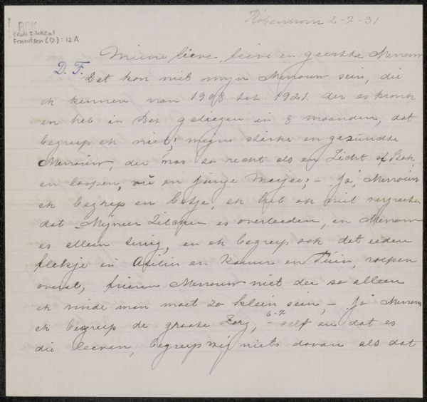
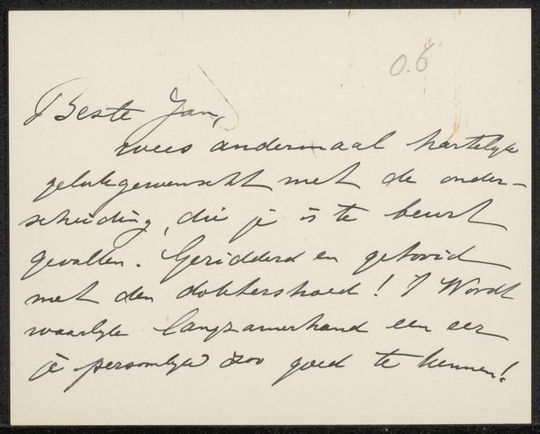
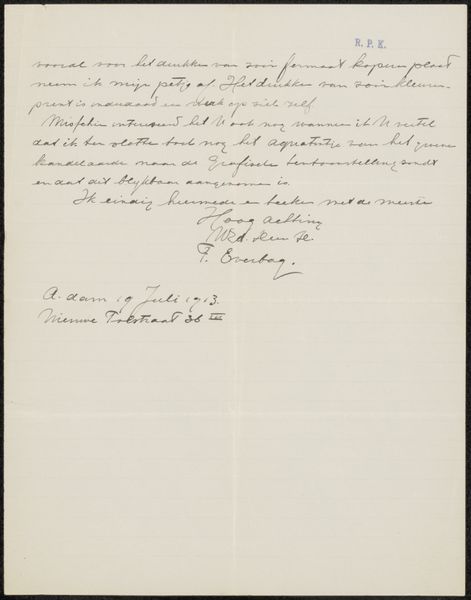
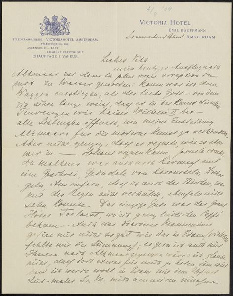
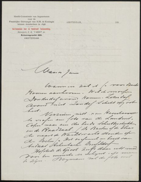
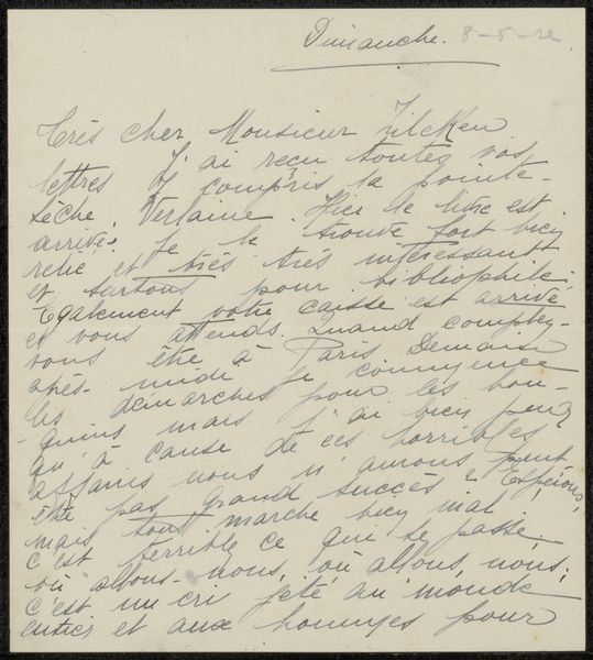
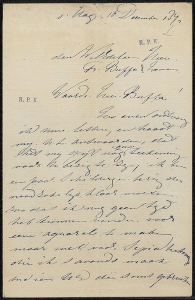
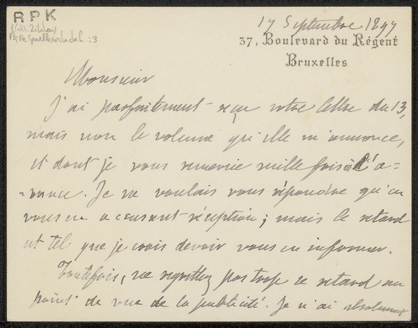
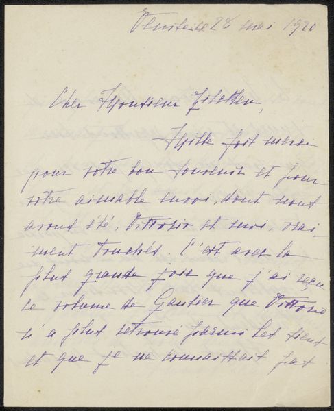
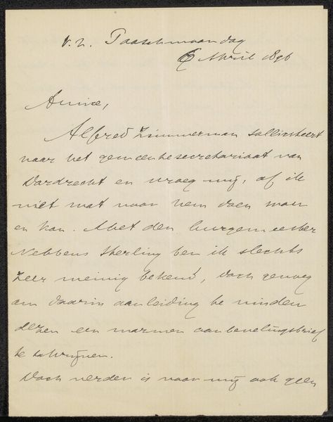
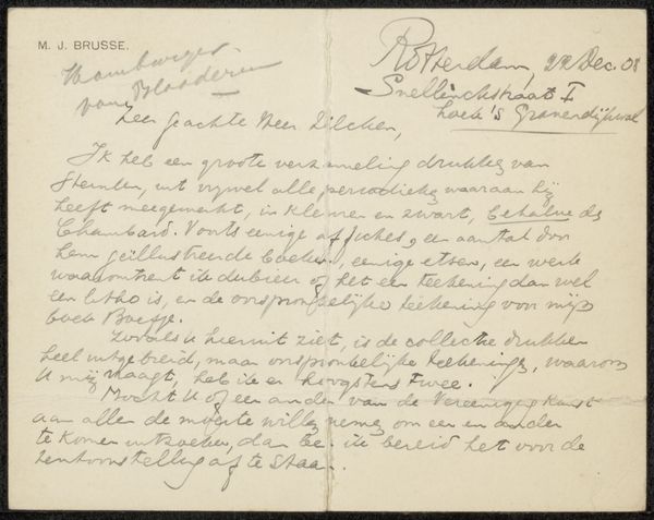
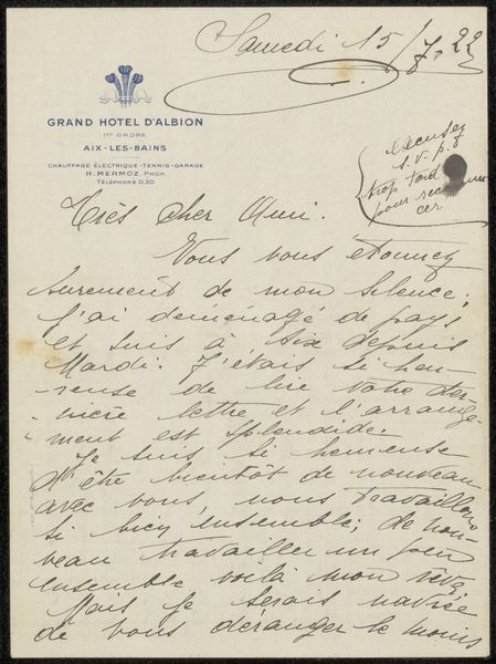
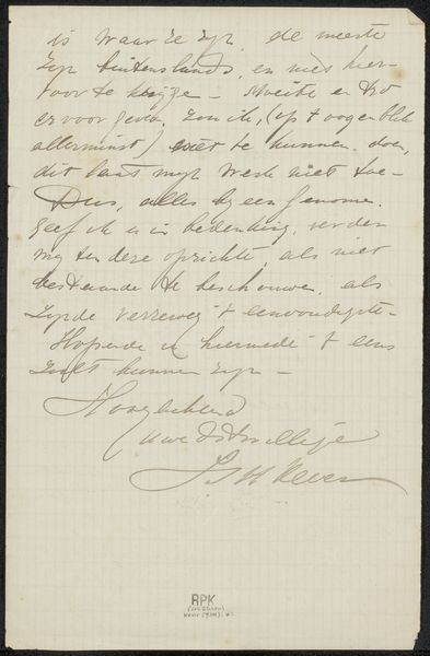
Curator: Here we have "Brief aan de heer J.J.W.B. van Dijck," believed to have been created in 1933 by Johannes Franciscus Maria Sterck. It's an ink drawing on paper, showcasing Sterck's aptitude for hand-lettering and calligraphy. Editor: Wow, it gives off this gorgeously antiquated feel. Like unearthing a secret correspondence from a bygone era, all fragile ink and deliberate curves. There's such a tangible sense of the author's hand at work. Curator: Indeed, the work demonstrates a remarkable control of line. Note how Sterck employs variations in stroke weight to establish a clear visual hierarchy within the text. The overall composition follows a structured layout, suggesting a formal communication, while the handwritten nature imbues the piece with personality. Editor: Absolutely. Imagine the writer carefully forming each letter. Each word is weighted with such an intent and carefulness. There’s a beauty in it – that each word feels like a sketch or an evocative drawing! The way the script almost dances… it transforms mere information into visual poetry. Curator: Precisely. The medium, ink on paper, serves to emphasize the temporality of the document, imbuing it with a sense of historical significance and offering viewers a glimpse into a specific cultural context. Editor: You're so right! Thinking about the act of writing a letter at all... now that’s history. And think of the intimacy, too. This wasn’t meant for just anyone’s eyes, and here we are, decades later, reading across the threshold of privacy and finding our contemporary meaning. It almost feels forbidden. Curator: It does invite contemplation of historical modes of communication. In its detailed attention to calligraphic form, Sterck’s piece elevates the mundane to the level of art, prompting the observer to consider the aesthetic qualities of handwriting itself. Editor: What do you think about how different fonts can elicit specific emotions? If Sterck would've instead employed clean, san-serif print it wouldn't touch us the same way, would it? This work, instead, invites curiosity, sentimentality and, strangely enough, empathy for someone long past. Curator: A keen insight, perfectly expressed! In conclusion, "Brief aan de heer J.J.W.B. van Dijck," serves as a poignant reflection on the art of correspondence. Editor: Agreed! I’m so thankful that we can peer across history and into this artwork that somehow preserves time and memory so effortlessly.
Comments
No comments
Be the first to comment and join the conversation on the ultimate creative platform.
More like this